Back to the basics: how do initial claims, total hours worked, aggregate real payrolls, and job growth relate?
Back to the basics: how do initial claims, total hours worked, aggregate real payrolls, and job growth relate?
– by New Deal democratFed
One of the most important reasons why big Fed rate hikes and big downturns in things like housing starts and credit provision haven’t translated into a recession this year (so far!) is the big decline in gas prices in the second half of last year. This big decline has translated into income and spending gains across the board for American households.
To give an idea of this impact, below I show gas prices for the past 8 years (blue, right scale) contrasted with real disposable personal income (red, left scale):

Gas prices went from $3.25/gallon to $5/gallon in the first half of last year due to Russia’s invasion of Ukraine. And then, as Europe successfully weaned itself from Putin’s gas, prices went right back down to $3/gallon last December. Since then they’ve gradually increased back up to about $3.50/gallon. Not coincidentally, real disposable personal income declined in the first half of last year, bottomed in June, and has increased ever since.
But this month will be the last month for those virtuous YoY comparisons, which will gradually become more challenging through this December. My suspicion is, this will put a damper on declining inflation. It may not start to accelerate again, but it may stall and is at least likely to decelerate at a more attenuated rate. Meaning consumer finances are likely to eat a little more challenging as well (not to mention the Fed’s apparent intention to hike interest rates once or twice more).
That’s why I have been focusing on the next shoe likely to drop, which is real spending on consumer goods. To recapitulate, typically early in recoveries real average hourly wages increase, leading to increased real spending. With more demand for goods, commodity, producer, and consumer prices increase. Ultimately they overtake wage growth, prompting consumers to cut back. A consumer recession ensures.
Yesterday, I updated the comparison of initial claims and the unemployment rate. As I again noted, initial jobless claims are a short leading indicator, and specifically lead the unemployment rate. Meanwhile, jobs are a coincident indicator, one of the most important ones. But there are several other job-related metrics, namely total hours worked and real aggregate payrolls. Today I wanted to refresh how they relate to initial claims and to job growth.
Let’s start with how initial claims (dark and light blue, inverted and /10 for scale in the graphs below) relate to aggregate real payrolls. Real aggregate payrolls turning negative YoY have been a good coincident indicator for the onset of recessions going back 50 years. Since initial claims lead, they ought to lead real aggregate payrolls, and in the below graphs, they do, as shown by the comparison of the dark blue and red lines – the dark blue line crosses 0 to the downside first.
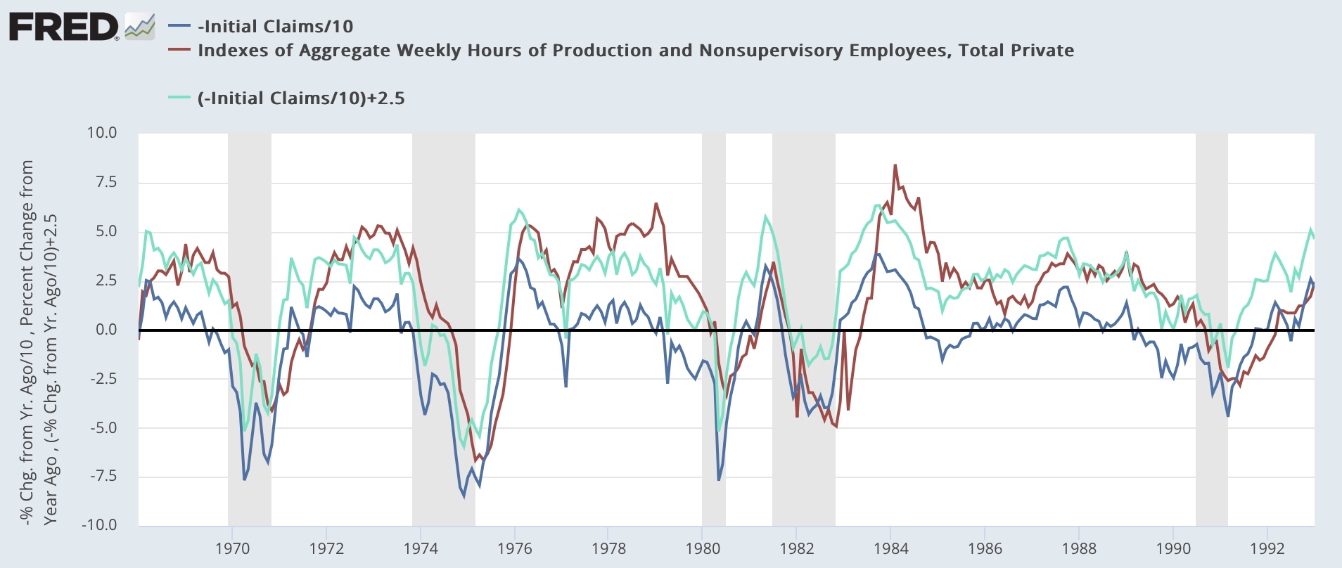

But by how much? That’s where the light blue line comes in. What the graphs above show is that typically initial claims have had to increase YoY by between 20% and 25%, averaging up 22.5%, to coincide with when real aggregate payrolls turn negative YoY. So let’s look at the current situation:

As I indicated yesterday, there are still two more weeks of June claims reports, so the final point in the dark and light blue lines above may change. But as it stands now, real aggregate payrolls look likely to resume their decline to 0 YoY.
Next, let’s compare real aggregate payrolls with aggregate hours worked. The below graph shows that the two have typically risen and fallen coincidentally, although sometimes (the 1970s, 1990) aggregate payrolls decline YoY first:

Here is the present situation:

Again, the two declined more or less in tandem. The jury is out on whether the recent rebound in real aggregate payrolls is noise or not. As I wrote above, I expect inflation comparisons to get more challenging after June, so my bet would be on noise.
Finally, let’s look at aggregate hours vs. jobs. As shown below, historically aggregate hours have declined YoY first, before jobs:


Here is the present situation:

As per past history, so far aggregate hours have decelerated towards 0 (zero) faster than the number of jobs. This makes sense, since we would expect employers to cut hours before they actually cut employees. And indeed, note that total hours worked rises and falls much more than actual jobs gained or lost.
So, to recapitulate: if the deceleration in YoY inflation abates, after the increase in initial claims (already at the red line, although not for long enough yet to warrant a warning), next I would expect real aggregate payrolls to resume their deceleration, and to turn negative once claims hit about 20%-25% higher YoY. Coincident with or shortly after that, I would expect aggregate hours worked to turn negative YoY. By this time we would already be in recession. Finally, well into a recession, jobs would turn negative YoY.
Initial Job claims: yellow caution flag turns more orange, Angry Bear, New Deal democrat
An additional point –
The gain in household spending I funded by increased wages, hours and borrowing. Hours increase because of hiring and longer workweeks.
Mian, Sufi and Werner (among others) have done considerable work on the consumer credit/spending cycle. Pulling consumption forward while encumbered future income with debt service turns out to greatly increase the cyclical spending swing you describe here.
I think there’s strong evidence that spending on goods was pulled forward strongly in this cycle. Might be worth tossing that into the analysis.
Macro:
Ok, you finally said something I am not aware of, forgot, or just plain do not know. I understand what NDd is saying. Interesting . . .