March employment report 2: unemployment recession indicators
Scenes from the March employment report 2: unemployment recession indicators
– by New Deal democrat
A reminder: I may be offline for the next couple of days. In the meantime, yesterday I looked at the 5 leading indicators contained in the employment report, and summarized how they either signal recession now or within the next 3 to 6 months.
Today I want to focus on unemployment and underemployment. Economist Gloria Sahm’s Rule, namely that when the 3-month average unemployment rate rises a half percentage point above the low of the prior 12 months, the economy is in recession, or is about to be, is sufficient to indicate the onset of a recession, but is not necessary. Recessions in the past have started with even a 0.1% increase.
So, let’s look at some indicators which give us quicker signals.
1. Initial jobless claims lead the unemployment rate
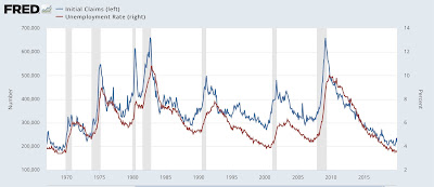
This is something I have written and updated numerous times in the past decade. Initial jobless claims are one of the 10 items in the Index of Leading Indicators, and as shown below, have a 50+ year track record of turning both higher and lower before the unemployment rate does:
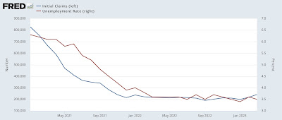
Here is the update for the past two years:
The relationship shows up even better when we compare the YoY% change in both up until the pandemic (note this means a % of a % in the case of the unemployment rate, so an increase from 4% to 8% would be a 100% increase):
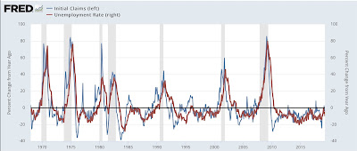
Usually, but not always, the unemployment rate has been higher YoY by the time a recession begins.
Here is the YoY update for the past two years:
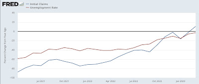
In March, initial claims finally did turn higher YoY, and the unemployment rate is on track to do so as well within the next several months. As I’ve indicated a number of times in the past year, my “red flag” marker is initial claims, on a monthly basis, being 12.5% higher for two months in a row. We’re not quite there yet.
2. Permanent job losers
This series began in 1994, so we only have about a 30 year history. But it does seem to be a good marker for weakness in the job market, as shown below measured 2 ways: its absolute level (blue), and YoY% change (red):
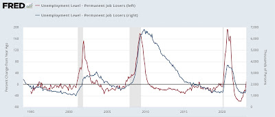
While there have been several brief false positives, notably 1996, where the 3 month trend is higher YoY, it has usually meant a recession is near.
There is a similar series of total job losers that goes all the way back to 1967. Here’s what that looks like YoY (blue) compared with the newer, permanent job losers series (red):
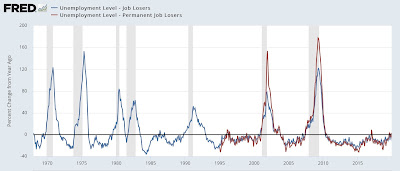
With the noted exceptions of 1974 and 1981, the older series has also turned higher YoY prior to all other recessions.
Here is a close-up of the past 2 years:
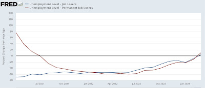
These metrics – as well as initial claims, discussed above – have just hoisted a yellow flag. If next month’s report is also higher YoY, that would merit a red flag, indicating a recession is very close, perhaps imminent.
March jobs report: leading sectors turn down, pre-recessionary report still quite positive, Angry Bear, New Deal democrat.
