Red/Blue COVID Death Rate Divide did not disappear after all
So much for the Covid Gap disappearing. The difference in the death rate for Covid still exists politically. It looks like the Red/Blue COVID Death Rate Divide didn’t disappear after all, ACA Signups, Charles Gaba
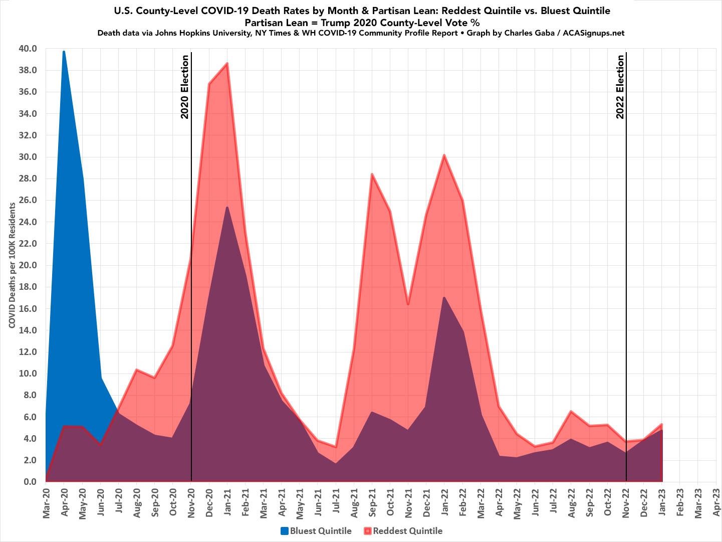
Last month Charles Gaba noted the partisan COVID death rate gap again. And again it had been higher
in the reddest U.S. counties than the bluest counties every month since July 2020. It appeared to be on the verge of finally disappearing entirely:
The initial COVID wave in March – May 2020, of course, devastated Blue America, primarily densely populated (and heavily Democratic) New York and New Jersey, while leaving Red America (mostly sparsely populated, rural Republican counties) relatively unscathed.
This situation quickly began to reverse itself only a few months later. Starting in July 2020–the same month the Vanity Fair expose was published, as it happens–the situation had already reversed itself: The reddest fifth of the U.S. was already experiencing a higher COVID death rate than the bluest fifth…and it has stayed that way ever since.
That’s right: While the COVID death rate ratio between the reddest and bluest parts of the country has grown larger and smaller at various points (reaching an all-time high of nearly 4.5:1 during the height of the Delta wave in September 2021), there has never been a single point in time that the bluest quintile has seen a higher death rate than the reddest quintile since July 2020. And this graph only includes official COVID deaths, not the “likely COVID excess deaths” which were never officially recognized as such…and which ran over 11 times higher in the reddest fifth of the U.S. than the bluest fifth in 2021.
However, while the lines haven’t reversed themselves again yet, they’ve been getting closer for awhile now–the Red/Blue divide dropped below 2:1 in June 2022 and hasn’t risen above that since. Most notably, in December, it dropped to virtually even (3.87/100K in the reddest quintile vs. 3.79/100K in the bluest quintile…the closest it’s been since May 2021…which, as it happens, is when the original COVID-19 vaccine first became widely available to all U.S. adults nationally
Charles notes the reason for the convergence of COVID death rates in both red & blue counties alike. It seems to bb due to Democratic-leaning residents joining their GOP neighbors in abandoning all mitigation measures across most of the country. There is hardly a mask seen in most public places these days. Only 15.5% of the U.S. population has an updated bivalent booster vaccine shot to date. Combine this with the spread of the new XBB.1.5 COVID-19 variant and it’s no wonder that COVID deaths are on the rise again across the political spectrum.
I wrapped up my December update by assuming that the blue and red lines would officially reverse themselves in January, but that:
Assuming the patterns of the past continue with the spread of XBB.1.5, I’d expect to see a spike in rural/red America a couple of months after it peaks in urban/blue America . . . probably sometime in March or so. The big unknown is how much of a spike either one will be this time around.
Well, the lines didn’t flip after all in January–the reddest quintile jumped up faster than the bluest quintile after all–two months earlier than I expected:
- Bluest Quintile: 4.70 per 100K residents
- Reddest Quintile: 5.33 per 100K residents (13% higher)
The January gap wasn’t that significant by itself…except that it had looked like the rate in the reddest quintile might be lower last month.
Again, the graph below looks at the reddest 20% and bluest 20% of the total U.S. population based on the 2020 Presidential election results at the county level. The reddest quintile includes roughly 65.1 million people living in counties where Donald Trump received 62.4% or more of the vote in 2020; the bluest quintile includes around 66.8 million living in counties where Trump received less than 31.6%. While the raw numbers aren’t quite equal, adjustments have been for actual population.
In short: Get vaccinated, get your bivalent booster, and still wear a mask when attending crowded indoors public events if possible.
Covid is still around. Get the boosters and stay away from crowds.
Take this as evidence that there are more people who are ‘rugged in uphill country’ in Red states than there are in Blue ones.
Not sure what the hypothesis is here. Always tough when you have a phenomenon that splits very unevenly. A lot of folks sadly died of COVID, but way more didn’t. The “didn’t die of COVID” rates in these places are very high and very similar. Again, the prior observations about the actual population choice apply. Those who did not vote should be excluded if voting choice is the factor being assessed. Those whose voting county and death county are not the same should be excluded (or you could do the legwork to pair the two and recalculate based on voting county). This actually can be fairly common, particularly with deaths in hospitals or hospices.
when the 2020 election happened, nobody had made a “vax or no vax” decision. When Joe Biden was inaugurated, I was still a couple months away from being permitted to get in line to be vaccinated, so my decision was made well after the election. I think whether or not you accepted these vaccines is a much better foundation to study COVID deaths. All these decisions were after the election and nearly all were after Trump left office. I don’t think who was President is a very likely strong factor in this anyway, but pumping up data from poor methodology about imputed decisions (I see no signs of any sampling programs to support that actual voting in 2020 Presidential and COVID deaths in counties correlate strongly – they might, but where is that data?) that pre-date what is probably far more significant choices seems to go against the normal ideas of establishing plausible hypotheses and then performing rigorous tests to establish the strength of them. Gaba could improve this a lot, but it would be tedious work. But why do that if your actual objective is not to provide a rigorously achieved expansion of knowledge?
Good luck trying to get a booster. If you had one in September, you cannot get another. We’ve been trying to line one up for March, about six months after our last COVID vaccination. So far, we have had no luck.
This has been the rule for most of COVID. Getting a vaccination has been a challenge. I supposed if the death and hospitalization rates start rising again, we’ll see the rules loosened a bit. Meanwhile, we’re thinking of a trip to Canada. It’s only 30 miles from here.
CDC: Stay Up to Date with COVID-19 Vaccines Including Boosters
Eligibility rules for boosters seems rather confusing these days.
you sure that what you’re looking at here is not a rural vs urban Covid death rate? rural populations, with sparse access to hospitals & quality health care, have tended to vote red…