January Update: COVID Death Rates by Partisan Lean & Vaccination Rate
Charles Gaba is doing another update on Covid death rates taking into consideration Partisanship and vaccination rate. At the bottom I include his last update if you wanted to compare commentary.
“January Update: COVID Death Rates by Partisan Lean & Vaccination Rate (including BIVALENT BOOSTER data),” ACA Signups, Charles Gaba

(sigh) Last month I posted what I assumed would be my final update of the red/blue and vaccination-level COVID death rate breakouts, but apparently that wasn’t meant to be. For one thing, the latest variant, XBB.1.5 (some are calling it “Kraken” but I don’t think that’s anything official) has reared its head in the northeast. For another, there’s been a renewed interest (at least on Twitter, anyway) in an article at Vice Media about the topic.
I’ll be posting a second entry addressing that article, the study it cites, and some misinformation about the red/blue divide later this week. But first, let’s take a look at where things stand as of mid-January.
I already knew going into this update that the divides in Red/Blue COVID death rates and likely as well as in Vaccination Rate COVID death rates have shrunk over the past few months, for several reasons:
First, the overall COVID death rate has dropped dramatically since the summer (which is obviously a good thing); it’s been averaging between 300 – 400 per day since mid-October.
The other reason is not good news: Hardly anyone seems to be masking up anymore regardless of partisan lean. The vaccination rate of the bivalent booster shot has been anemic for the most part…again, pretty much regardless of other factors. As of this writing, while 69.1% of the total U.S. population has completed their primary COVID-19 vaccination series (including 94.1% of those 65+), a mere 15.9% of the total population has also gotten their updated bivalent booster shot as well. Even among seniors it’s only at 39% nationally.
The bivalent booster has only been approved for all adults since the end of August, but that’s still pretty bad 4 1/2 months later: By comparison, a full 54% of the U.S. population had gotten their 2nd vaccination dose by September 16, 2021 (the exact same 4 1/2 months after the primary series was approved for all U.S. adults).
However, it’s one thing to know that the gap has shrunk; it’s something else to actually crunch the numbers and confirm such. So, I’ve gone ahead and done so once again.
I’ve added two more graphs this time. Since we’re so far removed from May 2021, and since the primary vaccination series effectiveness wears off after some time, I’ve also added both the partisan lean and vaccination rate breakout since August 31, 2022 . . . the day the FDA authorized the bivalent booster for all U.S. adults.
As always, here’s my methodology:
- County-level 2020 Population data via U.S. Census Bureau’s 2020 Census
- County-level 2020 Trump vote data via each state’s Election Commission or Secretary of State websites
- County-level Death data via Johns Hopkins University Center for Systems Science & Engineering for 49 states; NY Times COVID-10 in the United States github UT only
Remember: “Decile” means 1/10th or 10% of the total population (all 50 states + DC).
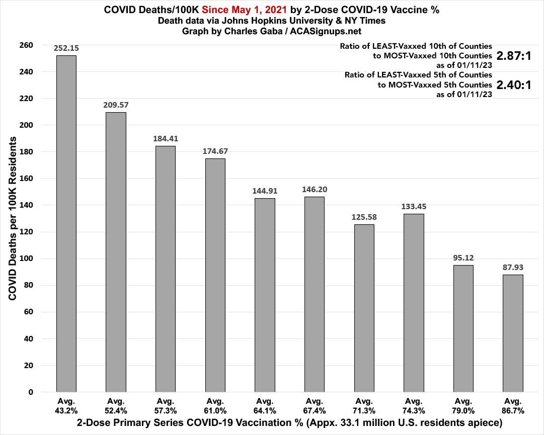
While it’s dropped significantly since September, there’s still a clear and dramatic correlation between how much of the population has been 2-dose vaccinated and its COVID death rate since May 1, 2021. The least-vaccinated decile still has a death rate 2.87x higher than the most-vaccinated decile…and in fact it’s increased slightly since December’s 2.81:1:
Note: I’ve also started posting the ratio of the highest and lowest quintiles of the total population, since some may think that’s more representative of the overall trend.
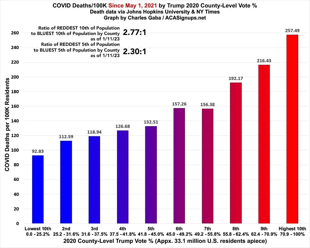
As always, what’s even more disturbing is how closely the death rate by partisan lean matches the death rate by vaccination rate; they’re almost mirror images of each other: Again, while the ratio has dropped since September, the death rate since May 1, 2021 in the reddest tenth of the country is, again, 2.77x higher than in the bluest tenth (down slightly from December’s 2.84:1):
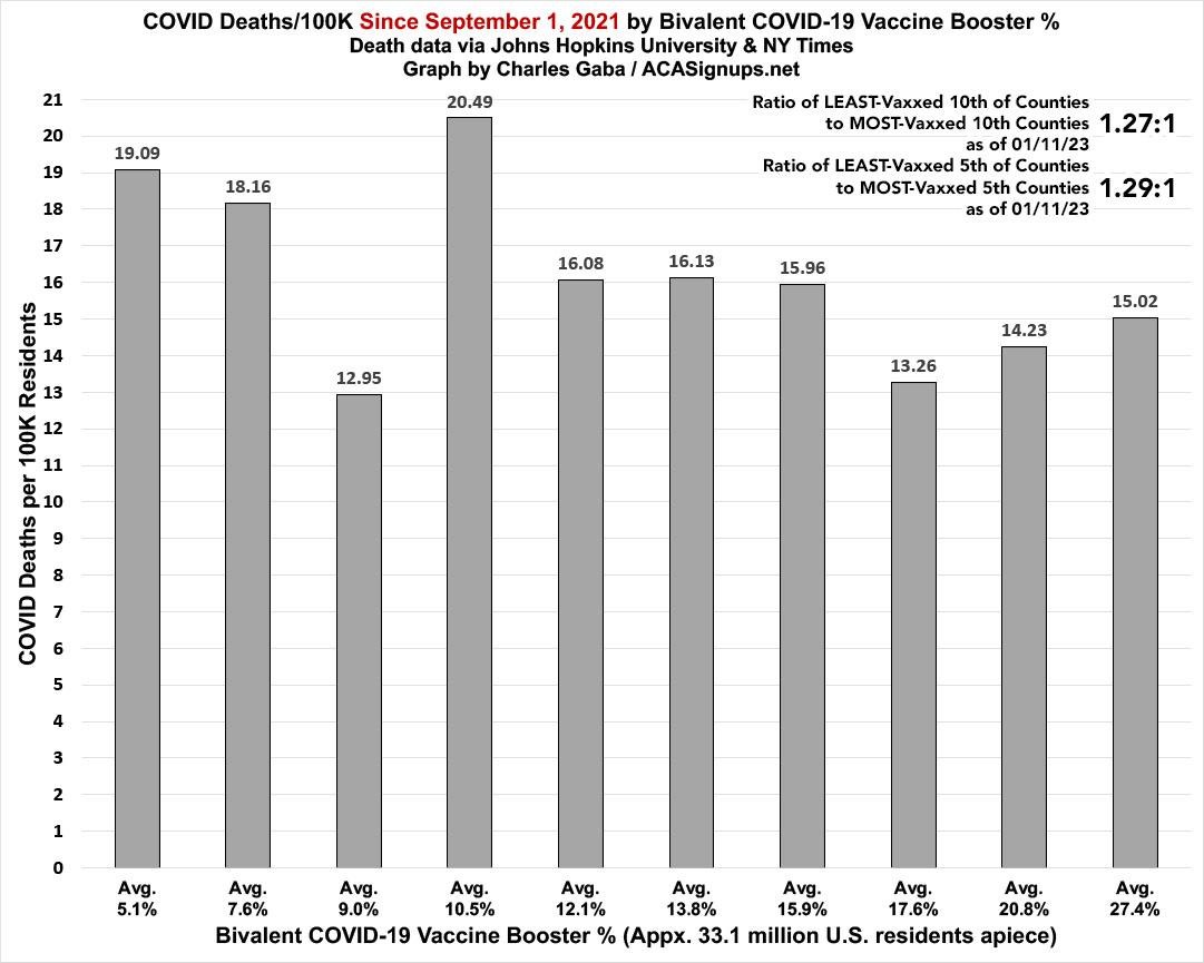
What about starting with the widespread availability of the bivalent booster on September 1st, 2022? As expected, the slope is far less dramatic on both fronts:
The death rate since 9/01/22 in the tenth of the U.S. with the lowest levels of up-to-date vaccinations (a pathetic 5.1% of the population) is only 27% higher than in the tenth with the highest up-to-date vaccination rate (a better but still not great 27.4% of the total population) , , , down from 32% higher in December.
The 3rd & 4th bracket also make for interesting exceptions to the pattern–the 9% vaccinated bracket actually has the lowest rate while the 10.5% bracket has the highest, which I’m pretty sure is due to this including both Brooklyn & Queens, as New York City is currently undergoing a nasty XBB.1.5 surge. By contrast, the 9.0% bracket includes Harris, Dallas & Tarrant Counties, TX as well as San Bernadino & Fresno Counties, CA and Orange County, FL:
In terms of the partisan divide, this has indeed also shrunk dramatically, with the death rate since September 1st down to just 63% higher (vs. 84% higher last month) in the reddest tenth of the country compared to the bluest tenth. In addition, there’s a significant bump in the 2nd-bluest decile (which includes major urban cities like Los Angeles, Queens and Detroit); if you were to compare the reddest fifth of the U.S. vs. the bluest fifth, it would be more like a 1.34:1 ratio:

Charles Gaba: In short: Get Vaxxed, Get Bivalent Boosted, and wear a mask when indoors in crowded public locations.
“Say hello to XBB.1.5: The Red/Blue COVID Death Rate Divide is no more,” Angry Bear, Charles Gaba @ ACA Signups
How is death location in counties other than where an individual voted in 2020 accounted for? Was it assessed and found insignificant? My experience in aviation is that correlating failure data (here, COVID death rate) with “factors” is frowned on if the populations are not the same populations or at least studied seriously to demonstrate expected uncertainty arising from this. That’s hard, so more typically you exclude “failure” data that does not lie within the “factor” data set. I would exclude 2020 non-voters and any voter dying of COVID outside the county they voted in in 2020 and rerun the analysis.
To be clear, 2020 non-voters are not in the “factor” and 2020 voters succumbing to COVID outside their voting county also represent “non-information” concerning the hypothesis (unless there is a correction made in the data to move them back to their voting county).