Coronavirus dashboard: updating the 52 Petri Dishes of democracy
Coronavirus dashboard: updating the 52 Petri Dishes of democracy
[Note: There is no significant economic data today (Dan here…May 13) Thursday we’ll get initial claims, and on Friday retail sales and industrial production for April, both of which will be important]
Here is the update through yesterday (May 12).
I will restart giving the daily increase in infections if States that have “reopened” start to increase significantly again. The preliminary evidence is that customers are largely staying away from reopened businesses in those States.
Number of new and total reported Infections (from Johns Hopkins via arcgis.com and 91-divoc.com):
- Number: 22,080, total 1,370,016 (vs. day/day high of +36,161 on April 24)
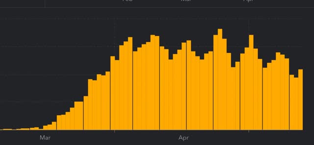
There has been a 1/3 decrease in the number of new cases in the US from peak. The US nevertheless has the worst record in the world, by far.
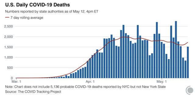
Number of deaths and rate of increase in testing (from COVID Tracking Project)
- ***Number of deaths: 1,510, total 76,617 (vs. day/day peak of +2,700 April 29)
- Seven day average of deaths: 1,616 (vs. 2,058 peak on April 21)
- Number of tests: 289,472 (vs. 318,720 daily peak on May 7*)
- Ratio of positive tests to total: 14.3:1 (new high* – target is 15:1)
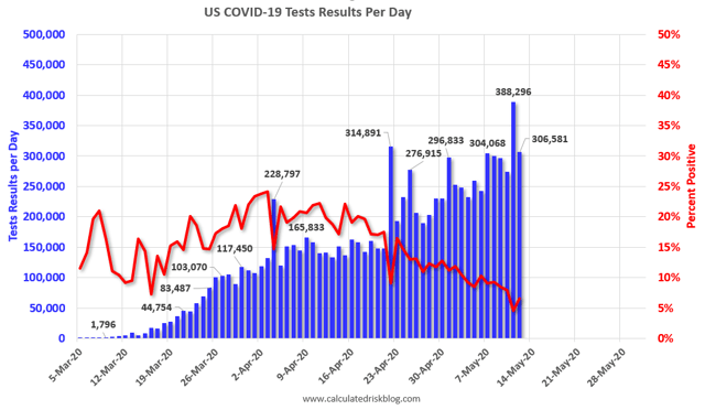
- 7 day average of tests: 283,000* (new high)
- 7 day average of positive tests to total: (11.3:1* vs. target of 15:1)
*These numbers exclude 113,489 past negative tests reported by NJ on May 11
Note several things:
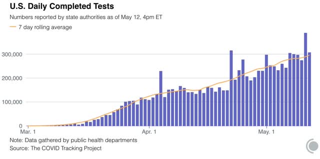
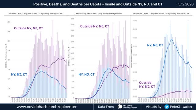
1. The number of new infections in the rest of the US increases dramatically starting on April 20, the same date that testing nationwide broke out of its 150-160,000 range and increased to nearly 300,000/day. This shows that the increased cases outside of NYC were mainly an artifact of increased testing.
2. The number of new infections in the rest of the US has *decreased* in the past week. Once we hit enough tests, the underlying trend – a slight but significant decrease in new infections – came through.
. While the NYC metro decline is the lion’s share of the nationwide decline, in absolute and even per capita terms, the NYC still has far more new cases than the rest of the country as a whole.
This clearly shows that, for the scale of outbreak, NY and NJ have been in a scale all their own, and that their huge decrease still shows them having a large number of cases.
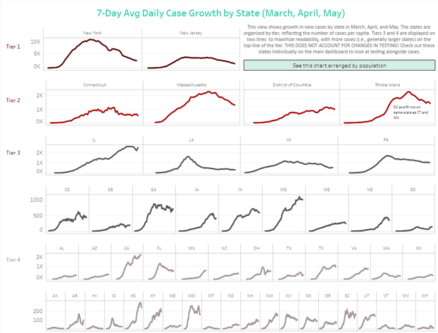
On the other hand, down at the very bottom line “Tier 4,” we see Hawaii plus 5 rural States (AK, MT, VT, WV, WY) “crushing the curve.” Based on the criteria I set forth yesterday, and including this graphic, I rate the States in the below summary.
Summary for May 6
- The number of daily new infections, adjusted for testing, appears to have peaked three weeks ago. There has been a decline of about 1/3 in new infections since then.
- The number of daily new deaths appears have peaked about 2 weeks ago.
- The trend number of daily tests has improved dramatically in the past 3 weeks to nearly 300,000. Better still, for the last 2 weeks, new infections have declined, even with higher testing – a very positive sign.
- The increase in infections in the rest of the US in late April and early May was mostly an artifact of the dramatic increase in testing in the rest of the country.
- My personal suspicion remains that the actual number of total infections in the US is about 5x the official number, or roughly 6.8 million, over 2% of the total population.
- Based on testing, a significant portion of the rest of the US outside of the NYC and other large metro areas could soon transition to a “test, trace, and isolate” regimen, but with few exceptions there is no sign whatsoever of the necessary preconditions being put in place. States’ conditions are rated below.
- Grade A” States (crushing the curve): AK, HI, MT, WY (4)
- Grade “A-“ States (close to crushing the curve): ID, WV (2)
- Grade “B” States (50%+ declines from peak, but not yet “crushing the curve”): AR, FL, LA, MI, NJ^, NY, WA (7)
- Grade “C” States (20%-49% declines from peak): CO^, CT^, IA^, MA^, MO, NV, OK, PA^, RI^, TN (10)
- Grade “D” States+DC and PR (insignificant declines from peak): DC^, DE^, GA, IL^, IN^, KS^, NH, NM, ND, OH^, OR, SC, PR^ (13)
- Grade “F” States: (failing: new highs in infections): AL, AZ^, CA, KY^, MD^, ME, MN^, MS^, NC, NE^, SD^, TX, UT, VA^, WI^ (15)
^= significant shortfall in testing, thus missing cases
“Coronavirus dashboard: updating the 52 Petri Dishes of democracy” is a highly stereotypical but empty virtue-signaling headline, signifying nothing.
In this morning’s news, a Novartis executive says at least 2 years to a vaccine (https://www.reuters.com/article/us-novartis-ceo-vaccine-idUSKBN22R0T7).
In the news of a few days ago, The Lancet published an article (https://doi.org/10.1016/S0140-6736(20)31035-7) showing that “we” are merely dragging out the inevitable (which was once valuable to do to a limited extent, back when hospital capacity was seriously at issue): essentially everyone will be exposed to an infectious dose of the virus over time, and nothing useful can be done about it (note: except maybe in New Zealand, if they choose to isolate themselves from the world forever.)
The time to extirpate the virus was all the way back in December or January. But even closing off air traffic to China (etc.) was “xenophobically racist” at the time. Now the virus is endemic. Indeed, by dragging this out we are helping to ensure that no one can escape exposure, except for a tiny handful who might be equipped to live as mole-people for an indefinite number of years.
If “we” keep almost everything shut down for 2 years, never mind longer, we will not be posting blogs or Twits, nor working remotely, any more. Nor will we be eating food any more. The supply lines in a modern economy are simply too interconnected, ensuring that such things will collapse over that much time.
And no team of swaggering, pretentious top-level bureaucrats can possibly know (with only a few exceptions) what is “essential” to prevent said collapse. For example, almost every tool, ag implement, etc. has a computer; becomes a brick when said computer fails; and requires highly ramified supply lines all over the world (except Antarctica) to maintain/replace said computer when needed.
So suck it up, folks, toss the Puritanism in the trash where it well and truly belongs, and leave it to putrefy: in this universe, like it or not – and yes, it certainly *is* unpleasant and unlikeable – absolutely-zero risk is simply not attainable. There will inevitably be a balance, a tradeoff, and no amount of Puritanical yelling can possibly avoid it. After all, there was never any guarantee that absolutely everything in this universe would be pleasant.
PaulS:
A nice speculative argument on “your” part. Let us allow the swedes to do their experiment and we in the US will do ours.
To your point on herd immunity, a population becomes sufficiently immune to a disease to which the infection will no longer spread within that group. Enough people can no longer get the disease due to vaccination or natural immunity and those people who are vulnerable are protected. The R0 for COVID 19 is ~3 which results to a herd immunity factor of 70%. Mumps R0 was ~10 meaning 95% of the people would have to infected or have been vaccinated to achieve herd immunity. 70% of the population being infected is not herd immunity. The problem with herd immunity is it hinges on vaccination. Without a vaccine, the only way to become immune to a disease is to get it and live through, which makes the strategy a whole lot more fatal.
More recently, they have found milder cases of COVID can cause damage to the heart, liver, arteries, lungs, kidneys etc. which will impact a person for a lifetime. The latest finding attributes contracting a form of Kawasaki disease in younger people from the COVID virus. In other words and globally, we still do not know the ramifications of contracting COVID 19. Open season for a country with 300 million people would overwhelm the healthcare system.
As of May 12th, there were 48,307 confirmed cases of COVID 19 in Michigan and 4,714 deaths or almost 1 in 10 died after contracting COVID 19. We recently had a spike because the Nazis, white-supremists, and the give me liberty-believers (who conveniently forget that their definition of liberty should not impact my liberty) protested at Lansing in close proximity to each other and mostly without facemasks. They protested again a week ago and showed up also on Thursday. The growth rate is going up and down as well as the increases in death.
This is not Guyana and you are not Jim Jones. You drink the kool aid and let us know how it works for you. Please report back when you are infected.
Hi Paul
I was hoping that you could answer some or all of the questions lying ahead of us.
What about China? Will there be enough demand to keep China afloat?
What would’ve happened if the govt had put all payments on hold? Better than looking ahead again to moveouts, long term vacancies a la 2008?
Will medicine mfg return onshore?
What of the poor gens that got the double whammy?
Do state/local govs have enough info like the above to make decisions?
Thanks
Run and Ken, Thanks for your responses to PaulS. It seems he is carrying water for the moron in chief who has declared we are back whether we have a vaccine or not. It makes no difference to me personally but I do fear for the country and particularly the lowest paid workers who have been disproportionally impacted by the shut down many of whom will not secure employment for the foreseeable future. I may get the virus but I have no problem avoiding the most dangerous places like airplanes, protests in Michigan and taverns in Wisconsin.
A lot of medicine is already onshore as is a lot of ppi.
Paul S, try harder. Your China point is a lie. Stop making sheet up. You can’t deal with reality, move on. People like you really are traitors, much like the fake protests, financed by plutocrats of a globalist variety.
No grade A for my adopted home of VT? Which has done a exemplary job especially in our northeast region? Where’s the love?
PaulS bleats “So suck it up, folks, toss the Puritanism in the trash where it well and truly belongs, and leave it to putrefy: in this universe, like it or not – and yes, it certainly *is* unpleasant and unlikeable – absolutely-zero risk is simply not attainable. There will inevitably be a balance, a tradeoff, and no amount of Puritanical yelling can possibly avoid it. After all, there was never any guarantee that absolutely everything in this universe would be pleasant.”
Straw man much? Nobody is claiming a world of zero risk. Nobody is playing Puritan.
How about trolling your straw men somewhere else, m’kay? Grown-ups are talking here.