Has America Lost its Drive? Part 2
I made a mistake in my original post. Graph 4 in that post was based on the wrong data set. As Roger Chittum pointed out in comments, that graph only covers a subset of total gasoline deliveries.
This is the correct graph. (Source.) Thanks, Roger!
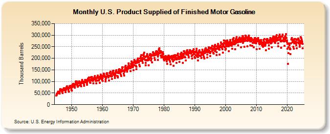
The fall off in gasoline delivery is not as extreme as I indicated, but it is still real. Here is a close-up view of data for the current century, from the same source.

Seasonal changes are dramatic. Peaks occur in July or August, valleys in January or February of most years. May values, highlighted with blue dots, and September values, highlighted with yellow dots, are recurring secondary peaks and valleys, respectively. July values are highlighted with red dots. The years 2008 and 2010 are accented with contrasting blue line segments.
In 2008, gasoline consumption dropped dramatically. May was down slightly, compared to ’07, while July and September were down a lot. Through 2009 and ’10 there was a slight recovery, with all three highlighted months showing increases. The 12 month moving average, in pink, stopped falling, but failed to increase very much.
Then, in 2011, gasoline deliveries turned down again. This can be seen clearly in the highlighted months and the moving average. Some of the standard explanations are changing demographics and retail habits. An aging population with more retirees might tend to drive less – though this is not my personal experience. Kids these days cruise on social media rather than pleasure drive through the streets of town as we did in my day. On-line shopping, though only about 5% of total retail, is growing rapidly.
You can’t gainsay any of these trends. They are probably affecting the big picture. But it would a stretch to say that they can account for less gasoline use in 2011, but not 2010 or 2009. Especially so, since this past year was supposed to be a recovery from the previous economic doldrums, and the expectation would be for the improvements of the previous two years to continue. But it looks like something is happening, economically or culturally, to cause another downturn in travel – though not as dramatically as I suggested in the original post.
The estimate of vehicle miles driven, from the December, 2011 report by the Federal Highway Administration, tells a similar story.

The years 2008 and 2010 are highlighted in yellow. The pink line traces the November, 2011 low back through the Summer of 2004. Again we see recovery in 2009 and ’10, and a resumption of the slide in 2011.
The slope change in mid-2005 is intriguing. This precedes the April 2006 peaks in the Case-Shiller Composite-10 and Composite-20 Indexes by several months, and the October 2007 peak in the S&P 500 by over 2 years. The new slope remains relatively constant right up to the peak in November, 2007.
Meanwhile, gasoline prices have increased again in the last month, after sliding about 70 cents from the high in May, 2011. This gloomy article at Seeking Alpha blames part of the price increase on “stronger demand, courtesy of a growing economy.” The data simply does not support this opinion. Instead of text book supply-demand behavior, gasoline prices and miles driven exhibit basically similar motion.
I still contend that the prices of petroleum products are manipulated on the supply side. All the data I’m aware of supports this.
I expected the original post to be a one-off, but the current picture is interesting, with no obvious explanation. This might bear looking into in another 6 months, or so.
Cross posted at Retirement Blues.
Jazz:
TWO Cartels . . . Oil and Refining
JzB, there’s a new post by doug short on DOT’s latest miles driven report – 3 detailed charts, including 2 adjusted for population growth…Vehicle Miles Driven And the Ongoing Economic Contraction
rjs –
Thanks for the link. Short uses the same miles driven data that I used. I didn’t think about adjusting for population. Of course, it makes a lot of sense.
Clearly there is something going on, and it appears to be a negative. This definitely deserves more looks in the future.
Cheers!
JzB
Are we seeing the effect of people being out of work? We have a very large population not working regardless of how classified (out of labor force, unemployed). I would think that with in this, those who have returned may also have found work closer to home, as the number of under employed and parttime or temp staff is increasing.
All together, we may be seeing a new effect for an economy in contraction that was gasoline dependent unlike the time of the Great Depression.
10% at 12 million people is a lot of people not regularly driving. Depending on the alternative calculations, this number of people could be as high as 24 million people. Lot’s of miles there.
Dan –
That’s certainly part of the big picture. I don’t think it explains 2011 vis-sa-vis ’09 and ’10.
U6 has dropped almost 2.5% since peaking in late ’09. I like U6 because I think it’s an uncooked number.
http://research.stlouisfed.org/fred2/series/U6RATE
Hale Stewart takes a look behind the numbers.
http://research.stlouisfed.org/fred2/series/U6RATE
Cheers!
JzB
Here is some pretty good evidence that demographics are the driver. The first wave of baby boomers are just turning 65, like I did in December. Birth rates went up for over a decade, then only dropped slowly through the 60’s.
http://www.infoplease.com/ipa/A0005067.html
That reference dosn’t include 1946, the year I was born. But I can tell you that mu first grade class swamped the school I attended. We almost doubled the size of the preceding class.
I retired early, at 62, but my classmates who take normal retirement will be leaving the workforce this year.
And driving a lot less, statistically.
Cheers!
JzB
Should have included this.
http://www.rigzone.com/news/article.asp?a_id=115404&hmpn=1
JzB
JzB, these might be interesting:
http://www.platts.com/weblog/oilblog/2012/02/20/and_now_chicago.html
http://www.platts.com/weblog/oilblog/
From the second link.
http://www.platts.com/weblog/oilblog/2012/02/21/retail_gasoline.html
Demand is down, and supply is down due to reduced refinery capcity, caused by shrinking margins (?!?) So reduced demand is going to continue to drive prices up.
Jesus, I need a drink, and I already have a headache.
JzB
Heh. It’s a nasty market.
My take: US demand is elastic (staycation vs. Winnebago tour) so refiners can’t sell gas for $4/gal even though crude is $120/bbl. So margins thin, plants become unprofitable, supply shrinks. But still, $4 gas won’t sell — at least until the pumps run dry — then it all changes round.
Elsewhere in the world, people are happy to pay $5-6-7 for gas, so crude keeps going up.
Lather, rinse, repeat?
Sigh. And *now* I read:
http://www.washingtonpost.com/blogs/ezra-klein/post/will-rising-gas-prices-sink-obama/2012/02/21/gIQAUCVXRR_blog.html
(via: http://jaredbernsteinblog.com/threats-to-the-current-recovery/)
Ezra’s right: “[It’s] something to watch closely.” I’d add, and maybe plan for?