The Bottom 80% of U.S. Households Persistently Dissaves, Spending more than Income.
Only the top 20% saves.
Originally published at Wealth Economics
Newly released data series from the Bureau Economic Analysis have revealed a pretty eye-popping economic reality that’s been invisible in the national accounts…forever. Subtract households’ Personal Taxes and Personal Outlays from Personal Income to yield Personal Saving, and it turns out that the bulk of U.S. households don’t save. Quite the contrary: the bottom 80% spends more than its income, year in and year out. Only the top 20% consistently saves.1
This reality was invisible before publication of the Distribution of Personal Income Accounts (here, the “DPIAs”), first released in December 2020 and now in its fourth (greatly improved) prototype version, released December 2023. It provides breakdowns of Personal Income and Personal Taxes by income deciles — top 10%, next 10%, etc. — currently for twenty-two years 2000 through 2021.2 The situation revealed in this post was simply invisible before the DPIAs were released.
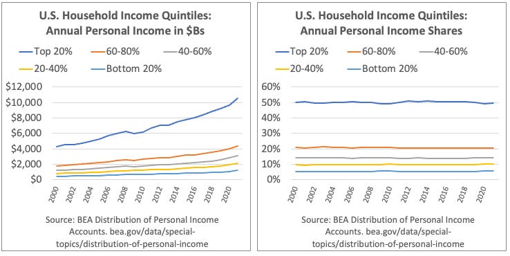
Meanwhile the BLS Consumer Expenditure Survey (CEX) provides income-quintiles’ annual spending shares, going back to 1984.3

Subtract an income-quintile’s outlays (spending and consumer-interest payments) from disposable income, and you’ve got Personal Saving for that quintile group. Divide that by disposable income, and you get the standard-issue Personal Saving Rate.

What in the actual hell? How can households maintain a spending deficit over decades, without running out of assets to spend? Spending is transferring assets to firms (mostly), in exchange for newly-produced goods and services. If you don’t have assets, you can’t spend.
The answer lies in the first footnote here. Personal Income isn’t the only source of household assets. The two big missing pieces are holding (capital) gains on assets, and borrowing (which adds both assets and liabilities, in equal amounts, to household balance sheets). Adding these two additional measures does shift most bottom quintiles from spending deficits to asset surpluses in most years.
Bottom-80% borrowing and and holding gains, as a percent of bottom-80% spending deficits. Post-GFC, pre-covid years.

While many have suggested that borrowing is what explains households’ ability to keep spending (it is, some), overwhelmingly it’s holding gains that “fund” the perennial dissaving of the bottom 80%.
For those who’d like more details, here’s a pared-down version of the spreadsheet that includes the data and graphs (but not all the derivations of that data). A new, full version of this paper and spreadsheet will be available in the next few weeks, incorporating all the latest national accounting data and multiple other improvements.
As always, comments, questions, and corrections from my gentle readers are greatly appreciated.
1 It’s important to note that the Personal Income measure ignores holding gains income (and some other smaller measures) — a very large chunk of households’ asset accumulation over years, decades, and generations. The same is true of National Income, the measure at the heart of Piketty & co.’s Distributional National Accounts, or DINAs. This post (at least until the very end) only deals with the Personal series, the measures used by almost every economist for economic modeling, and for evaluating economic inequality.
2 The DPIA’s deciles are easily summed into quintiles. They bring to fruition unfulfilled efforts toward distributional accounting that go back to Simon Kuznets (the godfather of U.S. national accounting) in the 1930s and after, and particularly to Selma Goldsmith, whose efforts in the 1950s were woefully under-resourced (woman’s work?) and sadly came to an end with her untimely death at age 50. Impressive recent efforts by non-government researchers over the last decade+, notably Piketty, Saez, Zucman and company, have tackled distributional accounting, but their available series only break out income by the bottom 50%, next 40%, top 10%, 1%, and above. The DPIAs’ deciles provide a far more detailed bottom-to-top picture of income distribution that make the findings here possible. Many might find it perplexing that economists have failed to request (or even demand) such distributional breakouts from national accountants over nearly a century. More jaded observers, noting economists’ solid position in the top 20% and above, find it less surprising.
3 The CEX survey does not capture all spending/outlays. But it does provide by far the best estimate of each income-quintile’s percent share of total outlays. The results are very consistent over decades. Multiply a quintile’s percent share by the BEA’s comprehensive aggregate Personal Consumption Expenditures (PCE) measure, and you get that quintile’s consumption spending.
You didn’t say this, so don’t take me as saying you’re doing it. My first reaction from the piece is that it would be easy to fall into a fallacy of composition and assume that all of the bottom 80% of households operate like this all the time. But that’s probably not the case. Perhaps there is a lifecycle mechanism so that households buy a bit of assets when young but in those quintiles such saving is offset by new borrowing/dissaving by people further along in the lifecycle so that it nets out with this data. Or, how far does it go that measures of household income exclude capital gains? Could it be that a household makes a 401(k) contribution in a target date fund at age 30, which is going to be allocated 90% to stocks, sees an incredible increase most of which is excluded from income, and then sells it the target date fund to provide retirement income, and even that is not technically included in the statistic, or only minimally so (like the bond interest and minimal dividends thrown off by the target date fund as it rebalances and approaches its final phase)? If the capital gains realized aren’t counted as income, is the spending of the money included so that this looks like a huge net dissaving?
This data might shape intuitions about things like, for example, whether to get rid of tax-advantaged savings vehicles like 401(k)s. I think there’s already a good case that the lion’s share of benefits from these vehicles go to high-earners. But this data might mean that basically all of the benefits go to high-earners! Well, that is, if a more granular approach doesn’t complicate that.
Presumably most of the holding gains are attributable to price appreciation of housing combined with the long term decline in mortgage rates, which made refinancing attractive whenever the Fed dropped rates. Houses essentially functioned like an ATM.
It will be interesting to see if this can continue, particularly for lower income cohorts. Mortgage lenders are unlikely to drop refinance rates to 2021 levels, given their current hangover from unrealized losses on mortgages that they are forced to hold to maturity. Lenders will also continue to be reluctant to lend, something reflected by the wide mortgage spread, which results in current mortgage rates of about 7%, 3% above the 10 year Treasury.
Most homeowners, who pay less than 4% on their mortgages, will find refinancing at higher rates to be unattractive, though HELOCs, also at higher rates, may be able to fill the void somewhat.
Lower income cohorts will find it difficult to get on the home price escalator and take advantage of future holding gains. Housing affordability was already declining before the Fed raising rates and will likely not improve much without significant price declines or much lower rates. To make matters worse, any rate cut could be largely offset by rising prices, driven by a shortage of inventory, reflecting a reluctance on the part homeowners to give up their 3-4% mortgages and upgrade to a nicer house at a higher price and a higher mortgage rate.
How do things like 401k’s affect this? As more companies do automatic enrollment, even the middle workers may have some investments, company matches, and gains that won’t be available to spend (ideally) until they retire. Does this distort income or saving?
Barry Ritholz noted that the BLS reported that half of all US households spent more than they earned back in early 2010. (I’ve linked to his article as my website.) I tried to follow up on this at the BLS, and the CES reports confirmed it. I’m not sure how this works. How long can people run in the red? Who is going to keep lending them money even at usurious rates? Does this account for Section 8 vouchers and SNAP? I know that cash benefits were considered income.
This is the dark matter of economics. Economists are always writing about the upper middle class and the wealthy, but 50-90% of everyone exists in a totally different economic environment, one in which there is no surplus money and taking on debt is basic survival. In fact, most labor in the US is performed by people living in this regime. Maybe economists need to think a bit about their incentives and utility curves.
Unlike dark matter, these people can be made visible.
The ‘bottom 80%’ always lives paycheck-to-paycheck, do they not?
And that means, these days, putting up a lot of credit-card debt, no doubt.
And hoping for windfalls of some sort. Death of a distant relative who remembers you, maybe.
@Fred,
“The ‘bottom 80%’ always lives paycheck-to-paycheck, do they not?”
Apparently, no, they do not:
“About 65% of working Americans say they frequently live paycheck to paycheck, according to a recent survey of 2,105 U.S. adults conducted by The Harris Poll, asking questions supplied by Barron’s.”
So not 80% always, but ca. 65% sometimes.
https://www.barrons.com/articles/living-paycheck-consumer-economy-bb16b8e8
Hmmm. Looks like only the upper 15% of the 80% are just maxing out their credit cards, hopefully.
Or maybe it’s the lowest 15%.
Does this lead to ‘deflation’ at some point? Good news – prices will be coming down!
“(Deflation) is the opposite of inflation and can be considered bad for a nation as it can signal a downturn in an economy—like during the Great Depression and the Great Recession in the U.S.—leading to a recession or depression. Deflation can also be brought about by positive factors, such as improvements in technology.” – Investopedia
US bankruptcies surged 18% in 2023 and seen rising again in 2024
Reuters – January 3