Total Income, and the Collapse of the Household Labor Share
The decline in workers’ share of the total pie is far more extreme than standard measures suggest.
Total Income, and the Collapse of the Household Labor Share, Wealth Economics, Steve Roth
The best way to start this post is with a graph that many will find surprising, even eye-popping. The graph kind of speaks for itself — pretty dismayingly, especially post-covid. The rest of this post just explains it.
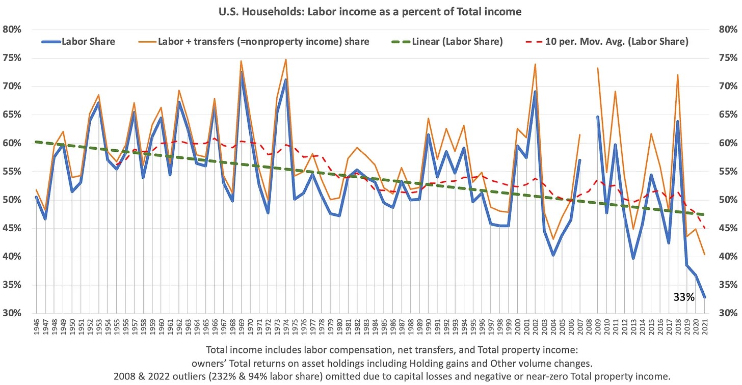
This graph answers a question that standard measures of labor share don’t and can’t answer. As households accumulate new assets, wealth, how of much of that newly-created wealth goes to workers, for working? As the wealth pie got bigger, what happened to labor’s slice of that pie? Did all the wealth boats rise together?
To answer that question, we need a measure of Total income — contributions to household wealth. And we need to answer another question: did that Total income come from 1. labor income/compensation, 2. property/ownership income, or 3. transfers (mostly from government)?
Wealth increases come from income, after subtracting spending, interest payments, and taxes to derive “saving.” The accounting arithmetic is fairly simple, detailed in a previous post. But as that post points out, the income measure is not (quite) so simple. Ditto saving.
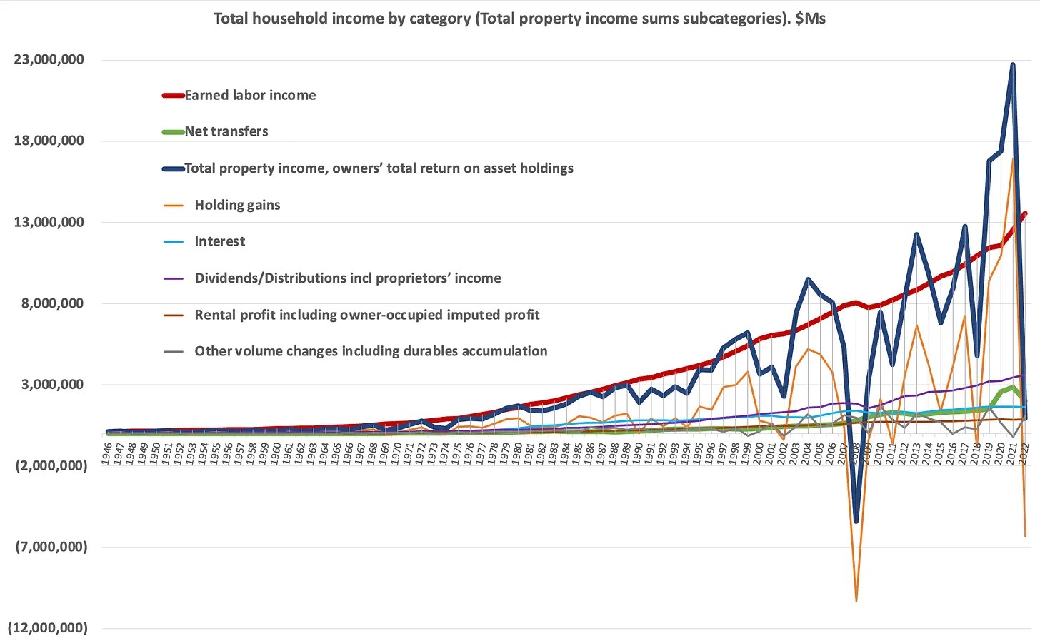
The standard measure of household’s “Personal Income” ignores a big part of households’ asset accumulation — their holding or “capital” gains on asset holdings over years, decades, and generations. If we add that to Personal income (plus some other, small adjustments), we get a measure of Total income (and what we can call Total saving), that does explain wealth accumulation.1 In particular it includes households’ Total Return on assets, while Personal income only includes dividends, interest, and rental profits received — the asset “yield.”
Here are the sources of households’ Total income over 75 years.2
Standard labor-share measures use less-complete or sectorally different measures as their denominators: labor compensation as a percent of GDP, as a percent of corporate “Value added,” etc. These measures can be pretty arcane (“National income” for example, which by the way also ignores holding gains). The accounting can get quite abstruse. Here are two fairly simple measures.
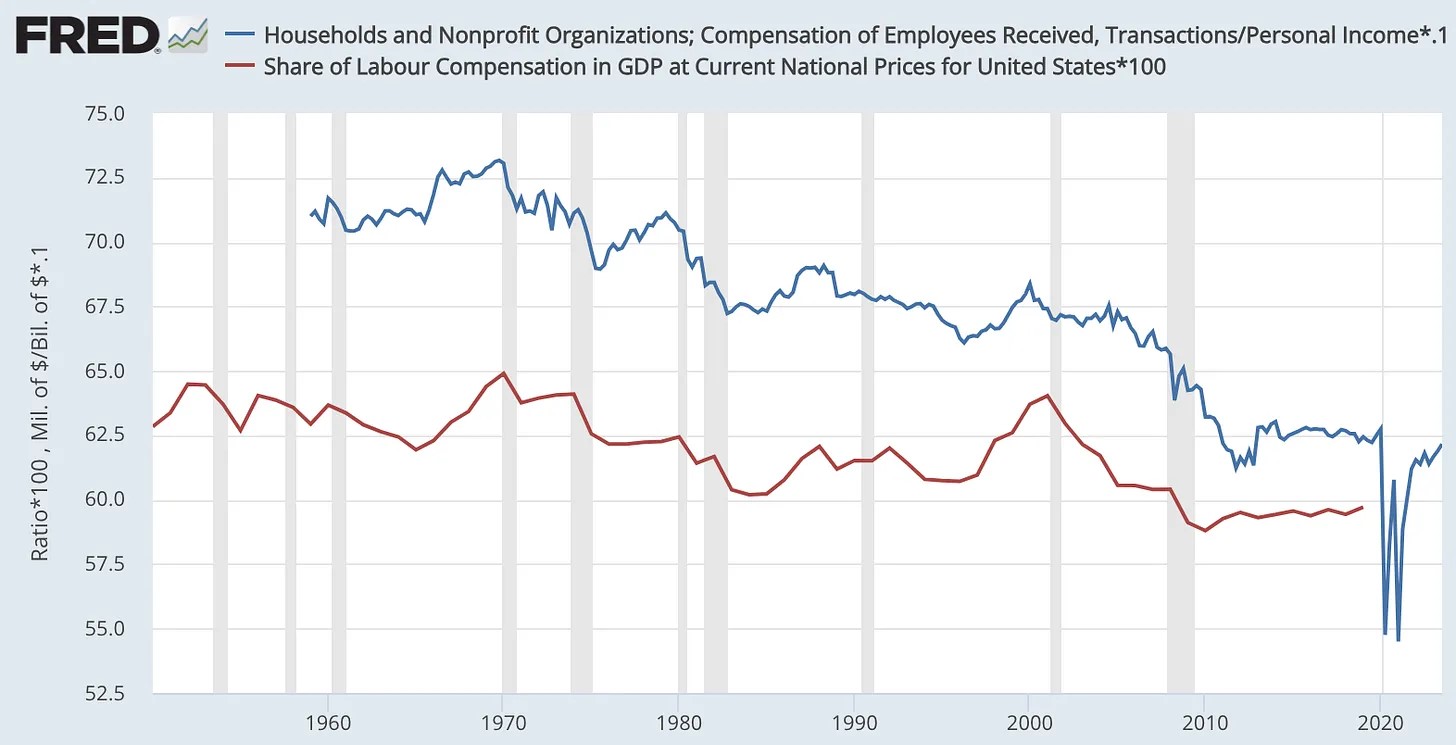
These measures also show a multi-decade decline, but to nowhere near the low levels of the Total income graph (especially post-covid). And since those measures ignore holding gains, they can’t explain different groups’ changing wealth shares over time.
Here’s that: the cumulative result of the labor-share decline and property-share increase over 33 years, revealed in household quintiles’ total wealth.3
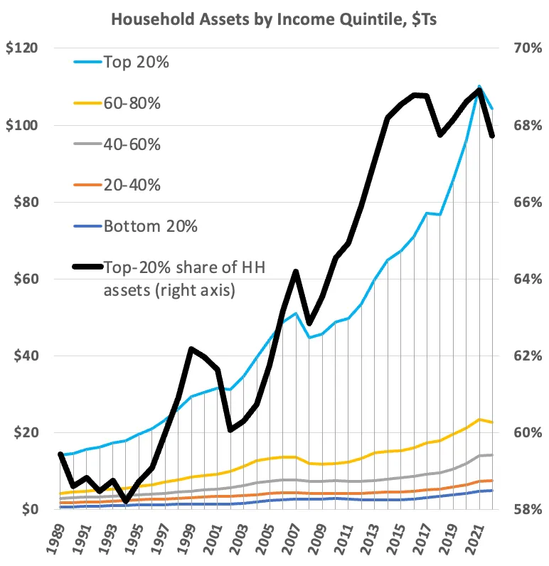
It’s the Matthew Effect in spades: “To him who has will more be given, and he will have abundance.”4 The magnitude of that effect in the U.S. over past decades is impossible to see using standard, balance-sheet-incomplete measures of household income, “saving,” and labor share.
For my gentle readers who might like to get the sources and data for these graphs, they’re happily provided on request.
Footnotes:
1 This Total income measure is commonly known as Haig-Simons income. Over many decades, income and wealth economists have been referring to it as the “preferred” measure of income because it explains balance-sheet changes. But still, this measure is rarely employed by economists.
2 Some proprietors’ income (~10% of total income) can and arguably should be classified as earned labor income instead of property income, as it’s treated here. But determining the “value” of proprietors’ labor is inevitably subjective. Should it include the value/profits derived from their accumulated “social capital,” for instance?” Some researches say yes. Piketty/Saez/Zucman and other researchers like Matthew Klein often, necessarily somewhat arbitrarily, allocate 50% of proprietors’ income to labor income. Because proprietors’ income is only ~10% of total income, though, this only increases the labor share of (Personal or Total) household income by one or two percentage points. At the same time, though, since ~87% of proprietors’ income goes to the top 20%, the adjustment delivers a significant dollar increase to that quintile’s attributed labor earnings, and an offsetting decrease in its property income dollars.
3 This graph uses income quintiles because the Distributional Financial Accounts provide that granularity, from bottom to top. The breakouts by wealth percentile only give the bottom 50%, next 40%, and top 10%.
4 It’s interesting to note that even in the 2008 wealth drawdown, unprecedented since the Great Depression, top-quintile wealth recovered in only five years. More recently: top-20% households recovered from the 2022 asset drawdown within nine months, by the end of Q3 2022.
I got interested in this problem back in 2008 when I read that the GDP inflation adjustment is different from the CPI inflation adjustment. I didn’t really follow up on that difference. Instead, I went to FRED and did a chart of a full time wage as a fraction of per capita GDP. As I had expected, this had been falling for a long time. It’s no better with the average hourly wage. The value of an hour of labor has been falling since the 1960s with a big drop starting in the 1980s. Our nation gets wealthier, but an hour of labor doesn’t get you a full share of that increased wealth.
(Interestingly, during the Great Depression, a full time job paid a much larger chunk of the GDP per capita. That’s not surprising. A lot of people were making do without full time jobs, so anyone who had one was doing relatively well. As they used to say, nice work if you can get it.)
Also, I’m not sure if you remember all the blame that was heaped on people leveraging the value of their home back before the 2008 recession. They were scolded that the rising value of their primary asset, their home, was only an illusion of wealth, not real wealth. The distinction is interesting, and it more revolves around how much wealth is involved. If asset prices rise, but someone doesn’t own all that many assets, they may have an illusion of wealth. If they have a lot of assets, they have real wealth. The line seems to be around two or three million dollars.
The trick is that it is enough wealth to weather the typical reversal long enough. If you just have one home and miss a few payments, you are out of luck. If you have ten rental properties, odds are you can hold on until the stimulus takes effect or a bailout comes through. That’s a problem when trying to estimate increased wealth from rising asset prices. If you have a lot of assets, that’s wealth. If you don’t have a lot of assets, you may have a higher net worth on paper, but it’s just the illusion of wealth. It’s also why so much of our nation’s increased wealth belongs to fewer and fewer people.
Thanks, Kaleberg.
@Kaleberg
> an hour of labor doesn’t get you a full share of that increased wealth.
Totally right. But I think not for the reasons you suggest.
Here’s the Household sector’s total labor compensation received, inflation-adjusted to 2022 $s (CPI), divided by HHs’ total hours worked. “Real” $s/hr are up from $32 in ’65 to $54 today. (Not impressive growth in annual-% terms much less CAGR, but still.)
Sorry, can’t paste the graph here.
https://fred.stlouisfed.org/graph/?g=1ekEQ
But this post highlights what’s missing from that. We’re not not just interested in income growth, but as per your line above, capturing shares of total wealth growth — the increasing stock of assets, and who gets what share of that increase.
That wealth increase is heavily driven by holding gains, which are ignored, absent from, and invisible in (Personal and National) income measures and GDP. So here, one measure comparing holding gains to labor compensation over the years.
https://fred.stlouisfed.org/graph/?g=1ekHa
Since the mid-90s especially, holding gains have been a much larger part of wealth-pie growth. And holding gains go to HHs for owning things, not for doing things.
It’s not (so much) that real labor compensation per hour hasn’t grown. More that the holding-gains mechanism for capturing a share of the full growing wealth pie has increasingly dominated over capture via working.
Holding gains go to asset holders. And here’s an especially egregious cherry-picked factoid: the top 10% of asset holders hold 84% of corporate equity shares/mutual funds/ETFs. So they get 84% of the cap gains on equity shares. Even if those people also receive labor compensation, these holding gains accumulated over years, decades, and generations are pure, unearned, non-labor income. FTW.
Steve:
Yes, on the last paragraph.