Updated US wealth distribution data shows how bad the Great Recession and its aftermath were, and how effective the pandemic assistance has been
Updated US wealth distribution data shows how bad the Great Recession and its aftermath were, and how effective the pandemic assistance has been
The desert of new economic data this week continues today. But last week the Fed released its quarterly data on wealth distribution in the US, and it shows an important point about the efficacy of the emergency pandemic assistance. Let’s take a look.
Let’s start with the raw absolute levels of total wealth held by the bottom 50%, 50%-90%, 90-99%, and top 1% of the US population:
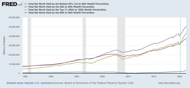
The total net worth of the US as of Q2 of this year was about $134 trillion (yes, trillion). Of that, only $3 trillion was held by the entire bottom half of the population. At the other extreme, the top 1% alone held assets worth $43 trillion.
Since the bottom half of the distribution shows up as squiggles at the bottom of the graph above, to better show the fluctuations among the groups, here is the same information normed to 100 as of the beginning of the series in 1989:
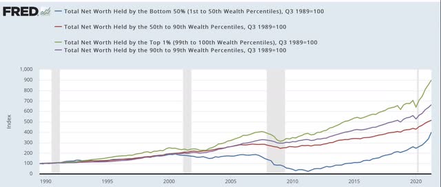
Most noteworthy is the virtual collapse – by nearly 90%! – in assets held by the bottom 1/2 of the population between its temporary peak in 2000 and several years after the end of the Great Recession in 2011. By contrast, with the exception of the stock market pullbacks during the tech crash and the first part of the Great Recession, the value of assets held by the top 1% has almost relentlessly increased in the past 30+ years.
Another way of looking at this is the %age share of total net US assets held by each wealth percentile, shown below:
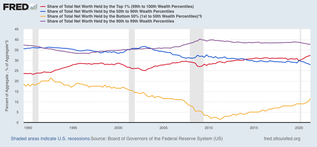
Again, with the brief exception of stock market pullbacks, the share of US assets held by the top 1% (red line) has increased almost continuously since 1989. By contrast, the share held by the bottom 50% (gold, multiplied *5 so that it shows up as more than squiggles) declined by 93% from 4.3% in 1992 to 0.3% in 2011. A secondary phenomenon in both the absolute and %age share numbers is that the 50th-90th%iles (blue) and the 90th-99th%iles (purple) held roughly steady with one another until the 2000s, after which the wealthier cohort pulled away from the middle class cohort, and has retained that advantage since.
Next, let’s look at the YoY% change in wealth for each group:
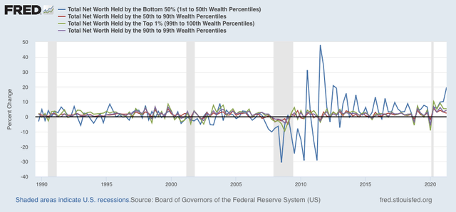
What is most noteworthy here, aside from the pasting that the poorer half of the US wealth distribution took during and after the Great Recession (frankly, a real indictment of both Bush’s and Obama’s emergency packages that bailed out Wall Street and the banks and left Main Street dangling), is the ground made up by the bottom half of the wealth distribution in the latter part of the last expansion and even more dramatically as a result of the emergency measures put in place to deal with the pandemic.
In absolute terms, the bottom 50% holds more wealth than at any point in the series (note, of course, this is not adjusted for inflation), but also the highest share of total assets than at any point since early 2006 – but still, only slightly more than 1/2 as much as the share they held at the end of the 1980s.
Finally, to give some indication of how this plays out in “real” terms, here are the total wealth amounts normed to 100 in 2006, and adjusted for the trade weighted value of the US$:
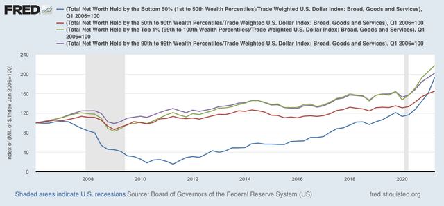
Again, how badly the poorer half of the US was treated during the Great Recession and the first part of the recovery thereafter shows up strongly, as does how well they did relatively speaking in the latter part of the expansion, and even moreso with the emergency pandemic assistance.
Ah! what a beautiful retrospective study! but going forward, prospective, should we, for example, study how families with a higher fertility rate become downward-ly mobile, as families with a lower fertility rate become upwardly mobile? Do you see what happened in Soviet Russia? Russians increased their per capita GDP by reducing their population, by murdering 50 million capitalists.
Do you see what happened in Communist China? do you see how Chinese increased their per capita GDP by simply decreasing their fertility rate, an improvement over the Soviets’ methodology? they brought a billion people out of poverty, but they also did it the wrong way. they did it through the mechanism of hysterectomy which is a much more serious deeper and potentially damaging surgery than vasectomy. Do you see what we now need to do? our government should offer free vasectomies to everyone over 9 years old, free, provided by the government for free, no out-of-pocket fee, no CoPayment.
Are our Senators doing just the opposite? Giving tax incentives to folks who increase their fertility rate? Creating more voters, more votes for their greedy selves by overpopulating? by an unsustainable incentive? With their earned income tax break?
Will Liz Warren soon say, “Senator, you are a dangerous man!”
?
This has been the pattern for income since the 1970s as well. If you plot the median income for the top 5% against the median income for the bottom 20%, you see the bottom slowly gaining, then losing it all in a recession with turnarounds in 1979, 1989 and 1999. (I haven’t updated the chart for 2019, but I can guess.) Meanwhile, the top 5% rises and only pauses during those recessions. I’ve put a few charts, including the one for the UK that inspired me to do this analysis, online:
https://app.box.com/s/hnxjbiwk6trpydqnrnvhab5ktdge82o2
Seth:
If you ever wish to post at Angry Bear, both Dan and I would place your information on Angry Bear. Your work reminds me of what Spencer would do. I helped him with his graphs, etc. on AB.
Bill