Coronavirus dashboard for September 29: the demographics of disease and death
Coronavirus dashboard for September 29: the demographics of disease and death
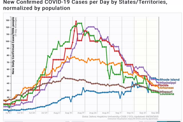
First, let’s start with the good news. The Delta wave continues to roll out just about as swiftly as in rolled in. Cases are down almost 33% nationwide, including in all 4 regions:
And all 5 States that were the worst hit at the outset – AR, FL, LA, MO, and MS – are all continuing to decline. Below I show them, plus RI, which is #25 among the 25 lowest States + DC. In other words, all the early poster children for Delta are now in the bottom half of all States for new infections:
Only 5 States are in any kind of uptrend at all – AK, MI, MN, ND, and NE:
Note that all of them are near or at the northern border with Canada, and 3 of them are also among the Trumpiest. To drive the point home, here is Canada itself, plus MI and MN:
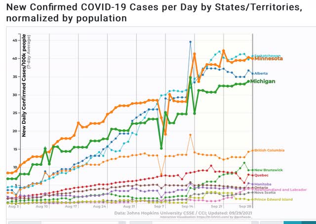
Alberta in particular is likened by Canadians to Texas in the US. So you have two of the (even) colder provinces, which are also the “libertarian” conservative provinces, having the worst records.
In other words, Delta continues to migrate north, and continues to hit the least vaccinated areas the hardest.
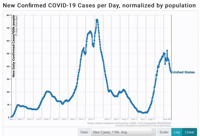
I hasten to add, however, that even with this relatively “good” news, the number of case is still far higher than at any point during the worst of the spring or summer 2020 waves:
Now to the demographics issue. Let me start with this graph of mortality by age for COVID vs. the Spanish Flu:
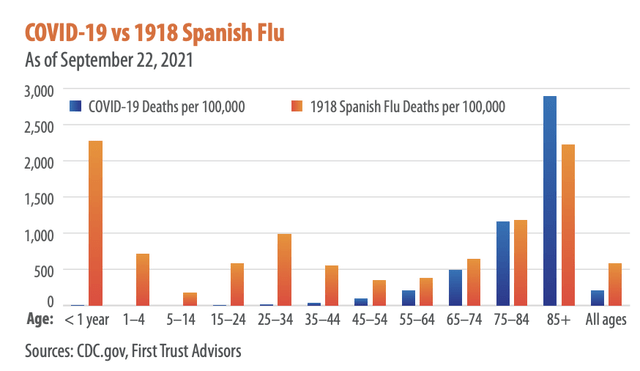
The graph comes from Brian Wesbury, a financial analyst whose twitter feed strongly indicates he is a devotee of Hayek and Ayn Rand. But don’t dismiss it – I went to the CDC site itself to verify the numbers for COVID, and here they are:
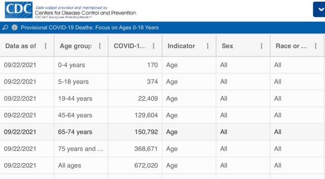
As of one week ago, there had been only 544 deaths from COVID among children since the beginning of the pandemic.
In other words, measured per capita, COVID (so far) has caused only 1/3rd the percentage of deaths compared with the 1918 Flu; and among the young, it has been far, far less deadly (so far, according to one graph I have seen, it is roughly equivalent to the number of children who die from influenza each year).
But haven’t we heard that Delta has been attacking the young at a much higher rate than the original strain of the disease? Yes, we have, and yes, according to the below graph it is true:
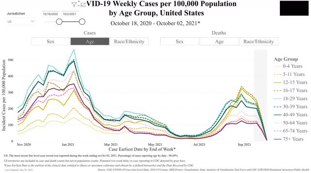
You can see that, per capita, Delta has attacked those two ages the most, followed right behind by the 12-15 demographic, and then the 5-12, 18-29, and 30-39 demographics virtually in a tie. Note that by contrast, children were among the least hit by the original strain last autumn and winter.
Now let’s turn to deaths. And it’s a completely different story:
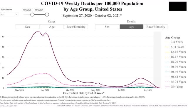
Delta continues to kill at the highest rate the oldest demographics in reverse chronological order. But because there are far fewer people over age 75, and also fewer in the 65-74 demographic, the raw *number* of people under 65 killed by Delta is larger, giving us fatalities of about 2000/day.
But this is still a vaccine success story because over 80% of people over 65 are fully vaccinated. Deaths among the 65-74 demographic are only about 1/3rd of what they were last winter, and deaths among those over 75 are less than 1/5th what they were!
