Total US coronavirus cases: 4,275,188
Average daily cases last 7 days: 65,896
Total US coronavirus deaths: 140,309
Average daily deaths last 7 days: 1,004
(Source: COVID Tracking Project)
Several months ago I wrote:
Total US coronavirus cases: 4,275,188
(Source: COVID Tracking Project)
Several months ago I wrote:
my forecast over the past month [has been] that the population of the US as a whole lacks the political and social will to beat the coronavirus. As a result, the outbreak will continue to wax and wane as complacency alternates with the fear generated by big new outbreaks.
The complacency of May gave rise to new outbreaks that showed up in June and deaths that have shown up in July. Case statistics over the past week show that the surge in cases and deaths, in turn, has caused the fear to kick back in, as shown in the below graph of the 7 days average in cases (solid line) and deaths (dotted line, separate scale) per capita for the US:
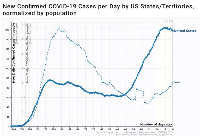
While deaths are still increasing, growth in new cases started to slow down about 12 days ago as the effects of new mask requirements in many States, the re-closing of bars and restaurants in others, and simple fear by people at first slowed the increase, followed by an apparent peak on July 22.
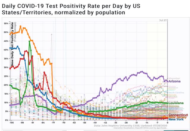
Josh Marshall has speculated, correctly I think, that an important reason why the “cases” and “deaths” scales trends look so different isn’t just demographics, but the fact that testing was so pitiful in March and April that a much larger percentage of cases were missed, citing the % of positive tests which was as high as 47% for NY in April. In other words is there had been more testing available, the trend line for cases would look much more similar to the trend line for deaths. The supporting graph makes the case quite compellingly:
Next, here is the graph of the 10 worst States for new cases, highlighting the top 5 plus Texas, which has declined to #10, and plus NYS for comparison to the early outbreak:
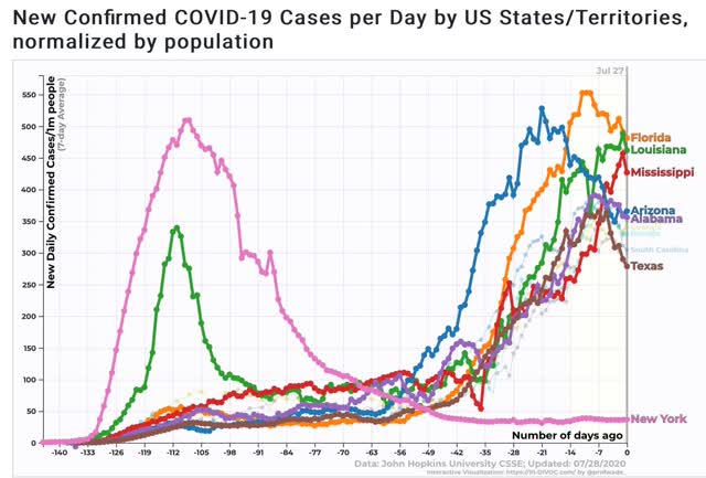
Note that, as I speculated several months ago, once the outbreaks get about as bad as it was in NY and NJ back in March and April, the “pain threshold” kicks in, and both the State and ordinary citizens take action to curb the outbreak.
Here is the latest county by county map of cases per capita from the NYT:
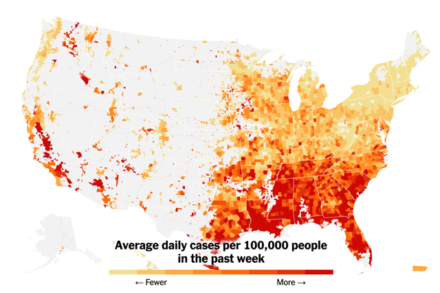
It is manifest that those States which recklessly reopened and/or did not require masks at least in interior spaces have suffered far more in the renewed outbreak than States, like NY and NJ, which were more responsible.
As my German grandmother used to say, “Those who cannot see must feel.”
Finally, here is the graph of the 7 day average of deaths per capita, again highlighting the top 5 States, plus Florida, which is #6:
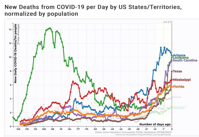
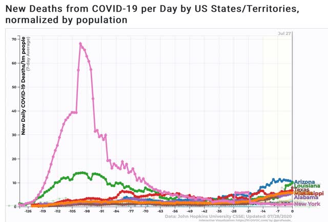
For perspective, here is the same graph plus NY for purposes of scale comparing the present per capita death rate in the current worst States vs. NY’s at its peak:
So there is some actual, if very slight and relative, “good news” in that the pain threshold has led to a decline in cases nationally and in some of the worst-hit States. But because national leadership is the same, I expect that any period of waning will give rise to new complacency (vis. a party in Jackson NJ with 700 guests!) and new calls for forced reopening.
New coronavirus cases rise in Midwest as they plateau in Sun Belt
Washington Post via @BostonGlobe – July 28
WASHINGTON – As new coronavirus infections appeared to plateau in the Sun Belt but creep up in the Midwest on Tuesday, governors and local authorities imposed additional restrictions and a powerful teachers union warned that its members would strike if ordered to return to unsafe schools this fall.
Anthony Fauci, the nation’s leading infectious-disease expert, warned that positive coronavirus test results were rising in Indiana, Kentucky, Ohio and Tennessee as the number of new cases is showing signs of leveling off in Arizona, California, Florida and Texas.
“We just can’t afford, yet again, another surge,” Fauci said on “Good Morning America.” A few hours later, Ohio Gov. Mike DeWine, a Republican, said Fauci’s appraisal was correct as he announced limits on county fairs, barring grandstand events, rides and games. He noted that emergency visits are decreasing and new cases have plateaued, but that hospitalizations are increasing.
Stressing the highly infectious nature of the virus, DeWine told reporters at his televised briefing about a 40-minute car ride that four people recently took to an Ohio lake. One person had the virus but did not know it. Within days, 10 people were sick, with two hospitalized and in intensive care, and three businesses had to be temporarily shuttered, he said.
“From a single car ride,” DeWine said, urging the public to wear masks and follow other public health precautions.
“If we do what we need to do, we can start these numbers going in the right direction,” he added. “We are at a crucial time.”
At a news briefing Tuesday, President Donald Trump continued to promote hydroxychloroquine, an anti-malarial drug that most studies have found is ineffective in treating the novel coronavirus. The FDA has revoked its approval of the use of the drug to treat covid-19, the disease caused by virus.
On Monday, Trump retweeted a viral video that featured Stella Immanuel, a Houston pediatrician and spiritual leader who calls hydroxychloroquine a cure for covid-19 and says masks are not important in fighting the pandemic. On Monday evening, Facebook tried to scrub the video from its site after more than 14 million people watched it, saying it was misleading. YouTube said it removed the video.
Immanuel has also said that alien DNA is an ingredient in some therapeutic drugs and that government scientists are developing a vaccine to prevent religious faith.
Asked about his retweeting of the video, Trump said, “I wasn’t making claims,” just passing along recommendations. …
Another factor to consider in any recent decline is to what extent the Trump administration is cooking the books now that they’ve steered the data away from the CDC.
Just an anecdotal view, but in my little world, I know a fair number of people whose “pain threshold” is pretty darn high I guess – they wear a mask when they must, to enter a store for example, but don’t otherwise regardless of the risk. For these folks I think it simply isn’t real unless they or a loved one is infected. Just a bit higher on the sociopath scale than the average Joe it would seem. Folks like this are the incubators for the next round of infection.
kwark:
It is frustrating when one takes all of the necessary precautions in a crowd and you meet a defiant one who becomes indignant by your actions to maintain a safe practice around them. My wife still works and her boss practices less than safe actions and is egged on by another who calls the precautions unnecessary. They are very vocal about it around her and the graphics people and photographers. As I tell her, keep insisting on safe practices as you will be proven right. The owner is off to Florida and does not believe she is going to a hot spot and the other is going to Arizona and scoffs at any safe practice. Perhaps one will contract it at which point there is little which can be done as Covid runs its course and at a minimum damages them physically.
The map of CA looks very red in the regions harvesting right now (if I remember my geography correctly).
My gut feel is that there are different pain thresholds for putting oneself in harms way and for putting employees in harms way.
July 29, 2020
Coronavirus
US
Cases ( 4,568,037)
Deaths ( 153,840)
July 29, 2020
Coronavirus
Massachusetts
Cases ( 116,684)
Deaths ( 8,580)
Deaths per million ( 1,245)
————————————–
July 4, 2020
Coronavirus
Massachusetts
Cases ( 109,838)
Deaths ( 8,172)
Deaths per million ( 1,186)
Even in areas in which the spread of coronavirus infections has slowed, the spread continues and infections are dangerous. The current Massachusetts experience would be considered a pronounced danger in a country such as Korea.
https://www.preprints.org/manuscript/202004.0203/v1
July 12, 2020
Face Masks Against COVID-19: An Evidence Review
By Jeremy Howard, Austin Huang, Zhiyuan Li, Zeynep Tufekci, Vladimir Zdimal, Helene-Mari van der Westhuizen, Arne von Delft, Amy Price, Lex Fridman, Lei-Han Tang, Viola Tang, Gregory L. Watson, Christina E. Bax, Reshama Shaikh, Frederik Questier, Danny Hernandez, Larry F. Chu, Christina M. Ramirez and Anne W. Rimoin
Abstract
The science around the use of masks by the general public to impede COVID-19 transmission is advancing rapidly. Policymakers need guidance on how masks should be used by the general population to combat the COVID-19 pandemic. Here, we synthesize the relevant literature to inform multiple areas: 1) transmission characteristics of COVID-19, 2) filtering characteristics and efficacy of masks, 3) estimated population impacts of widespread community mask use, and 4) sociological considerations for policies concerning mask-wearing. A primary route of transmission of COVID-19 is likely via small respiratory droplets, and is known to be transmissible from presymptomatic and asymptomatic individuals. Reducing disease spread requires two things: first, limit contacts of infected individuals via physical distancing and contact tracing with appropriate quarantine, and second, reduce the transmission probability per contact by wearing masks in public, among other measures. The preponderance of evidence indicates that mask wearing reduces the transmissibility per contact by reducing transmission of infected droplets in both laboratory and clinical contexts. Public mask wearing is most effective at stopping spread of the virus when compliance is high. The decreased transmissibility could substantially reduce the death toll and economic impact while the cost of the intervention is low. Thus we recommend the adoption of public cloth mask wearing, as an effective form of source control, in conjunction with existing hygiene, distancing, and contact tracing strategies. We recommend that public officials and governments strongly encourage the use of widespread face masks in public, including the use of appropriate regulation.
New York, New Jersey, Connecticut experience of spring remains the reference point for thinking about COVID for millions of Americans. I shared this AB post with an attorney friend of mine with no commentary at all other than “this guy NDD” makes useful summaries of American COVID data and his reaction to it was principally that he was not aware of just how less severe the problems were in Florida and such states until he saw the death rates superimposed against New York in the final graph. New York = bad and other states seeming to peak at about 20% NY = not bad. He also did not take the better current NY data as much of an endorsement of NY policy. He compared it with the warden of the prison whose escape data looks great a couple of months after the top 10 highest risks tunneled out.
July 29, 2020
Coronavirus
US
Cases ( 4,568,037)
Deaths ( 153,840)
India
Cases ( 1,584,384)
Deaths ( 35,003)
Mexico
Cases ( 402,697)
Deaths ( 44,876)
UK
Cases ( 301,455)
Deaths ( 45,961)
Germany
Cases ( 208,811)
Deaths ( 9,212)
France
Cases ( 185,196)
Deaths ( 30,238)
Canada
Cases ( 115,431)
Deaths ( 8,917)
China
Cases ( 84,060)
Deaths ( 4,634)
Notice the ratios of deaths to coronavirus cases of 15.2%, 16.3% and 11.1% for the United Kingdom, France and Mexico respectively.
July 30, 2020
Coronavirus
US
Cases ( 4,588,051)
Deaths ( 154,360)
July 30, 2020
Coronavirus
Dominican Republic
Cases ( 67,915)
Deaths ( 1,146)
Deaths per million ( 106)
Cuba
Cases ( 2,597)
Deaths ( 87)
Deaths per million ( 8)
The difference in the experience of the spread of the coronavirus in the Dominican Republic and Cuba should be studied as a difference in effectiveness of healthcare systems. The Dominican Republic has been the fastest growing country in per capita GDP since 1970, while Cuba has been beset by sanctions, but health outcomes in Cuba are starkly better through and through.
July 30, 2020
Coronavirus
US
Cases ( 4,603,119)
Deaths ( 154,575)
https://fred.stlouisfed.org/graph/?g=tyGR
January 30, 2018
Personal Saving as percent of Disposable Personal Income, 2017-2018
A 25.7% personal saving rate reflects just how frightened we have been, and rightfully so.
July 30, 2020
Coronavirus
Israel
Cases ( 70,036)
Deaths ( 500)
Deaths per million ( 54)
———————————–
July 4, 2020
Coronavirus
Israel
Cases ( 29,170)
Deaths ( 330)
Deaths per million ( 36)
After evidently having controlled the spread of the coronavirus, the Israeli government acceded to political pressure to open businesses and schools with relatively little caution. There has since been an unrelenting spread of infections.
July 30, 2020
Coronavirus
US
Cases ( 4,618,389)
Deaths ( 154,854)
Simply looking to the data, the American coronavirus spread looks to be pervasive, only differing in intensities. This means isolating communities is no longer a viable option so that social distancing is what remains. Then social distancing needs to be strictly maintained at work and school.
Chinese specialists have been pointing to the spreading of coronavirus infections in the southern hemisphere, where these are the winter months. We should not forget this, nor the complication of typical winter pulmonary infections.
Children may carry coronavirus at high levels, study finds
New York Times via @BostonGlobe – July 30
It has been a comforting refrain in the national conversation about reopening schools: Young children are mostly spared by the coronavirus and don’t seem to spread it to others, at least not very often.
But Thursday, a study introduced an unwelcome wrinkle into this smooth narrative.
Infected children have at least as much of the coronavirus in their noses and throats as infected adults, according to the research. Indeed, children younger than age 5 may host up to 100 times as much of the virus in the upper respiratory tract as adults, the authors found.
That measurement does not necessarily prove that children are passing the virus to others. Still, the findings should influence the debate over reopening schools, several experts said.
“The school situation is so complicated. There are many nuances beyond just the scientific one,” said Dr. Taylor Heald-Sargent, a pediatric infectious diseases expert at the Ann and Robert H. Lurie Children’s Hospital of Chicago, who led the study, published in JAMA Pediatrics. “But one takeaway from this is that we can’t assume that just because kids aren’t getting sick, or very sick, that they don’t have the virus.”
The study is not without caveats: It was small and did not specify the participants’ race or sex or whether they had underlying conditions. The tests looked for viral RNA, genetic pieces of the coronavirus, rather than the live virus itself. (Its genetic material is RNA, not DNA.) …
Age-Related Differences in Nasopharyngeal SARS-CoV-2 Levels in Patients With Mild to Moderate COVID-19 via @JAMA Pediatrics