This is what exponential growth looks like
This is what exponential growth looks like
I’ve placed an added emphasis on high frequency indicators, as they will be the first to show the impact of coronavirus on the economy.
This morning chain store sales for last week were reported. They were:
– Redbook +6.0% YoY
– Retail Economist unchanged w/w, +0.9% YoY
Needless to say, there was no impact at all on the Redbook number. While the Retail Economist number was definitely weak, there have been other, similar weak weeks earlier this year, so that number is equivocal. I suspect that this situation will change in no more than two weeks.
Meanwhile, here is a graph of the number of coronavirus cases in a number of countries including the US, compared with Italy, the epicenter of the outbreak in Europe (via Mark Handley, a Professor of Networked Systems in the UK):
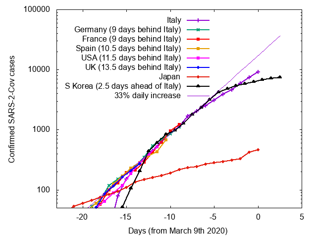
Notice that the graph is in log scale, where exponential growth is shown as a straight line. South Korea and Japan, both of which have taken very aggressive testing and quarantine measures, show a slow spread, and in South Korea the number of *new* cases has actually declined in the past few days, leading to the total number shown above to level out. The US, by contrast, is on track to have the same number of cases Italy has now in about a week and a half.
This is what exponential growth looks like. The spread of the disease looks manageable, until all of a sudden it very much is not. This is why, even if the disease abates with warmer weather, exactly *how* warm the weather has to be makes an important idfference between a contained and a calamitous outbreak<.
I’m hearing conflicting accounts about whether it is heat, UV light or a combination of the two. If it were UV light one would suspect a correlation with altitude as well as temp.
My son just emailed me this interactive site on coronavirus.
https://covid19info.live/
If the above site is accurate there are some interesting things to be observed.
Countries with large populations like Brazil, Russia, etc. have low numbers. Why? What about Africa? I do not see any media hysteria over the coronavirus in Africa. Is any data coming in from Africa?
We’ll see what the numbers and exponential growth looks like in a couple of weeks once everyone has caught up to Italy’s time with coronavirus.
Jerry:
There is some data on Africa; but, there is not data for all the countries in Africa.
I have been looking for patterns. It is difficult to find them because people move around a lot more than in the past. An epidemic in one country could be caused by people returning home from some place else, tourists, or even migrants. One healthcare person suggested warmer and more humid countries have fewer cases due to the fomites laden with the virus can not remain airborne due to the humidity saturating the fomite. I see it in some places but not in all places.
Russia closed off its borders with China once the Chinese announced their epidemic. This might explain Russia’s lower numbers. Chinese moving through China probably had an impact upon the increases. China’s epidemic is much lower now than previously and most due to sectioning off Wuhan and other hot spots from the rest of China. Limited ins and outs. Are China’s numbers accurate?
This site is accurate through March 13th. The other site is a master piece by an independent. It is hard to ignore such work. Coronavirus Cases
Your seeing the food/supplies stocking on Redbook while the other see’s the overall picture more with its faded purchases of stuff you don’t necessarily need right away.
By April the stocking should end and disinflation occurs while supply inventories rise.
For March, your looking at a large disinflation anyway.
Question – why has Japan been so successful in slowing it down?