Real wage growth continued to improve in February
Real wage growth continued to improve in February
Now that we have February’s CPI (up +0.2%), let’s update nominal and real wage growth.
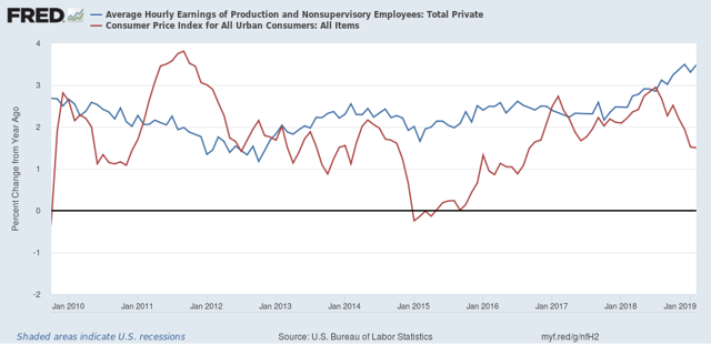
First, here is a graph of nominal wage growth YoY vs. consumer inflation YoY since the beginning of this expansion almost 10 years ago:

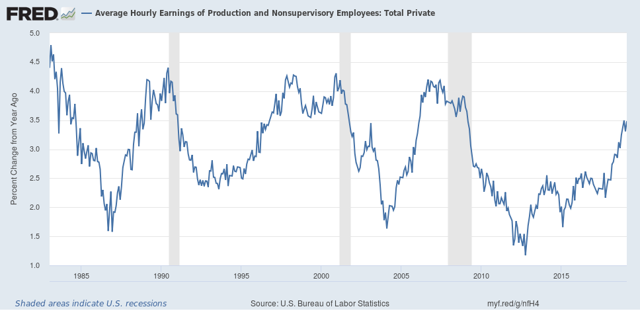
First of all, why do I bother with nominal wages? Because employers don’t give out inflation-adjusted salary and wage increases. If they give you a 3% raise, it’s a 3% raise regardless of what happens to inflation. And the long term picture is that nominal wage growth decelerates coming out of recessions until unemployment (or, more likely, underemployment) falls to the point where employees gain a little bargaining power:

To return to the first graph, nominal wage growth has been improving YoY since late 2012. Meanwhile CPI has been meandering around a 2% YoY average, depending on what has been happening with gas prices. Since lately these have been stagnant or down YoY, consumer inflation has waned.
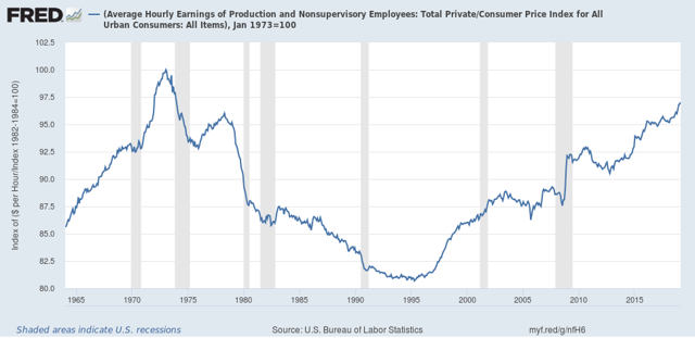
As a result, real wages have improved considerably in the past year, to the point where they are now exactly -3% off their peak in the early 1970’s:

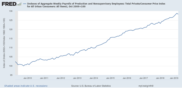
But because aggregate payrolls declined in February, according to the employment report, the aggregate pay that non-managerial workers took home, in real terms, declined by -0.4% in February. In real terms, this amount has increased by 28.2%, down from an increase of 28.6%, more than they earned at the worst point after the Great Recession in October 2009:

Nevertheless, real wage growth in general continued to be good news. Be aware, however, that real wage growth is a long *lagging* indicator, that starts up well after a recession bottoms, and can continue even into the next recession.

Graph 3 is important. It does show that real wages have risen relative to where they were in 1995. But note the tremendous decline in real wages from 1978 to 1995, which basically is the period where the supply-side crowd claimed that Reagan’s economic policies did wonders for the economy. If wonders is defined as shifting the distribution of income away from labor towards the owners of capital, I guess their claim is correct.
Graph 3 – How much of the real hourly wage change is the baby boomer compositional mix in the labor force? The lead edge boomer was 27 years old in 1973 (low end of life time hourly wage) and 49 years old in 1995 (high end of life time hourly wage).
In addition to the baby boomers entering the workforce, a larger percentage of women entered the workforce also. That would have the effect of lowering the average wage based on the sex differential. More workers competing for jobs and one growing segment getting maybe 25-30% less pay is part of the story. Union busting and “right to work” is another.
Kevin Drum has an interesting post that decomposes wage growth in a way that suggests most of the recent wage growth for low wage workers might be due to and limited to states that raised their minimum wages.