For the last several years, I have tried to identify several graphs that most bear watching over the ensuing 12 months. This year, in addition to watching bond yields like everybody else, the data that most bears watching, it seems to me, can be summed up in the question: Is the US economy about to enter a Boom?
The recent economic news has almost all been good. In particular the unemployment rate has dropped as low as 4%. Meanwhile, the GOP certaionly believes — I most certainly don’t — that the recent tax changes are going to unleash a torrent of Capex spending and wage increases (as opposed to mergers, acquisitions, stock buybacks and executive pay bonanzas).
So, is the economy on the verge of firing on all cylinders?
There is no standard definition of a Boom. But since I am a fossil, in my lifetime I have experienced two times when it certainly felt like the economy was working extremely well and on a very broad basis: the 1960s and the late 1990s tech era. The “good times” feeling of both eras was palpable. Employment was rampant and average people felt that their situations were going well.
What distinguished those to eras from all the other economic expansions? I found five markers that stand out, and two that, oddly, didn’t.
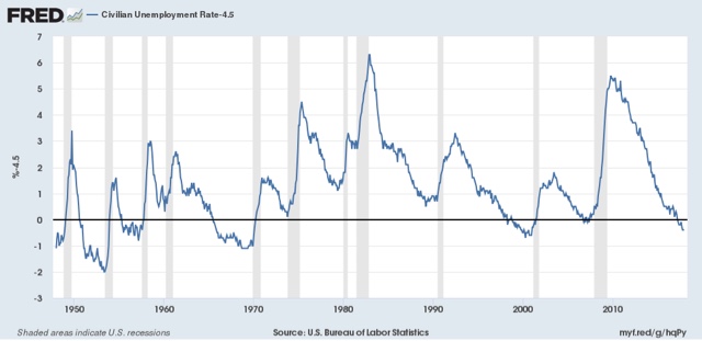
Let’s start with the first marker: the unemployment rate (note that the U6 underemployment rate wasn’t reported in its current configuration until 1994, and so is not helpful). In both the 1960s and the late 1990s, the unemployment rate hit 4.5% or below for extended periods of time:
While these weren’t the only two periods of low unemployment, they are among those that stand out, in particular vs. the 1970s and 1980s, none of which expansions hit such a low mark.
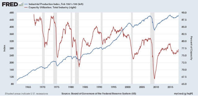
Now let me examine the two markers that didn’t make the cut. You would think that industrial production and capacity utilization would be making strong new peaks during Booms vs. other expansions. But that isn’t the case. industrial production (blue, left scale below) has made new peaks during each expansion, while capacity utilization (red, right scale) has been relentlessly declining:
What does stand out at least somewhat is the duration and rate at which industrial production grew during both Booms. During both the 1960s and 1990s, production grew at or over 4% a year for extended periods of time, not just right after the end of a recession
So the rate of growth of industrial production is the second marker of a Boom.
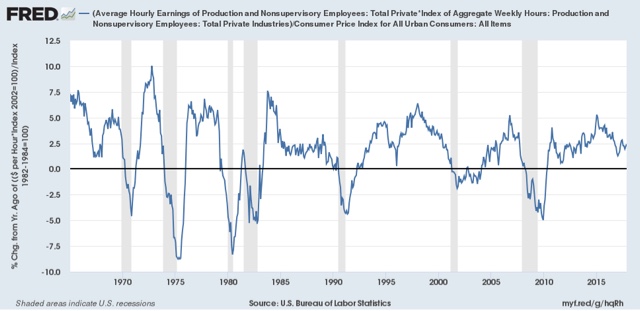
The third and fourth markers iare the rate of growth of real average earnings for non-managerial employees, both individually and in the aggregate. During the two Booms, in contrast to other expansions, real average hourly earnings also grew at roughly 1% YoY or better:
Meanwhile, real aggregate earnings grew at a rate of 4% YoY or better:
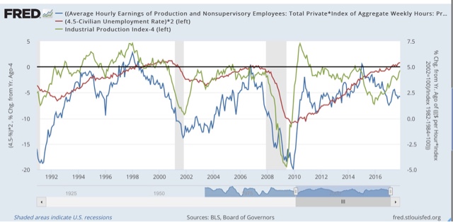
Here’s what three of those markers look like when put together in one graph:
The fifth and final marker of a Boom — probably as the byproduct of the first four — is an increase in the YoY rate of inflation:
So, to summarize, when they occur together, the five markers of an economic Boom are the following:
1. An unemployment rate under 4.5%
2. YoY industrial production growth of at least 4%
3. YoY real wage growth of at least 1%
4. YoY real aggregate wage growth of at least 4%
5. Increasing YoY inflation.
As we begin 2018, only the first and last markers are present: we have low unemployment, and at least temporarily, the YoY inflation rate is higher than it was a year ago. But industrial production is not growing as fast as either of the last two Booms, and real wage growth has continued to be lackluster.
Based on my lieffetime experience, while the US economy is currently doing pretty well in general, it is not anywhere near a Boom, at least not yet.
I’ll continue to track these indicators during 2018.


Based only on recent (pre & post Great Recession data) international currency markets have bid up the relative value of the US dollar when global capital owners expect the US economy to outperform the other major currencies – Euro, Yen, Pound mostly.
However since the Trump Bump in the relative value of the dollar it’s been in steady decline down to the lows of the preceding periods (from 2014/2015 where it has remained.. with emphasis more on the even lower extremes than anything else.
There’s no international capital that believes the US is on the virge of a boom.
Some other broad indicators:
In the 1960’s boom, EPOP grew from ~55.3% to 57.3% straight up between 4Q ’64 and 4Q ’66 and continued on up from there to peak at 58.1% before the next recession hit. 2% / 2 years is an EPOP growth rate of 1% per year
In the 1990’s EPOP grew rapidly from Q1 ’93 at 61.4% to 63.1% in Q1 ’95, or by 2% in 2 years — the same rate as occurred in the 1960’s
At present the quarterly EPOP growth rate since Great Recession lows (58.3%, Q2 2011) has been sporadically increasing to its current 60.1% in Q2 2017 … a growth rate of <2% over 6 years… anemic (0.3%/year) by 1960's and 1990's standards..
The other indicator is that the production capacity of the US is at or near it's current limits, with corporate profits as high as they've ever been, but with no indicators of a rapid increase in investment to increase capacities — so businesses aren't using their extreme profits to expand in anticipation of an impending major upswing in demand… which may also indicate a major reduction in competitiveness among producers (of goods and services).
Both EPOP growth rates and the huge profits without huge increases in production expansion investments are self consistent and not indicative of any anticipated economic boom occurring in the near future..
There are a couple of ways to look at this… one is that demand growth remains anemic since the depths of the Great Recession, which may simply be due to the fact that there's been no stimulus to the econmy from any sources …foreign competition or domestic policies or fiscal stimulus,
As to "wage/salary" growth.. I use real compensation per hour of all employees in the private non-farm sector as my primary indicator… more wages without considering benefits changes doesn't measure consumer's ability to growth consumption spending.
Data per FRED
Index of Real Compensation per Hour
Q1 1951 39.4
Q2 1968 64.2
Real Index Growth Rate: 1.43/year
Real Percent Growth Rate: 3.65%/year
Q4 1996 81.96
Q1 2000 92.30
Real Index Growth Rate: 3.18/year
Real Percent Growth Rate: 3.9%/year
Q4 2009 100.26
Q3 2017 103.32
Real Index Growth Rate: 0.39/year
Real Percent Growth Rate 0.4%/year
More Recently:
Q2 2014 99.95
Q3 2017 103.32
Real Index Growth Rate: 1.04/year
Real Percent Growth Rate: 1.04%/year
By any measure employment compensation growth in the 1960's and late 1990's were from 10x greater than they've been since the end of the Great Recession and 4x what they've been since the middle of 2014.
So there's no indication of any type of boom pending now compared to the 1960's and 1990's. Perhaps precisely because real employee compensation growth has been so anemic.
Have you looked at using nominal personal income as a marker. I think it is one of the most important economic indicators to watch and it’s growth has accelerated in recent months. I use the monthly data but the monthly data and the quarterly nominal GDP are amazingly coincident.
Just btw, I have been using the
1. international currency mkt US relative Dollar value
2. EPO growth rates
3.Real Corporate Profit Growth v Real Corporate Investments
4 Real Employee Compensation Growth (%)
for the last 15 years as primary indicators, among others, in understanding of how our economy actually works.. as US tax and spending policies change and global competitiveness changes.
This all comes together in the Gross Domestic Product which has been on the decline since the 1980’s… commensurate with vastly increased global competiveness initially from post war Europe’s and Japan’s reconstruction and then extending to China and other rising competition, AND US Tax reductions on unearned income and upper echelon capital owners, with Regulation reductions to increase the proportion of capital invested in higher risk ventures.
The effect of declining US GDP growth since the 1980’s has been to stimulate US domestic capital investment in nations that produce greater roi (nations with increasing GDP growth) .. e.g. capital flight… and increasing concentrations of income and wealth at the tiny tip of recipients in the US, exacerbating and increasing economic inequalities at an ever increasing rate
Tariffs on trade only reduce US competitiveness .. restricting trade has never been a solution.
Concentrating income & wealth at the tippy top of recipients who are already the wealthiest and highest incomes has never been a solution either. (trickle down stimulating growth has always been just a propaganda.. never a reality)
Our public education system is a sham and other nations have surpassed us only because we persist in allowing individual fiefdoms (“states”) to maintain full control of public education no differently than it ever has from the outset. If any part of the US’s future competitiveness depends on educating our youth, then we missed the boat long ago.. We cannot compete with the rest of the globe by maintainng “state” level educational autonomy “tradition” in spending or methods.
BTW, this is all because the US worships at the alter of “individualism” which is in its essence a divide and conquer strategy to maintain and increase gov’t control by a tiny minority for their own (rather than the nation’s) benefit. In a word, we’re being raped by our own.
Debt service has fallen a lot in the past 10 years. That frees up income, and I expect to see economic vigor any time now, as debt service has bottomed out and appears ready to climb for maybe 7 to 10 years.
(Debt service rising as credit use expands, driving economic growth.)
Something similar happened before: debt service low in the early 1990s, then rising thru the vigor of that decade.
Maybe it is possible to revise the truth right out of statistics.
See: BEA – National Income – Table 2.1. Personal Income and Its Disposition
The data reported in 2006 is BEA information stored on wayback.com.
The data reported 2018 is BEA information from their website.
2005 Personal Savings Rate as a Percentage of Disposable Personal Income
__________________1st Qtr___2nd Qtr___3rd Qtr___4th Qtr___Avg for 2005
As reported in 2006___ 0.6_____ -0.3______ -1.5______ -0.3_____ -0.50
As reported in 2018____ 3______ 2.5_______ 2.2______ 2.7______ 3.47
The 12 March 2006 issue of my local newspaper actually reported that personal savings rate for 2005 was -0.5% so these downloaded numbers are correct.
There is a total difference of 3.97% between the savings rates reported in 2006 and 2018.
And during that same year:
___________________4th Qtr 2004___4th Qtr 2005_____Difference
Total Household Debt__$9.042Trillon___$10.002Trillion___$960Billion
Download Excel Data: https://www.newyorkfed.org/microeconomics/databank.html
Does anyone seriously believe that the personal savings rate was 3.47% for 2005? At the same time that households were borrowing almost a trillion dollars?
JimH
“The 12 March 2006 issue of my local newspaper actually reported that personal savings rate for 2005 was -0.5% so these downloaded numbers are correct.”
I think you mean the numbers come from the same source.. not that they are “correct”.
JimH
The economic series you show for 2005 reported in 2018 is shown in this FRED chart …. I’ve used the data from 1980 to present just to show the savings rate as % of disposable income is consistent over time … falling from ~a peak of 12.4% to 2.7% in 4Q 2005….ending in Q4 2007 (2 years later) at 2.8% before increasing again to 9.2% and then falling back again to 3.3% again in 3Q 2017.
https://fred.stlouisfed.org/graph/fredgraph.png?g=hsCA
The economic data series is A072RC1Q156SBEA
In fact, this series is available from Jan 1, 1947 and its never even approached 0% or negative saving rate.. The lowest savings rates by far from 1947 to present are those in the 2 year period 2005 through 2007.
And yes to answer your question it has always been the case and full expected that that the savings rate is at a minimum when indebtedness is near a maximum.
I won’t try to explain the data you report from wayback in 2005, but the series reported by BEA at present is consistent within itself from 1947.
JimH
I did one google search that explains your discrepancies in 2005 savings rates.
The positive values are reported by BEA from NIPA, while the negative values are reported by the Board of Governors of the Federal Reserve system using a different measure (Flow of Funds measures)
So basically you’re using apples and oranges.
“There are two basic sources of calculated values for the personal saving rate: the NIPA estimates from the BEA and the estimates of the
changes in personal net wealth that can be computed from the flow of funds (FoF) accounts maintained at the Board of Governors of the Federal Reserve System (BOG).”
The economic article from FEDERAL RESERVE BANK OF ST. LOUIS REVIEW explains the overall reasons why the two measures differ in the 2005 – 2007 period.. Caution: detailed and in depth..
http://piketty.pse.ens.fr/files/GuidolinJeunesse07.pdf
Longtooth wrote “I think you mean the numbers come from the same source.. not that they are “correct”.”
Yes, I meant that the stats reported in my local paper in 2006 and the stats from wayback.com are both from the Bureau of Economic Analysis (BEA). And they were what was reported early in 2006.
And the 2005 stats which I collected in January 2018 are also from the BEA website. (You can use the interactive tables and use Modify to get spreadsheets from past years)t
All of my data is from the Bureau of Economic Analysis. Here is a link to the wayback webpage which I am using:
See: https://web.archive.org/web/20070605161838/http://www.bea.gov/national/nipaweb/TableView.asp?SelectedTable=58&FirstYear=2005&LastYear=2007&Freq=Qtr
Look at line 34 which is for the personal savings rate .
But you have missed the most important point.
The BEA has adjusted some of their statistics including the Personal Savings Rate. And when they adjusted them, they also adjusted the stats from the date of the adjustments far back into the past too. So it is somewhat difficult to find the original published stats. Thus my use of wayback.com
FRED is just showing you the adjusted stats for all years.
I know this is confusing. I was aware of it because the 2005 personal savings rate of -.5% was burned into my memory.
And as I said before: “Maybe it is possible to revise the truth right out of statistics.”
The measurement technique for Personal Savings Sate as it was measured in 2005 was good enough when the US economy was not declining.
But once the US economy slowed excessively then BEA had to change the way the Personal Savings Rate was measured.
I would describe this as a rubber ruler effect.
BEA is reporting that the Personal Savings Rate for the last 4 quarters in percent was:
Q4 2016____Q1 2017____Q2 2017____ Q3 2017____Average over 4 quarters
3.6_________3.9________3.7_________3.3________3.625
But using the measurement technique used in 2005 would subtract something.
It looks like they added 3.97 to the 2005 number so let’s subtract that amount.
That would give us a -.345% Personal savings rate for the year ending in Q3 2017.
See what I mean? Some of the truth has been removed.
I am sure that they would have a good excuse for making the change. But they never saw a need to do it before.
JimH,
You need to read the economic analysis paper I linked to understand why this shift occurred. No economist of any stripe, including the Fed economists believed for a moment that the savings rate went negative in 2005 – 2007 period The problem was due to how it was being measured… hence the adjustment.
Indeed from several years of declining savings rate prior to 2005/2007 most economists dismissed the rate of decline as being an artifact of how it was being measured, but as you said, while it was strongly positive it was not a big deal.
Read the paper and digest it first…. and I agree it’s not easy reading or for the faint of heart, but that’s what you need to do to understand what and why the BEA reports were shifted. The prior measures were an artifact of flow of funds mis-measurements.
If what you’re alleging is the BEA intentionally deciding to fake the numbers then you belong in the Trump camp.i
The author says:
“the GOP certaionly (sic) believes
— I most certainly don’t —
that the recent tax changes are
going to unleash a torrent of
Capex spending and wage increases”
Walmart proves this statement is not correct. Many companies have paid $1,000 bonuses to workers as a result of the tax bill. Higher minimum wages WILL boost the economy.
https://www.msn.com/en-us/money/companies/walmart-raises-starting-hourly-wage-to-dollar11-amid-tax-overhaul/ar-BBIgcbX?li=BBmkt5R&ocid=spartandhp&ffid=gz
Longtooth,
I have already read the article for which you provided the link. You should read their conclusion. They are concerned with the trend not the absolute amount.
And there were articles at BEA discussing alternative measures of the personal savings rate in 2002 and 2004 but nothing was done. And then there was this paper in 2007.
See: https://bea.gov/scb/pdf/2007/02%20February/0207_saving.pdf
The personal savings rate is done by a calculation. ([Disposable income – Outlays]/Disposable income)
So it is entirely possible for the savings rate to be negative, if a tremendous amount of borrowing is supporting the Outlays. And that is exactly what was happening in 2005. Households borrowed $960Billion that year.
I am not alleging some grand conspiracy. But I am pointing out that they had not seen the need for this change until July 2007 after the economy was in obvious decline.
And after the BEA’s adjustment in 2007, the statistics makes it appear that in 2005 American households borrowed $960Billion yet saved $972Billion of their disposable income. (See my earlier comment for total household debt links)
That is pure nonsense.
JimH,
I’m not sure what you are alleging or alluding to but the following doesn’t compute:
“I am not alleging some grand conspiracy….”
And after the BEA’s adjustment in 2007, the statistics makes it appear that in 2005 American households borrowed $960Billion yet saved $972Billion of their disposable income. (See my earlier comment for total household debt links)
That is pure nonsense.”
If the BEA’s estimates are pure nonsense, then either the BEA is inept and hugely in error, or they are making up the data to suit some purpose… e.g. intentional cover-up, aka conspiracy. .
How to do reconcile your “pure nonsense” conclusion with “not alleging [gov’t] conspiracy”?
BTW this is way off-topic from the Posted content. I think all you’ve really said is that the gov’t makes up their own data so you can’t rely on it for estimating how the economy is doing or might do.
Longtooth,
This 2007 revision of the method of calculation is affecting the reported Personal Savings Rate this year.
The BEA personal savings rate is done by a calculation. ([Disposable income – Outlays]/Disposable income)
So here we have a reported calculation of savings vs reported data of increasing household debt. I choose to believe the reported data.
What I am saying is that the currently reported rosy picture of the current economy is somewhat flawed by a focus on some statistics while ignoring others.
We have a difference of opinion. Have a good day.