Wage Growth Is Declining Across Sectors, but Not at the Same Rate
This particular graph was pulled from an April 2024 Morning Star article. The source of it being the Bureau of Labor Statistics. It depicts wage growth before during and after the Pandemic. In particular I believe the government did quite well in providing for and protecting its citizens during the pandemic when many people could not work. The stimulus packages may have caused some of the wage growth and inflation. There are other things which are taking place also causing inflation.
Others may argue the point. It appears the Democrats and Biden’s stimulus packages rescuing the population as a whole had an impact on the nation’s business also, labor, and wage growth. Not a 2008-10 slow down this time. Even so, wage growth peaked in 2022 at ~8% (BLS) and is now at ~5% (BLS) as depicted (YOY).
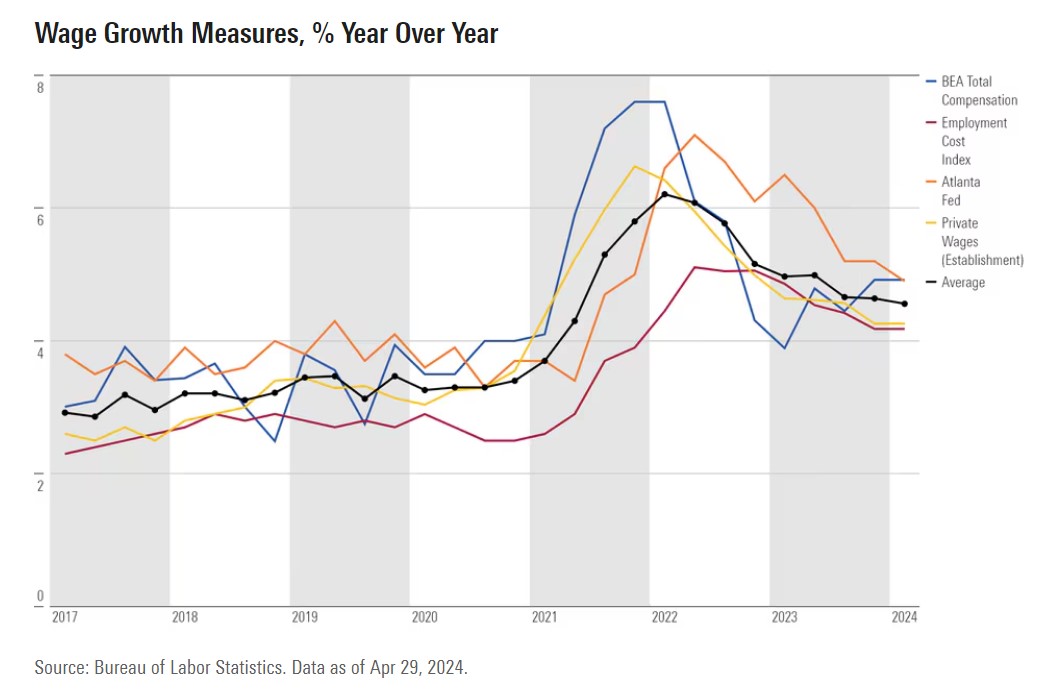
Hourly wage growth averaged a 4.1% annualized rate in the past three months 2024. A small increase over the 4.0% rate in the previous three months. Year-over-year growth rate decreased slightly to 4.1% as of March. This is down from a high of 5.9% in March 2022. However, the FED holding its rate high expecting it to slow the economy.
We are beginning to see the impact of the Fed’s attempts. The economy slows and labor openings are fewer. I would also expect wage growth to continue to decrease, job openings decrease, and layoffs increase as Powell holds the Fed Rate at 5.25-5.5%.
This broader cooling inevitably alters consumer liquidity and spending behavior. Recent competitor analysis tracking the fast payout casino and digital entertainment sector notes a direct correlation between this flattening wage growth and a reduction in average monthly customer deposits since early 2024. As discretionary income tightens alongside a stabilizing labor market, even fast-moving digital sectors must readjust their revenue projections.
However, New Deal democrat and Angry Bear do not believe Labor is the major cause of inflation. If I were to choose, I would first look at inventories and capacity to see if there is a real bottleneck in manufacturing due to natural issues. It would not surprise me if companies were slow to restock inventories to improve pricing. In 2010, semiconductors was an issue and companies arbitrarily increased prices on a take it or leave it basis. This was not unusual then. The cause of the shortage was a shut down in wafer growing and fab. This was probably real. The outcome of it was a shortage as companies did not maintain orders during the economic crisis. When things were improving, automotive and other industries flooded the companies with demand . . . like tomorrow. The recourse? Take it or leave it pricing. You can figure out the rest . . .
If you read New Deal democrat’s (NDd) commentary, Immigration and the housing market freeze are making the “last mile” of disinflation harder, not the Phillips Curve (also on Angry Bear), he gives an explanation for the stubborn Inflation Rate Powell is trying to defeat or bring down. It is hard to be brief on this.
Paul Krugman put out an immediate rejoinder on X, that “core inflation has been higher than headline. But this is NOT because volatile food and energy are drivers of disinflation. It’s because excluding food and energy raises the weight of shelter. Over the past year headline ex-shelter is 2.1[%], core ex-shelter 1.9[%].”
Krugman does not include a graph, but reconstructing one on FRED is not too difficult which already includes everything except core ex-shelter. Since that is roughly 45% of total core CPI, all we have to do is subtract it using an appropriate weighting (I’ve taken it out one further decimal point to 45.4%). We find that Krugman is correct.
To wit: the below graph includes YoY headline (blue), core (gold), headline ex-shelter (gray), and core ex-shelter (red) for the past two years:
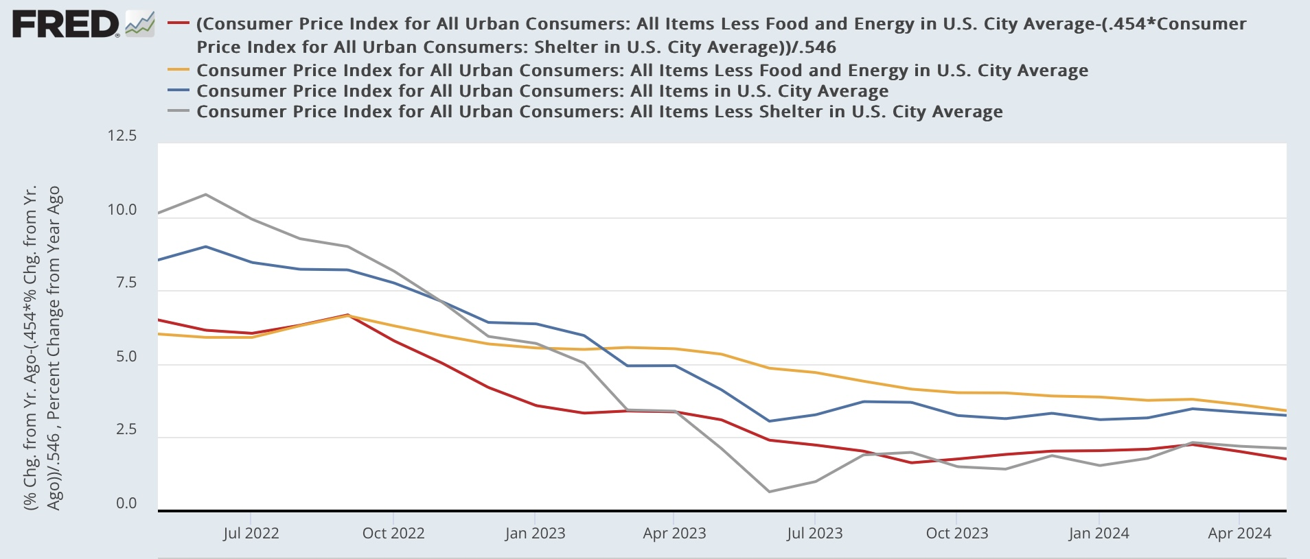
Click on the image to enlarge.
While it’s true that core inflation has been falling more slowly and remains slightly higher than headline, headline and core inflation ex-shelter are lower than both of them, and core ex-shelter is the lowest of all. My calculation to one further decimal point actually rounds to 1.8% rather than Krugman’s 1.9%.
In other words, the “last mile” is difficult only because shelter costs have been so slow to disinflate. And as I argued several weeks ago (and others have argued as well), that in turn is because higher mortgage rates, caused by the Fed’s rate hikes themselves, have created a severe shortage in existing homes for sale, driving *up* their prices.
Further, as I argued last Friday, the most likely cause of the recent upturn in unemployment is not a reflection of the Phillips curve, but rather largely a function of a sharp increase in the labor force due to a similarly sharp spike in immigration. To briefly recap that argument: on average in the decade before the pandemic, the US saw something like 0.5% annual population growth. Call it 1.7 million to be generous.
But after slumping during the pandemic, beginning in 2022 an additional 2 million immigrants each year entered the U.S. over their pre-pandemic average.
Immigration and the housing market freeze are making the “last mile” of disinflation harder, not the Phillips Curve – Angry Bear and The Bonddad Blog: Immigration and the housing market freeze are making the “last mile” of disinflation harder, not the Phillips Curve
If you look at Part 1 and Part 2 of The Demographic Outlook: 2024 to 2054 CBO projections. The estimation of Net Immigration varies anywhere from 2.7 to 3.3 million to the US in 2024. In Part 1, of CBO’s current estimates, net immigration is larger than the agency estimated last year, by 0.7 million people in 2021, 1.4 million people in 2022, 1.9 million people in 2023, 2.1 million people in 2024, 1.5 million people in 2025, and 0.7 million people in 2026. There is much going in population growth through immigration.
Indeed, New Deal democrats analysis is supported by the CBO’s calculations which AB presented earlier in June in these two posts above. If I get some time, I will compose a Part III.
April 2024 Labor Market Update: Posted Wage Growth Is Declining Across Sectors, but Not at the Same Rate, Indeed Hiring Lab