The unemployment rate is not *uniquely* overestimating the “true” employment situation
The unemployment rate is not *uniquely* overestimating the “true” employment situation
Bill McBride a/k/a Calculated Risk put up an entry over the weekend positing that the employment situation is worse than the unemployment rate indicates.
He bases this on the expectation that the overall labor force was expected to grow by 100,000 a month in 2020 and this year, whereas as of last month there were a little more than 2.9 million less people employed compared with just before the pandemic. This shortfall, he calculates, amounts to an “adjusted” unemployment rate of 7.9% vs. the official 5.2%.
This type of calculation is similar to many that were floating around for almost the entire duration of the last expansion – that the employment situation was far worse than the “official” headlines.
My take is a completely different one. I start out with the proposition that Of course, the unemployment rate underestimates “true” unemployment. That’s why we have the U6 underemployment rate, that most notably counts people only working part-time because they cannot find full-time work. And even beyond that, we have the people who aren’t unemployed and aren’t even in the labor force, but tell survey takers that they “want a job now,” series NILFWJN that is posted in every monthly employment report.
In short, my question is, is there any *unique* way that the unemployment rate is undercounting now vs. any other month?
My answer is “No.”
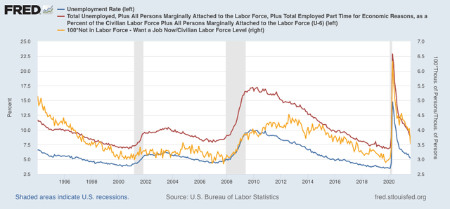
Let me start with a graph of all three of the above metrics: U3 (the official unemployment rate, blue), U6 (the underemployment rate, red), and those Not in the Labor Force who Want a Job Now (gold, right scale):

The “official” unemployment rate now, 5.2%, is the same as where it was in summer 2015, and spring 2005 in the earlier expansion. The underemployment rate, at 8.8%, is where it was in March 2017, and in autumn 2005 in the earlier expansion. Finally, NILFWJN as a percentage of the labor force is equal to where it was in September 2017, and slightly above its worst level of 2004 in the earlier expansion.
In other words, all three of these metrics now are at about levels they were at in the middle of the last two expansions. Nothing terribly unique about that.
Beyond that, let’s take a look at the prime age labor force, aged 25-54 years. This is the group that has, generally speaking, finished their education, but is still too young to retire, and is the group Paul Krugman honed in on when discussing employment shortfalls during the last expansion.
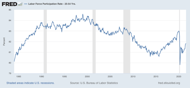
Let’s start with the Labor Force Participation Rate for this group:

Note that in the 1980s this ratio was rising strongly, as more and more women entered the labor market. That dynamic had pretty much hit peak in the 1990s. Since then, there has been a nearly persistent slow decline.
At its peak in 2007 and 2020 just before the pandemic, 83% of people aged 25-54 were in the jobs market, whether they were employed or unemployed. As of August, this ratio was 81.8%, roughly a 1.2% shortfall.
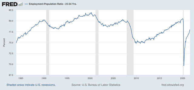
Now here is the employment-population ratio for this same group:

In three of the last four expansions, this peaked at 81%. As of last month it was 78%, a 3% shortfall.
The difference between the two metrics is that those who are unemployed are still in the labor force, but not employed. Hence they are included in the first metric but not the second.
In other words, the unemployment rate among the prime-age workforce is about 1.8% above its best levels in the last several expansions. In the 2002-07 expansion, that was 4.4%. In the 2009-20 expansion, that was 3.5%. The current unemployment rate of 5.2% is 1.7% above the latter and only 0.8% above the former. At most that suggests that the current unemployment rate is about 1% lower than it would otherwise be.
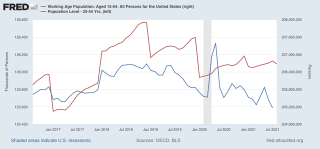
This conclusion is buttressed when we take into account the actual population of the prime wage labor force (red):

Just before the pandemic, it was 125.9 million. Last month it was 126.1 million, only a little over a 0.1% increase – nowhere near the 1.8 million increase suggested in Bill McBride’s analysis. In fact, when we use the entire working age population estimates covering ages 16 through 64 (blue isn’t the graph above) , there has been nearly a 500,000 decrease!
In conclusion, while certainly the official unemployment rate undercounts those marginally attached to the labor force, or not even in the labor force who want a job, there is no reason to believe that it is *uniquely* undercounting the unemployment rate now vs. any other time in the past 30 years.

US jobless claims drop to 310,000, a pandemic low
NDd:
It took me a while to find this. I wish they would leave data alone. Of course if they did so, we would have more to say about what is going on in the Labor market.
I understand your points. I believe our first go around was in 2000 when PR peaked at 67. Prior to that, Greenspan was increasing the Fed Rate (if I remember correctly) to simmer down an overheated economy by whacking Labor. It worked.
As you can see, we have been on a downward trend for awhile. There is a difference here between men and women which I will not get into here or even latter.
I kind of expanded your PR data (Graph) to get a better view of what has been occurring since 1990. The first chart is a graph of PR by year going back to 1990. As you can see the US has peaked right about 2000/2001.
The second chart I will show is Monthly/Yearly Participation Rate by the numbers.
For some reason I can not get an annual average. The PR in 2000 peaked at 67.3.
In the short term, one might question why PR will decrease and when will it go back up. If it does not, than it is time to look for reasons why.
The TV and paper Press are shy on explaining what is going on between PR, U3, U6, NILF, etc. So, it is not a bad idea to explain what U3 is if PR returns to what it was like I did in 2002. And then I stopped as it never did get back there.
We have decreased quite a bit, some of which can be blamed on baby-boomers retiring. Much more can be blamed on lost jobs to technology and overseas low Overhead costs in manufacturing.
You are correct in your analysis. I believe Bill McBride will probably stop eventually.
Anyway, just showing the larger picture.
This is taken from BLS “Databases, Tables & Calculators by Subject” https://www.bls.gov/charts/home.htm I am not sure the link will take you there,
This one may get you in the right place: https://www.bls.gov/cps/tables.htm
Bill
310,000 would have been considered a bad week in the pre-pandemic days. Now, it’s a “green shoot.”
Leaving the working-age cutoff at 64 when (for instance) full SocSec benefits are not available until 67 is a legacy of the data collection process. That probably doesn’t have a material effect on the shortfall–it’s not going to rocket up to 2%, or even 1.5%–but it will be a growing gap in the future.*
*We can quibble whether the non-disabled 65-67 cohort are truly WJN, but they don’t want to lose their home or starve, either.