Coronavirus dashboard for August 25: is the Delta wave close to peaking?
Coronavirus dashboard for August 25: is the Delta wave close to peaking?
I’ve been writing for about a month that, if the US outbreak followed the cycle of India and the UK, in which the Delta wave hit its peak about 6 to 8 weeks after onset, in the US the peak would be about Labor Day. As the graph below (which is in log scale better to show accelerating and decelerating trends) shows, it looks like that is about to happen:
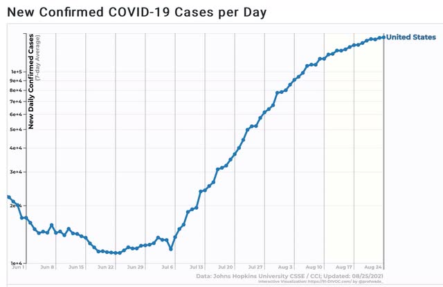
For the US as a whole, cases over the last 7 days increased by about 10%. One week prior, on August 17, it was about 20%. On August 10 it was 30%. On August 3 it was 50%. On July 27% it was almost 70%. So if the pattern continues, it looks like the Delta wave is about 1 week from peaking – I.e., right about and maybe a little before Labor Day.
That the Delta wave may be approaching its peak by noting in how many States it has already done so, or is very close to doing so. A couple of weeks ago I noted that was the case with the 4 or 5 earliest States to be hit. Now there are 8 States + DC which are down week over week, or at least clearly down from their prior peak:
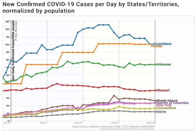
Additionally, there are 9 other States that appear very close to doing so:
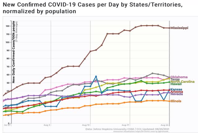
Note that 3 of the 4 biggest States – NY, TX, and FL – are on this list, plus IL. Among the largest States, only CA is still in an unabashed uptrend.
Deaths, which have been following cases by 3 to 4 weeks, are still in a pronounced uptrend:
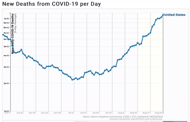
The likelihood is, we will be up to about 1750 to 2000 deaths a day in 3 to 4 weeks.
Finally, I have to comment on one item in the news the past few days in which I am clearly a dissenter; namely, the matter of cases in South Dakota in the wake of the Sturgis rally. You’ve probably seen the charts and graphs showing that over a 14 day period beginning on August 7, SD had the highest rate of increase in cases of any State.
There are two problems with the claim: (1) the starting date happened late in a week during the last week in which SD stopped reporting daily results; and (2) the % increases start from a very low number.
As to the second item, note that an increase from 1 to 4 cases is a 300% increase, while an increase from 1000 to 2500 cases is only a 150% increase. The amount of the % increase is strongly affected by how small the initial number is. For example, the purported huge increase of 225% in 2 SD counties’ hospitalization cases, came in counties with exactly 1 and 4 COVID hospital patients.
As to the first item, here is a six-month comparative graph of cases Per Capita in South Dakota vs. Vermont (which has one of the highest vaccination rates of any State):
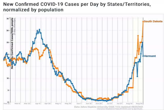
The trajectories of these two graphs over the six-month period is nearly identical.
Now here is a look at South Dakota’s reported cases Per Capita on a daily basis (wide solid line), and the weekly average (narrow dotted line):
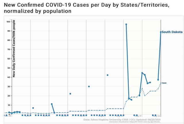
Note that until August 11, SD was only reporting once a week. The rest of the days were entered as zeroes. This meant that the entire time from August 4 through 10 was entered as an average of 6 cases per 100,000; after which on August 11 it abruptly rose to 14 per 100,000. There is simply no way that the number of cases on August 7, the start date of The NY Times charts and graphs, had zero cases. In fact, had SD been updating daily, it probably would have been about 9 cases per day on the 7th, resulting in a 2 week increase of about 2.7x vs. Vermont’s 2.3x increase – higher, but not by much.
I don’t doubt that the Sturgis motorcycle rally has had some effect on increasing SD’s numbers. But we’ll have a much better idea once the artifact goes out of the data starting tomorrow. If SD – with 48% fully vaccinated – and VT – with 67% fully vaccinated – continue to track fairly closely in the next few weeks, that will be significant evidence that there are a large %age of SD’s population with immunity or resistance to COVID due to previous infection.
Is this anything?
Could a spritz in the nose stop COVID’s spread?
fwiw, here’s a poster from the South Dakota DOT and the Sturgis police on their successful biker rally (compared to Chicago)
re: “if the US outbreak followed the cycle of India and the UK, in which the Delta wave hit its peak about 6 to 8 weeks after onset, in the US the peak would be about Labor Day”
UK cases are rising again, they’re about 29% higher than at the beginning of the month..
https://www.worldometers.info/coronavirus/country/uk/
@Fred,
The idea is reasonable. Not sure why it’s an improvement over the current vaccines, unless it triggers secretory antibody (IgA) locally.
NDd;
Since the Sturgis crowd came from all over the nation and not one place, how would you track the impact of this social get-together? It seems to me to be particularly hard to assign a number. Even if we did know the numbers, the impact on each state would be miniscule.
I am pretty-sure the mingling was mostly unprotected and the results of such behavior resulted in many becoming sickened by the Covid virus whether vaccinated or not with the latter unvaccinated suffering more so than the former and the frequency of death higher.
South Dakota Covid cases quintuple after Sturgis motorcycle rally
Meade County, home to Sturgis, has had a more than 1,500 percent increase in cases in the past 14 days.
Meade County, home to Sturgis, has had a more than 1,500 percent increase in cases in the past 14 days.
I hope this is the case for our kids sake. The school board meeting devolved into total anarchy over masks. Allegations flew, tempers raged, lawsuits discussed as well as resignations. Personal liberties at the expense of everyone else’s is in vogue, and a lot of people just don’t want to deal with it. Erosion of our civil establishments is full on. Maybe that’s the point?
Mr. Smith,
Let me know if you actually find a point to all this insanity other than crazy people have a tendency to act insane. What I see is children in adult bodies, some of which have guns, acting out their frustration and helplessness in the realization of their own inadequacies. Their is no point to such tantrums other than to get attention and rebel from the authority that denied them the attention for which they had been longing. Get enough individualists together and you have an angry mob.
It will be interesting to see if school year start kicks this back up. I did not see a lot of social distancing among Wisconsin kids this summer, but there also a geographical element to this, so maybe Wisconsin is simply a “September/October” place.