Coronavirus dashboard for June 17: the second wave of the tsunami comes ashore
Coronavirus dashboard for June 17: the second wave of the tsunami comes ashore
As of yesterday, there were 2,137,731 total documented coronavirus infections in the US. Total known deaths were 116,963.
As I have stated several times in the past month, I believe that coronavirus infections and deaths will wax and wane around the April-May plateau of roughly 20-25,000 new daily infections and 500-2000 daily deaths, at least as long as Trump remains President. This is because, absent competent Federal leadership, the US lacks the political and social will to do what is necessary – distancing + mask-wearing + tracing – in order to “crush the curve” as almost every other industrialized European and Asian country has been able to do.
The current situation in the US is divided by region. In the early hard-hit areas of the Northeast and Midwest, effective measures were put in place and have been relaxed more gradually. As a result, the infection rates there have continued to decline. By contrast, in the Confederacy, the High Plains, and the Southwest, lockdowns were put in place late if at all and lifted early without any meaningful restrictions. As a result infection rates have begun to rise, in a few States at an exponential rate.
Yesterday the COVID Tracking Project finally released graphs for each region per capita, shown below:
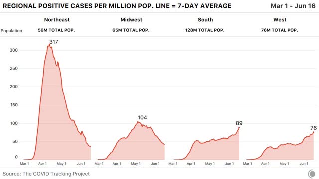
In the Northeast and Midwest, the 7 day moving average of new infections has fallen to roughly 40 and 45 per million, respectively. In the South and West, it has risen to 89 and 76 per million, respectively.
Here is a map showing which States have falling rates of new infections (green), relatively flat rates (yellow), and increased rates of new infections (red):
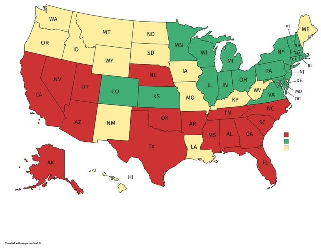
The regional pattern is obvious.
Here are the thumbnail graphs of all States with recent increases in new infections, ranked in order from highest to lowest number of *total* infections over time:
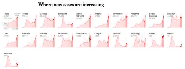
The last half dozen States shown, including, e.g., Oregon, Montana, Alaska, and Hawaii, have such small total numbers that the recent increases aren’t really significant; whereas the first shown, Texas, isn’t even in the “top 10” for the per capita rate of new infections (it’s #17. California is #14)).
The “leader of the pack” among the recklessly reopened States is Arizona, which saw a huge increase in new cases yesterday, bringing its 7 day average up to 214 per million:
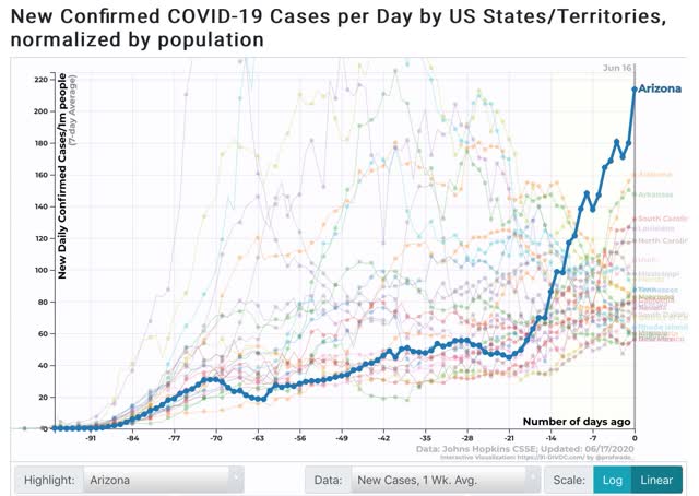
As shown in the graph above, the remaining “top 10” are all States in the Confederacy, High Plains, and Mountain West. In order, (showing rates of new infections per million as of June 15 in parentheses) they are: Alabama (156), Arizona (150), South Carolina (125), Louisiana (127), North Carolina (117), Utah (102), Mississippi (98), Florida (83), and Iowa (83).
To put this in perspective, here is the same graph but superimposing NY’s trend-line:
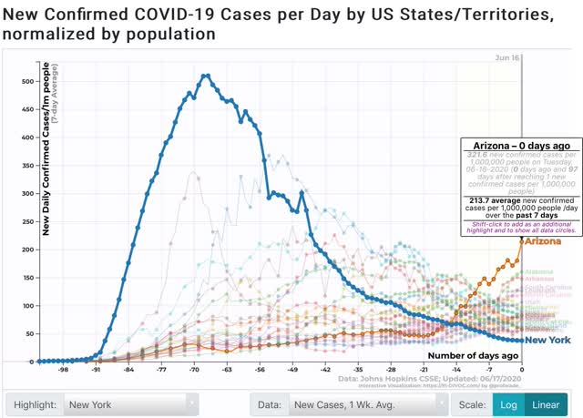
Even now, Arizona is not nearly as bad as NY, NJ, CT, or LA were at their peaks. But at its current rate of doubling roughly every 9 days, if this continues in about 2 weeks AZ will be as bad as NY was at its worst.
https://news.cgtn.com/news/2020-06-19/Mild-virus-cases-may-bestow-far-lower-immunity-Chinese-study-RrpuzzzE7S/index.html
June 19, 2020
Mild virus cases may bestow far lower immunity: Chinese study
People who catch COVID-19 but don’t show symptoms may have significantly lower levels of immunity against the virus than those who become severely ill, new Chinese research showed Thursday.
The majority of virus patients display relatively minor signs of infection, and a small proportion show no symptoms at all.
Very little is known about this group, given that they are far less likely to be tested than those who go on to develop severe symptoms including respiratory problems.
Researchers based in China compared two groups of individuals infected with COVID-19 in Chongqing’s Wanzhou District: 37 who showed symptoms versus 37 who did not.
The researchers analyzed blood samples from both groups taken a few weeks after recovering and found that just 62.2 percent of the asymptomatic group had short-term antibodies, compared with 78.4 percent of symptomatic patients.
After eight weeks of convalescence, antibody presence had fallen in 81.1 percent of asymptomatic patients, compared with 62.2 percent of symptomatic patients.
What’s more, asymptomatic patients were found to have lower levels of 18 pro- and anti-inflammatory cell-signalling proteins than the symptomatic group, suggesting a weaker immune response to the novel coronavirus.
Authors of the study, which was published in Nature Medicine, * said their findings called into question the idea that everyone who has had coronavirus are immune to future infection.
“These data might indicate the risks of using COVID-19 ‘immunity passports’ and support the prolongation of public health interventions, including social distancing, hygiene, isolation of high-risk groups and widespread testing,” they wrote.
Danny Altmann, a spokesman for British Society for Immunology as well as professor of Immunology at Imperial College London, said the research raised a vital question for combating COVID-19.
“Much immunology data so far has come from analyzing the sickest, hospitalized patients, but most people who have been more mildly affected will want to know whether this is likely to have conferred lasting, protective immunity,” he said.
Altmann said it was “an important and potentially worrying point” that many patients in the study showed a significant decline in antibody levels in just two months.
“Though this is quite a small sample size of patients, it is in line with some concerns that natural immunity to coronaviruses can be quite short-lived,” said Altmann, who was not involved in the research.
* https://www.nature.com/articles/s41591-020-0965-6
The old south has much higher rates of COPD and diabetics.
Could this contribute to higher death rates per number infected?
@Spencer
The increases are in confirmed infections. To my knowledge, diabetes and COPD don’t influence infection rate, just outcome.
I live in Texas and the past couple of weeks have witnessed an alarming amount of careless disregard for social distancing and wearing masks. We returned to work(25%) two weeks ago and many of my co-workers were asking “do you know anyone actually infected?” A lot even questioned the validity of the amount of infected and dead.
Flash forward two weeks and a dozen people sent home due to exposure with someone testing positive.
This disease does not care if you believe or not. We need to wear masks and do what is necessary to stop the spread.
June 19, 2020
Coronavirus
US
Cases ( 2,297,190)
Deaths ( 121,407)
UK
Cases ( 301,815)
Deaths ( 42,461)
Germany
Cases ( 190,660)
Deaths ( 8,960)
Canada
Cases ( 100,629)
Deaths ( 8,346)
June 20, 2020
Coronavirus (Deaths per million)
Belgium ( 837)
UK ( 626)
Spain ( 606)
Italy ( 572)
Sweden ( 500)
France ( 454)
US ( 367)
Netherlands ( 355)
Ireland ( 347)
Switzerland ( 226)
Canada ( 221)
Luxembourg ( 176)
Portugal ( 150)
Germany ( 107)
Denmark ( 104)
Austria ( 76)
Finland ( 59)
Norway ( 45)
Greece ( 18)