New coronavirus cases vs. testing in “reopened” States
New coronavirus cases vs. testing in “reopened” States
Are new coronavirus infections increasing in States that “reopened” on or about May 1? The jury is still out. The number of infections is up in 4 of the 5 biggest States that have done so, but so are the number of tests. The likelihood that most or all of the increase is an artificial of an increase in testing depends on the date on which you start your comparison.
I haven’t been able to find graphs that nicely show both tests and positives together, so let me just show you 2 separate graphs of the 7 day average in number of new cases diagnosed vs. the 7 day average in testing for Texas, which is the state with the biggest number of new cases.
First, here are new coronavirus infections, which are up 42% from April 30:
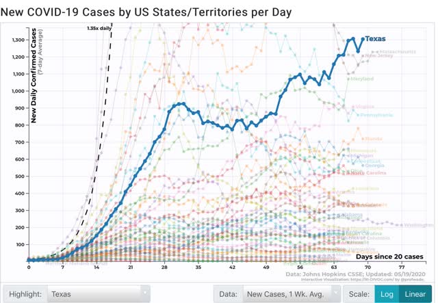
Figure 1
But here are new tests performed, which are up 120%:
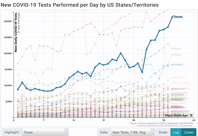
To save space, I won’t show them, but the trends are similar in the 4 other States, except in Georgia, where there has been an actual decline in new cases reported since April 30.
Instead I’ve prepared the below chart of both the increase in tests and increase in cases for the 5 target States. Additionally, as you can see in the graph of Texas above, there seems to have been a renewed pulse upward in new cases since May 10. Since there is a 5 to 10 day lag between exposure and the onset of symptoms, this may be what is showing up. A similar pattern seems to be occurring (but could be just noise!) in several of the other States, so the below graph also compares test increases to new infections dated from May 10 as well:
| State | Test increase From 4/30 |
Case increase From 4/30 |
Test increase From 5/10 |
Case increase From 5/10 |
|---|---|---|---|---|
| AZ | 157% | 51% | -41% | 15% |
| FL | 35% | 12% | 4% | 21% |
| GA | 135% | -2% | 65% | -13% |
| TN | 41% | -1% | 12% | 36% |
| TX | 120% | 42% | 77% | 19% |
All 5 States show bigger increases in tests than in new infections when dated from April 30. Dated from May 10, 3 of the 5 States – AZ, FL, and TN – show a bigger increase in new cases than in testing. Georgia remains a complete outlier, but has been shown to have important data integrity issues.
It is certainly possible – indeed likely – that many people, especially seniors, are probably continuing to practice safe distancing and mask wearing habits, despite the local governments’ lifting of restrictions, and this is probably at least a partial explanation of the data. But the virus is impervious to ideology. To the extent people in the “reopened” States are engaging in unsafe behavior, we should expect new infections to increase. Nevertheless it is safe to say that nothing dramatic has happened in the first three weeks of May.
One would not expect a serious rise in new cases until the first week in June due to the reopening in the beginning in of May. This is because although states legally reopened, despite the news reports people didn’t rush out, they trickled out. Then there is a ten day to two week incubation period. Then, most people tough it out at home until their symptoms don’t go away or progress to a point where they brave a trip to a hospital which is now perceived as hazardous. Add it all up and you get four to six weeks. This adds to the danger because a lot of folks will have come to the conclusion that everything is OK before the walls come crashing down sometime in the first or second week in June.
At least in Texas the number of positive results per test appears to be flattening out at about 6%. At least that is the way I see it as they do not make it clear how that ratio is calculated.
The absolute number of tests given is still growing, but because the numerator has become so large the growth rate in percent is rapidly weakening.
Are the criteria for administering diagnostic tests the same for all states? When I see percent positive I don’t know if I am looking at a selected group or not.
Jane:
What we need to know are:
Testing Positive,
Contracting Covid (and there is a difference)
and Deaths.
This site does a nice job. http://www.cashin.ru/virus/usa/
JaneE’s point in short form: the data are unreliable.
Is there a chart that shows the dead people coming back to life?