The superiority of stay at home orders vs. voluntary social distancing: two graphic proofs
The superiority of stay at home orders vs. voluntary social distancing: two graphic proofs
Here are a couple of graphs I pulled last week that I’ve been meaning to post. Together they show that mandatory “stay at home” orders have been much more effective than voluntary social distancing.
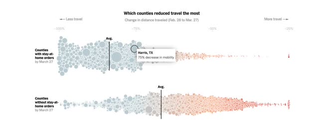
While almost all counties showed a sharp decline in the average distance travelled – the average decline in counties with only voluntary “social distancing orders” was about -66%, while the average in counties with a mandatory “stay at home” order was over 80%.
Second, here is a graph of the average decline compared to normal distance traveled during the latter part of March:
It is not surprising that the sharp deceleration in the day by day increases in the number of infections happened once mandatory stay at home orders were issued. Since most of Dixie promulgated such orders within the past week or so, further deceleration is likely given the 2 week incubation period for the coronavirus.
https://www.scientificamerican.com/article/map-reveals-hidden-u-s-hotspots-of-coronavirus-infection/
—-
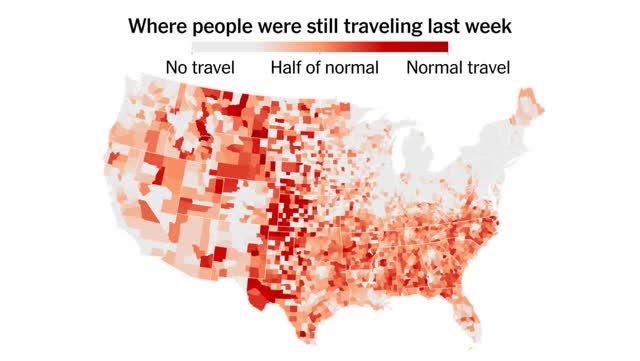
Contrast suppressed travel with the corona hot spots. Then you complete the proof, and it is ambiguous. The regions with no travel restrictions have the fewer outbreaks. Causality is reversed, outbreaks cause travel restrictions.