In the last couple of months variations of the same graph which is supposed to “solve” the wage conundrum have been going around. I saw another version this weekend:
Easy to see, there is what looks like a nice, nearly linear relationship between the prime age (25-54) employment to population ratio (left scale) with wages as measured by the employment cost index (ECI)(bottom scale).
While I see some merit to the approach, I don’t think the graph actually means what its purveyors think it does.
First, let me reproduce it with FRED data, which I am able to do through 2001:
Same pretty linear relationship, with maybe a slight bend at area of 79% participation and 2.5% wage growth.
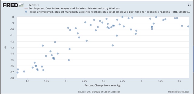
Now let me do the same thing, except this time, while I am continuing to use the prime age E/P ratio, let me substitute the (inverted) U6 underemployment rate:
Same nice relationship, with a little bit bigger kink at the same point in the graph.
Now let me do the same thing again, this time using the U3 unemployment rate:
Once again, same nice relationship, with more of a kink at that same point in the graph.
In other words, in the source graph that allegedly “solves” the problem, it isn’t the employment/population ratio that is doing the heavy lifting at all! Rather, it is the substitution of the Employment Cost Index for average hourly wages that is responsible for the smoother relationship. That’s because, unlike other measures of wages, the ECI has shown increasing wage growth in the last several years:
When we use average hourly wages as the measure instead of the Employment Cost Index, the nice relationship disappears:
And of course, since unlike the Employment Cost Index, average hourly wages go back all the way to the 1960s, we can see what the prime age e/p ratio looks like in previous periods. Here it is for the 1980s and early 1990s:
Hmmmm, I don’t think that is the same nice relationship whereby both increase and decrease together, do you?
When we confine the prime age E/P ratio to just men, to deal with the effect of the secular entry into the workforce by women, here’s what we get:
Nope, that is not really helpful proving the case either.
Let me emphasize the I do think there is some merit to the approach. But at least part of the problem is that the labor market can only absorb so many new entrants at any given time, and when too many new entrants saturate the job market (as during the time that tens of millions of women entered the market during the 1970s and 1980s), wages will be depressed.
It is thus probably not a coincidence that the three periods of time during this expansion that have seen the highest rate of new participants in the last 20 years are the exact same periods when wage growth stagnated:
In short, it looks like the nice neat relationship between prime age employment participation and wage growth disappears when we use other measures of wages, and also when we apply it to prior periods.


