Gimme shelter: the real cost of renting vs. homeownership
Gimme shelter: the real cost of renting vs. homeownership
But I have never seen a discussion of the relationship between the relative cost of homeownership vs. renting, particularly as a function of the household budget.
That is a curious void. For the choice (or ability) to live in the residence one desires isn’t a matter of its cost by itself, but also the relative cost of the type of residence. What is the cost of a house compared with the cost of an apartment (such as luxury apartments)? How expensive are each of them compared with a household’s income? If both are too expensive, maybe the choice is made to live with mom and dad as an extended family.
The purpose of this post is to fill that void. Herein I compare the cost of home ownership — in terms of the down payment, but also in terms of the monthly mortgage payment — with the cost of renting, and further, compare each to the median household income (since by definition, the people renting the apartment or living in the house are a household!).
Let’s start with the “real” cost of a down payment on a house. The first choice of most people is to reside in a single family house. Most people who follow economics are familiar with the housing bubble, bust, and recovery in the past 15 years. Here’s what the median house price looks like measured in comparison with median household income:
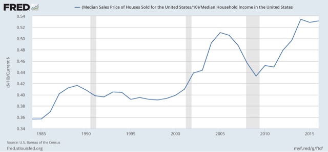
In the above graph I’ve divided house prices by 10, to measure the share of annual household income needed for a 10% down payment. The graph would look exactly the same, just with different nominal values, assuming a different percentage of down payment.
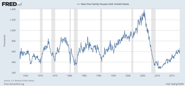
What is surprising here is that house prices now are even higher than they were at the peak of the bubble in 2005 as compared with median household income. As we’ll see below, there are good reasons to believe even these lofty prices do not mean we are in another bubble. But perhaps they are an important reason why, even more than eight years into the current economic expansion, home sales are barely above where they were at the bottom of previous recessions:
But if down payments are so dear, why have people chosen in increasing numbers to purchase houses? Perhaps that’s because, when we compare monthly payments, and compare them with the alternatives, the picture looks entirely different.
Let’s start with the most obvious comparison. Here is the median asking monthly rent for an apartment in the US since 1995 (note: the series goes back to 1988):
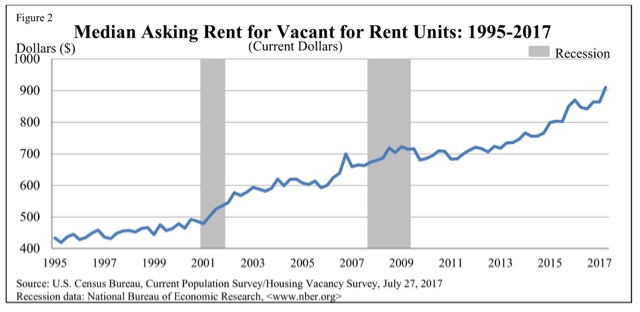
In 1988 the median rent averged $343 per month. In the second quarter of this year it was $910.
Now, here is what it looks like in comparison with median household income:
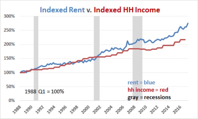
If house prices have risen to new highs several times since the turn of the Millennium, so have apartment rents — almost relentlessly. You can use this property management review site if you’re looking for an affordable property rental.
In percentage terms, in 1988, the median rent for an apartment was 14.5% of median household income. That rose to slightly over 16% in the mid 1990s before falling to the series’ low of 13.7% in 2000. Since then it has risen to a record 18.4% of median household income in the 2nd quarter of this year.
Now let’s take a look at the monthly cost of living in a house. The below graph shows the median monthly mortgage payment for a house (blue) compared with median household income (red). Median monthly mortgage payment is calculated by using the median house price and the 30 year mortgage rate for each quarter, and consulting an amortization table using those values:
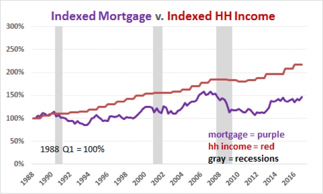
Notice that the monthly payment for the median house isn’t extreme at all! In fact, currently it is very moderate in terms of the long term range. Let’s break that down by showing the percentage of median monthly income (1/12 of the annual) that one month’s mortgage payment consituted (note: I am assuming a 10% down payment, with 90% mortgaged to be consistent. Using a different down payment does not change the shape of the comparison at all, only the nominal values):
- Going back to 1988, the median mortgage payment was slightly over 40% of median monthly household income.
- This fell back under 28% at the end of 1998 before rising to 32% in 2000.
- After falling briefly, at the peak of the housing bubble in early 2006 it had reached a secondary peak just over 35% of median monthly income.
- At the bottom of the bust at the end of 2011 it made a new low of 23%.
- Even now, with the real cost of a house at all time highs, the median monthly mortgage payment is still less than 24% of median household income.
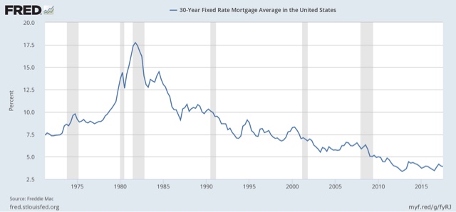
Monthly mortgage payments are moderate because, even as house prices have risen, mortgage rates fell to new lows not seen in over half a century several times during this expansion, most recently in the summer of 2016:
In our final comparative graph, let’s see how median monthly rent compares with median monthly mortgage payment:
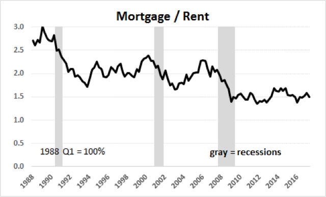
Most notably, the overall trend in the last 30 years has been that monthly mortgage payments have fallen from over 3 times median rent to about 1.5 time median rent now. Put another way, even at the peak of the housing bubble, the monthly carrying cost of a house was about 2.3 times the median cost of renting an apartment. At the bottom of the bust, that fell to 1.4 times the cost to rent. For the last five years, monthly mortgage payments have hovered near 1.5 times the median asking rent.
By comparing the “real” cost of housing to renting, both in terms of down payments and monthly mortgage payments, we can make sense of some of the biggest trends in the market for shelter.
With both real house prices and real apartment rents at new highs, perhaps it is no surprise that a record number of young adults are choosing, or maybe stuck with, continuing to live with mom and dad:
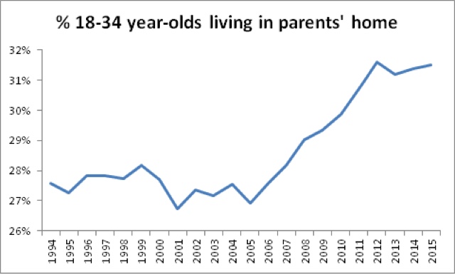
Note, by the way, that these adults are included as part of their parents’ household for purposes of the homeownership rate above.
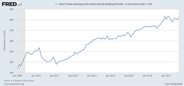
On the other hand, with monthly mortgage payments at such relative lows compared to both rental payments and median incomes, if one can get past the down payment, home ownership is clearly the better choice. Thus single family home construction continued to rise until at least the beginning of this year, and has declined only slightly with the roughly 1% increase in mortgage interest rates:
Finally, that being said, it is hard for me to imagine how home sales could continue to grow much further if house prices continue to outpace even their 2005 multiple of median household income. But if rental prices also continue to grow relative to median household income, then we can only expect to see even more involuntary extended family households.
[Special thanks to Mike KImel for preparing the customized comparative graphs used in this article.]
Where is this mythical land where the only cost to owning a home is coming up with a down payment and paying a mortgage? I hope people that have never owned a home are not reading this. They will get a false impression of what the real costs of homeownership is and could end up in a situation where they cannot afford a home they purchased because of all the hidden* costs.
*hidden only to the ignorant
Here is Bill McBrides post on the same subject:
http://www.calculatedriskblog.com/2017/10/are-house-prices-new-bubble.html
What Jay said.
Property taxes, homeowners insurance, utilities, roof, tuckpointing, painting . . .
I did a similar analysis of this back in 2006, except I computed the median house price in terms of the median hourly wage. I updated it using median weekly earnings in 2016. My data went back into the 1960s, and one thing really jumped out. House prices soared when Volkert raised interest rates in 1979, the year I bought my first house. (I remember biking around downtown Boston from bank to bank trying to lock in the best loan rate I could.) Mortgage payments went from maybe 15-20 weeks of work to maybe 25-30 weeks. Needless to say, this explains why so many women went into the work force and stayed there. It was increasingly difficult to buy a house on a single salary.
The housing bubble looks surprisingly tame in my graph. In the collapse, mortgages grazed 20 weeks, then started climbing again. Of course, even if you have work, it is harder than ever to get a mortgage. Since housing prices in prime areas are rising again, young people are facing a race in which their attempts to save for a down payment are increasingly futile was they are aiming at a moving target, one moving farther and farther away.
https://www.dailykos.com/stories/2016/5/1/1522091/-House-Prices
Another major failure of this analysis is that national data will provide a biased result in favor of home-ownership over time. Where is renting most concentrated? NYC, DC, San Fran, Boston, etc. They aren’t printing more land in cities so one would expect that rents will rise faster in NYC than the cost of an owner-occupied home next to the corn field in Nebraska.
You aren’t comparing apples to apples when you show a national statistic of home prices/mortgage vs rental rates.
Further, a chunk of that mortgage/rent improvement from 1980s to now has to do with a decline in interest rates. Part of the cost of a mortgage has to do with time value of money / opportunity cost. You are indifferent to paying a higher dollar value mortgage – ceteris paribus – if inflation rates are higher as you rationally expect a higher rate of return on the appreciation of the property in a higher interest rate environment.
Meanwhile, I have one question Where are these rental numbers coming from? $383 in current dollars was the median rental cost in the 80s?
I lived a lot of the 80s in non metro areas, and I remember nothing like that.