Guest post: How wages in services vs. goods-producing jobs explain relative GDP growth during Recoveries (Hint: producing goods is better)
by New Deal democrat (Bondaddblog)
How wages in services vs. goods-producing jobs explain relative GDP growth during Recoveries (Hint: producing goods is better)
This week I will put up several posts discussing the relative impact of goods-producing vs. service jobs in the economy, prompted by an article by Kevin L. Kliesen and Lowell R. Ricketts of the St. Louis Federal Reserve entitled “Faster GDP Growth during Recoveries Tends To Be Associated with Growth of Jobs in ‘Low-Paying’ Industries” (pdf), which was subsequently picked up by Prof. Mark Thomas at Economist’s View.
The title gives the essential conclusion of the authors, and is primarily supported by the information in the chart below:

The authors explain that they compared 14 industries:
The industries are ranked by their average real wage per worker in that industry . . ..{i}n 2007. . . . [I]ndustries with average real wages above the industry median as “high-paying industries” and industries with average real wages below the industry median as “low-paying industries.
The breakdown by high vs. low paying industry is similar to that of the National Employment Law Project (except they include a mid-range bracket as well). The NELP found 33% of all jobs created as of August 2014 to be high-paying vs. 41% low-paying, or roughly a ratio of 4:5. The article in question, counting through December, has the same ratio at 9:8.
As I wrote two weeks ago, the NELP data strongly suggests that recovery started among low-paying jobs, and has spread to higher paying jobs over time. The St. Louis Fed article is consistent with that trend towards higher-paying jobs having continued.
Part of what piqued my interest is the following statement:
What might surprise some people is that both durable and nondurable manufacturing jobs were in the lower-paying end of the distribution (below the median) in 2007.
My immediate thought was that while, in 2007, manufacturing was not a high paying industry, that was not the case before. Perhaps sensing that criticism, the authors wrote in footnote 4:
We chose 2007 under the assumption that the distribution of real wages within an industry was that which prevailed when the economy slowed and subsequently fell into a recession. In analysis not reported here, we looked at the distribution of average real wages for these 14 industries in 1981, 1990 and 2000. The distribution of high- to low real-wage industries changes very little across time.
As we will see several times this week, that starting point of 1981 is important.
The first important point to be made is that the title can hardly be supported by such a limited set of 4 recessions and recoveries, which does not even include earlier post-World War 2 economic cycles. And of course, as better indicated by the authors in the actual conclusion in the body of the article, correlation does not mean causation.
Second, note from the chart that the 4 recoveries do not break down so cleanly as suggested by the authors. In the “higher GDP growth” 1980s and 1990s, low-paying jobs outpaced high-paying jobs by roughly 2:1. In the “lower GDP growth” 2000s, the ratio was the reverse, i.e., 1:2. In the present recovery, the ratio is closer to 1:1 — i.e., only slightly tilted towards “high-paying” industries. Such a limited data set, and such a diversity of results, only barely supports the conclusion.
Third, the study only compares at the 66-month mark (that is, 5 1/2 years into a recovery). The NELP found that this recovery started by adding almost exclusively low-paying jobs, and has increasingly added higher-paying jobs as the expansion has progressed. It has been my thesis that this is probably not unique, that is, recoveries commonly start by adding lower paying jobs, and add higher paying ones later. I would have liked to see if an examination of the same data by the St. Louis Fed showed the same for the last 3 recoveries as the NELP data supports for this one.
But the biggest issue is whether the authors overcomplicated the issue. If we simply divide jobs into goods-producing vs. services, we get a very similar result for all 4 recoveries and 3 of 4 of the recessions (the 2001 recession being the exception).
The singular difference between losses in the Great Recession and the 3 previous ones is that, in prior recessions, service jobs were relatively untouched, while in the Great Recession, nearly as many service jobs were lost (4.5 million) as were goods-producing jobs (5.0 million). I wrote about this over 5 years ago. Here is the graph from that article for the 3 previous recessions:

Here is the updated graph for the 2008-09 Great Recession:

More to the point, here are the actual numbers of job losses from the 4 recessions, from that same September 2009 article:

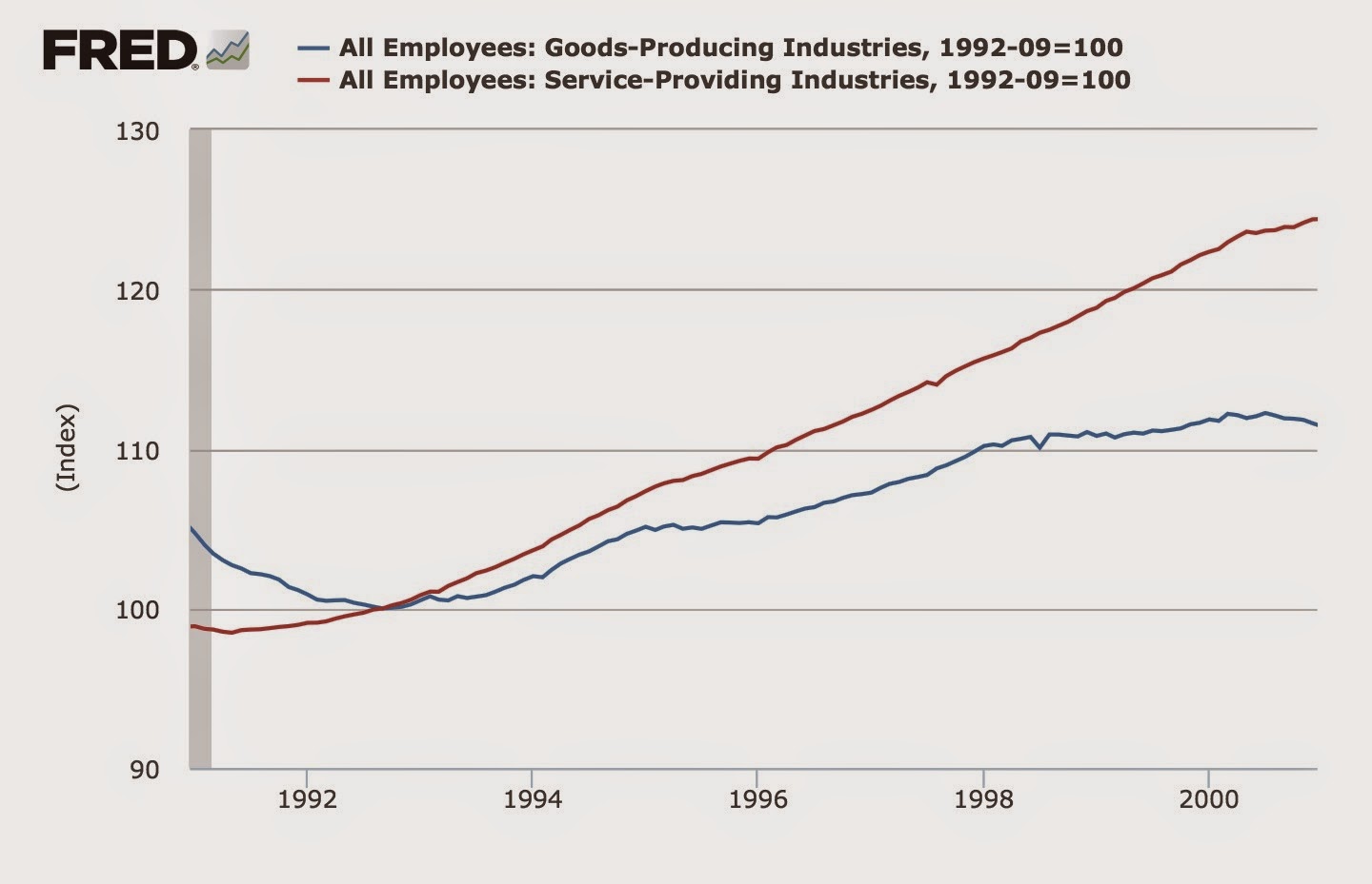
Turning to the subsequent recoveries, in the 1980s and 1990s, goods-producing jobs increased at about double the rate of service jobs:

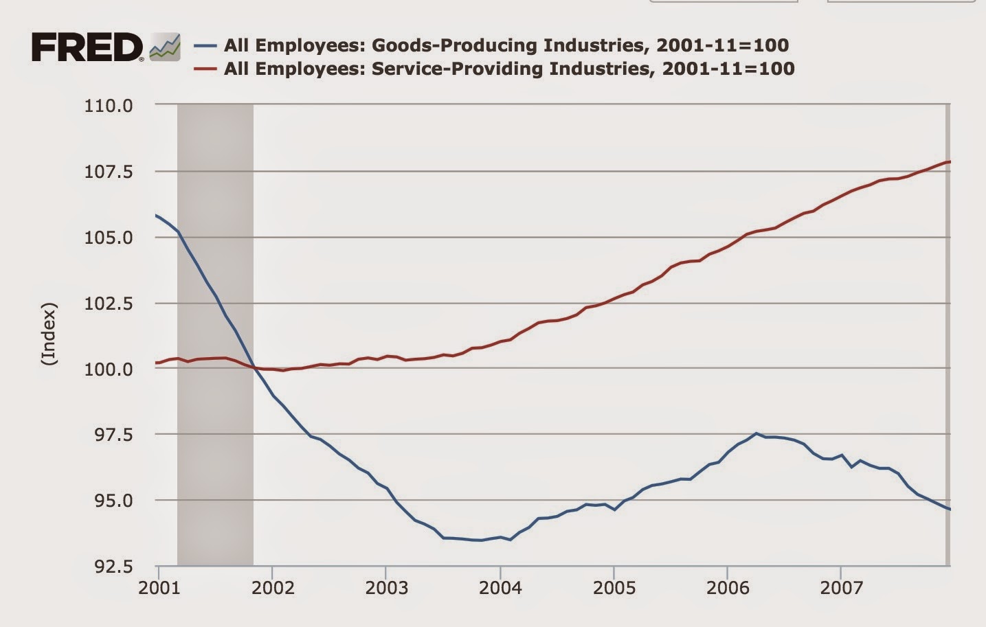
In the 2000s, service jobs increased at double the rate of goods-producing jobs:
In this recovery, goods-producing jobs have increased at a slightly higher rate than service jobs:

In other words, the data found by the Kliesen and Ricketts can be simply explained by the huge loss of goods-producing jobs (to Latin America and subsequently to China and robots) beginning in 1982, and in particular the halving of such jobs between 2000 and 2010.
NDd here…..I decided to see if I could extend the analysis back in time to prior recessions and recoveries, and to further examine the impact of wages in goods-producing and services jobs over time. The results were very telling, and will form the basis of my next few posts.
It might be interesting to see an analysis of the same national recession, at the state or regional level.
Time to recovery based on job types. A further split of manufacturing might be interesting as well, to see if certain types of manufacturing help a region to be relatively recession-proof.