Is GDP Wildly Underestimating GDP?
The markets have been showing a rather particular schizophrenia over the last dozen or so years — but not, perhaps, the one you may be thinking of. This schizo-disconnect is between the goods markets and the asset markets, and their valuations of U.S. production.
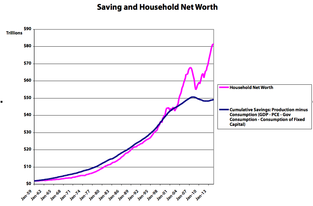
In short, the existing-asset markets think we’re producing and saving far more than we see being sold and accumulated in the newly-produced-goods markets. Take a look:
(See here for some ways to think about these measures. The spreadsheet cumulating saving is here. You can find all the data series on Fred here.)
A huge gap has emerged between what we’ve saved and what we’re worth.
Household Net Worth is the asset markets’ best estimate of what all our privately-held real assets are worth. It’s our best or perhaps only proxy for that value. (Household net worth includes all firms’ net worth, since households are firms’ ultimate shareholders. Firms, by contrast, don’t own households. Yet.) This is not just about assets like drill presses and buildings, but also skills, techniques, knowledge, organizational systems, etc. — all the tangible and intangible stuff that allows us to produce more stuff in the future. Household Net Worth at least provides us with an index of the change in that total value, as estimated by the asset markets.
As we increase our stock of real assets (“save,” by producing more than we consume), household net worth (wealth, or claims on those real assets) increases. The valuation jumps up and down as asset markets re-evaluate what all those real assets are worth — how much output and income they’ll produce in the future — but the two measures generally (should) move together.
Except: Since about ’98, and especially since ’02, that hasn’t been true. And no: zooming in on earlier periods doesn’t reveal the kind of anomaly we’ve seen since 2002.
There are two oddities here:
First, the flattening of cumulative savings: this measure was increasing exponentially for decades. Then it slowed significantly starting in the late 90s, and has gone flat to negative since The Great Whatever.
Second, the continued exponential growth of household net worth, and the resulting divergence of the two measures.
But bottom line: Net Worth and the cumulative stock of savings used to move pretty much together. They don’t anymore. What in the heck is going on?
There are three possibilities:
The asset markets are wrong. They’re wildly overestimating the value of our existing stock of real assets, and the output/income they’ll deliver in the future. See: “Irrational exuberance.”
The goods markets are wrong. The market for newly-produced goods and services is setting the prices for newly produced goods below the production’s actual value.
GDP is wrong. We’re producing something that’s not being measured by the BEA methods (tallying up what people spend on produced goods). There’s production the GDP methods can’t see in sales, so it doesn’t show up in saving (production minus consumption). But the asset markets can see it (or…sense it), and they deliver it to households in later periods, through the mechanism of market asset revaluation/capital gains.
Techno-optimists will like this last one. You’ve heard it before: The BEA has no sales-based method for estimating the produced value of free digital goods like Wikipedia, or the utility people derive from using them. They’re not purchased, so the BEA can’t “see” them. They could look at ad dollars spent on Facebook as a proxy for the value of browsing Facebook, but…that’s a pretty shaky estimation method, especially when many of those ad dollars would have been spent anyway, in other media. GDP simply doesn’t, can’t, measure that value, because nobody purchases it.
The timing sure supports this invisible-digital-goods story. The divergence takes off four to eight years after the release of the first mainstream web browser, and the global mainstreaming of the internet in general.
But it’s worth pausing before swallowing that explanation wholesale. You have to ask, for instance:
How does the internet/digital-goods story explain the flatlining of cumulative savings? Shouldn’t that continue to rise, though perhaps not as fast as net worth? Has the internet killed off sales (and accumulation) of traditionally measurable, purchased, goods to the extraordinary extent we see over the last dozen-plus years?
Are the asset markets seeing something else that GDP can’t see? Improved supply-chain management? More-efficient corporate extraction of profits from other other (less-developed?) countries? More-effective suppression of low-end wages? The rising costs of education and health care? (Which the BEA counts as consumption, extracted from saving, even though they’re arguably investment at least in part; they produce very real though intangible and difficult-to-measure long-term value/assets.) Or — here’s a flier — does it have something to do with the Commodities Futures Modernization Act and other financial “liberalizations” passed in the waning days of the Clinton administration? Something else entirely? In particular: would any of these explain the striking trend change in the cumulative savings measure?
Whatever the causes, the divergence of these two measures suggests a rather profound and singular economic shift of late — a shift that is not being widely discussed, even amidst the recent spate of commentary on Piketty’s Capital. (Piketty, by the way, defines wealth and capital synonymously — though his usages are not always consistent.) Prominent exceptions include the economists Joseph Stiglitz and Branko Milanovic, who are actively interrogating the troublesome theoretical intersection of wealth and real capital. The recent divergence of these two national accounting measures suggests that they’re tilling fertile ground for our understanding of how monetary economies work, and how we measure those workings.
Note: Technically one might add (negative) government net worth to the household measure to arrive at national net worth. But: 1. government net-worth estimates are inevitably dicey to meaningless. Government assets (and services) aren’t generally sold in the marketplace, so we have no observable sales information to base our estimates on. Liabilities are also very tricky: estimates vary massively based on your chosen time horizon and (necessarily) arbitrarily chosen discount and economic-growth rates. And 2. It barely changes the picture drawn above. Feel free to add government to the spreadsheet if you want; you’ll find estimates of net worth for the federal, and state/local, government sectors here. Net worth is — as it should be — the bottom line for each sector.
Cross-posted at Asymptosis.
I wonder if the same is happening in the other developed countries. That might give a clue I would think. If the same pattern is everywhere, that would point us towards global economic changes like the shift to digital goods. If it is not, that would suggest either that something odd is going on in the US or in how we’re measuring one or both of the stats here.
The question of our day. Sounds like a government data crisis to me.
Steve Roth,
My first guess was your first choice “The asset markets are wrong”.
That guess is tempered by the thought that collected and reported statistics are primitive enough that small errors happen and using your method those errors would accumulate.
But examining the Savings and Household Net Worth graph more closely, it is apparent that these two measures have tracked together fairly well until about 4th quarter of 2003.
Which leads me to question what change could have caused that disconnection after the 4th quarter of 2003?
If asset investors begin looking for higher returns than reasonable markets provide then they will resort to speculation.
I would expect that to show up in commodities and coincidently the inflation adjusted price of oil rose over 30% from 2003 to 2004. The price of oil continued to rise more than inflation until 2008. The price fell by over 40% in 2009. But in 2010 and 2011 it recovered most of the losses in price
See: http://inflationdata.com/Inflation/Inflation_Rate/Historical_Oil_Prices_Table.asp
Also coincidently, the Effective Fed Funds Rate was low at about 1% in October 2003.
http://research.stlouisfed.org/fred2/series/FEDFUNDS
Borrow cheap money and speculate in oil and you will distort that asset market. Probably happened in other commodity markets too.
Steve Roth,
Oops. Sorry for the errant copy in the comment above. Read this one instead.
My first guess was your first choice “The asset markets are wrong”.
That guess is tempered by the thought that collected and reported statistics are primitive enough that small errors happen and using your method those errors would accumulate.
But examining the Savings and Household Net Worth graph more closely, it is apparent that these two measures have tracked together fairly well until about 4th quarter of 2003.
Which leads me to question what change could have caused that disconnection after the 4th quarter of 2003?
If asset investors begin looking for higher returns than reasonable markets provide then they will resort to speculation.
I would expect that to show up in commodities and coincidently the inflation adjusted price of oil rose over 30% from 2003 to 2004. The price of oil continued to rise more than inflation until 2008. The price fell by over 40% in 2009. But in 2010 and 2011 it recovered most of the losses in price
See: http://inflationdata.com/Inflation/Inflation_Rate/Historical_Oil_Prices_Table.asp
Also coincidently, the Effective Fed Funds Rate was low at about 1% in October 2003.
http://research.stlouisfed.org/fred2/series/FEDFUNDS
Borrow cheap money and speculate in oil and you will distort that asset market. Probably happened in other commodity markets too.
Well, remember my charts on income vs consumption? Look at your chart and note it’s not just that assets and saving split, it’s that savings was always above net worth.
Your split is starting right around the same point the share of income for the 99% fell below personal consumption (recall this shifted the other way around 1945) and the share of income went over 15% to the top 1%.
This ain’t no coincidence.
I believe that the share shift is mostly do to the way we generate income now.
So, is it unreasonable to expect savings to be down, but assets shares to be up when the economy has shifted to making money from money vs labor?
Then we solve a recession with a real estate bubble that when it busts is solved by pumping money into the top of an economy which is used to buy back stock (as one example). Where are these people going to park their money (besides off shore)? Let it sit in banks? How would the bank then make money? It has to move, there has to be velocity to have gdp growth and it ain’t moving into the hands of labor so that their income is above consumption. And if there is enough money parked off shore, is it enough to change the savings registered here?
So, yeah, the government is still measuring the economy as if people are in their garages with lathes and milling machines creating the next great consumer product (which is happening somewhat via software development) while making money from mney has become a much larger % of growth.
Gets to the question of just how real is our’s and maybe the worlds economies? I know, I know all those hundreds of trillions in derivatives are just notional. Until someone let’s you borrow against them.
Steve Roth,
Expanding on the borrowing cheap money and speculating.
One could do that by speculating in the stock markets too. And that would raise the Household Net Worth of anyone owning stock whether directly or through a 401K.
And if your Household Net Worth is correct then we could be looking at a $20Trillion to $30Trillion bubble in stocks and commodities. And bubbles always burst.
Assets are set in global markets, savings is measured in local markets. China holding its currency down decreases domestic interest rates and increases asset values. This would also lower savings rates as income and employment is held down while increases in asset values reduces need for domestic savings.
@JimH:
It’s hard to imagine that the assets markets could be so spectacularly wrong, all of a sudden, and for so long. A wild anomaly. Possible, but…
I think your notions on rates and rising debt levels are pointing the right direction. Will ponder more…
>I believe that the share shift is mostly do to the way we generate income now.
Yeah, two ways that output and income are shared out: you get income for doing things, and you get income for owning things. The latter is clearly overwhelming the former, increasingly over the last three decades.
“$20Trillion to $30Trillion bubble in stocks and commodities.”
And bonds and houses.
But still it’s hard to figure out why cumulative savings has gone so flat to down.
@Daniel: “remember my charts on income vs consumption?”
Yeah but as i remember “income” in those charts was the standard national-accounts measure, which doesn’t measure *total* household income including cap gains, a.k.a. change in net worth. So hard to say how those relate. Can’t do that in your head. See my recent post linked in this one:
http://www.asymptosis.com/why-you-probably-dont-understand-the-national-accounts-in-pictures.html
Again yes, rising private debt as Steve Keen has been displaying so clearly for so long. Household leveraging, when it works (asset prices go up), increases HH net worth…
Steve,
It was Saez data which did include cap gains. All based on personal tax returns.
@ Dan: Gimme de link(s) please?
Steve Roth,
This “>I believe that the share shift is mostly do to the way we generate income now.” was in a comment by Daniel Becker.
Residential housing does seem like another good candidate since the banks, the government, and speculators have acted in ways that propped up housing prices as the housing bubble was reduced. Banks were looking at anything to mitigate their losses and slowing the process helped. The government also worked at slowing the reduction of the bubble since they were worried about bank failures. And lastly speculators saw what they thought were bargains so they bought them with the hope of making minor repairs, then using them as rentals until the residential home market recovered when they could be sold at a profit. The end result seems to be that first time homebuyers are substantially priced out of the market. Sooner or later there will be another correction. If nothing else home prices will stagnate and inflation will be the correcting factor.
I doubt that the bond markets are contributing much to this discrepancy.
I agree that accepting a Household Net Worth discrepancy of $30Trillion as due to asset bubbles is difficult to believe. Even spreading it across the stock and commodity markets and the residual housing bubble, it is still shocking.
But what else changed after the 4th quarter of 2003 and caused a low in Household Net Worth in about January 2009, before continuing upwards? And back in about the middle of 1999 Household Net Worth mildly rose then plateaued until about January 2003? (About a $7Trillion rise.) Was that the dot.com bubble and a slow resolution?
As to accumulating savings being flat, blame stagnant wages and high household debt and the associated debt service. I believe that consumers have reduced savings other than retirement savings and have reduced ability to acquire more credit. Neither savings nor debt is changing much. In that respect your number agrees with the BEA’s Personal Saving since about 2008.
I bet the Japanese were asking similar questions in the 90’s. I doubt they came up with satisfactory answers.
I simply don’t trust the data – any of it. It’s a jumble of conflicts , and misses really significant stocks and flows -US residents’ offshore , off-balance-sheet wealth and income , entitlement unfunded liabilities as net present values , etc. , etc. This is not intended as a criticism of your efforts , which I think are admirable , it’s just that I doubt we’ll ever be satisfied that we know how it all adds up.
Looking at macro econ data , the only clear thing that jumps out at me is that everything started going to hell – slowly at first , then all of a sudden – in the mid-1970’s , both in the U.S. and globally. Slower growth based on an unsustainable debt-based model , specifically crafted to benefit the 1%.
The Age of Finance – funny , it sounds respectable , in a way.
BTW , have you seen Lance Taylor’s stuff ? Like you , he’s tried to make sense of the national accounts :
http://ineteconomics.org/sites/inet.civicactions.net/files/Taylor_Barbosa_Rezai_Kumar_wages_transfers_0404.pdf
Also , Cynamon and Fazzari :
http://ineteconomics.org/sites/inet.civicactions.net/files/Cyn-Fazz_HH_Demand_Working_Paper_5.pdf
I’m with JimH on this. For most of my adult life, my investment strategy has been: “There is nothing to invest in, I might as well buy stocks.” There have been a few hiccups now and then where I’ve taken a hit on my portfolio, but then everyone realizes that the market collapse hasn’t changed things. Despite collapsed stock prices, there is still nothing to invest in, so everyone buys stocks. All it takes to make stock prices go up is enough people trying to buy more and more of them.
The reason there is nothing to invest in is simple: supply side economics. Thanks to all the subsidies and legislation in favor of the supply side, there has been no real growth in the demand side. When I was a kid, the business magazines would publish regional worker income statistics because businesses were interested in demand. Now, all they care about is avoiding taxes and getting government handouts. Why should they invest? There is nothing to invest in if no one has money to buy it.
Steve,
The current link is: http://topincomes.parisschoolofeconomics.eu/
However, it does not allow you to simply download his spread sheets as I had. I still have his sheets I used and can send them. If you don’t have my email, Dan has it.
Good posting and comments here. FWIW, Kaleberg made me eyeball the differences between the two slopes each year. It looks like the household net worth slope is greater roughly 1983-1990, 1995-2000, 2004-2007, and since 2010. (Again, this is eyeballing.) Each time, the slop difference appears to be greater, as if something is getting more and more out of whack, an accumulating imbalance.
@Daniel Becker:
I know the topincomes data, wondering about your “charts on income vs consumption.” Searching, I find stuff from years back. That what you’re pointing to? Thx.
@Marko:
“everything started going to hell – slowly at first , then all of a sudden – in the mid-1970′s”
Yep. The end of Bretton Woods the rise of fully fiat currency/floating exchange rates? The demise of capital controls? Have those made it possible/easier for financial prestidigitators to skim larger shares (read: “rent”) off the world economy?
That Taylor paper is *very* interesting. Thanks. Will spend some time with it.
And yes, Cynamon and Fazzari rock. I’ve got their data from that paper, have been poking at it, will probably post something about it soon.
But everyone, still, what seems to me like the central conundrum:
Why has (our measure of) cumulative savings growth flatlined, rapidly, for the first time since WWII?
Either we’re producing much less or consuming much more (or both), or the measure is suddenly broken.
??
@PJR:
Here are the series index, with log scale:
http://www.asymptosis.com/wp-content/uploads/2015/01/Screen-shot-2015-01-24-at-9.23.17-AM.png
Steadily slower growth of savings (the stock), over decades.
A 2005 paper from the ECB has this figure showing the inverse relationship between the personal savings rate and net worth/DPI in the US :
http://www.ecb.europa.eu/press/key/date/2005/shared/img/sp051104.en_img004.jpg
From their conclusions :
“The empirical evidence suggests that today’s global imbalances are mainly the result of fundamental imbalances in private savings rates around the world. The substantial drop in US private savings has been the key factor behind the sustained increase in the US current account deficit over the past 15 years. Persistently low real interest rates, as well as wealth effects resulting from the equity market bubble of the 1990s and the more recent boom in the housing market, are likely to have played a central role in understanding this decline in private savings in the United States. Moreover, private savings rates in Asia have remained high – even rising in some instances – since the 1997-98 Asian financial crisis. Although such a savings pattern may, at least in part, be the result of a lack of financial intermediation, it is also relevant for understanding today’s global current account imbalances. Thus, economic policies that help, in particular, to raise the private savings rate in deficit countries, and to some extent policies that help to lower private savings and raise investment in surplus countries, will be of central importance in addressing global imbalances.”
So , they seem to think that the increased asset values acted as a disincentive for savings. Combine this with the secular decline in interest rates since the early 1980s – which may have both disincentivized savings and boosted relative asset values – and you may have the bulk of the explanation for the trends we see.
Increased debt/gdp over the same period must also play a role ( even while recognizing that it is deducted in the net worth calc ). My guess is that if all debt that will eventually go bad was allowed to go bad today , starting tomorrow we’d begin to see higher savings and lower asset values.
http://www.ecb.europa.eu/press/key/date/2005/html/sp051104.en.html
Steve,
The chart on income vs consumption is what I created out of BEA data and Seaz data. I had to do the math for each year and then plug it into a spread sheet to get the graphs.
@Dan: can u give me a link to your charts? Thx.
Steve Roth,
“Why has (our measure of) cumulative savings growth flatlined, rapidly, for the first time since WWII?”
Another way of looking at the problem is that your definition of savings and accumulated saving misses capital gains.
But Household Net Worth is including capital gains. Those gains create wealth out of thin air and they can destroy it as easily. That would explain the peaks in 2000, 2007, and the current one.
Here is the data for Household & Nonprofit Organizations from 1952 to the present from the FED:
http://www.federalreserve.gov/datadownload/Format.aspx?rel=Z1&series=26bbadea7966c10536259acd5d7e7980&lastObs=&from=12%2f01%2f1951&to=12%2f31%2f2014&filetype=csv&label=include&layout=seriesrow
I downloaded CSV but you could change that to “Excel 2003, or newer”.
Just click “Go to download” then click “Download file”
It appears to me that it was the FED and the investor class creating asset bubbles. Dot.com, residential housing, oil prices, and the stock market. They are making paper profits but those don’t get into GDP.
Piketty and Zucman decomposed wealth accumulation from 1970-2010 into contributions by savings- vs capital gains- induced growth. For the US , they come up with numbers that look like they might fit Steve’s graph pretty well – 72% of wealth attributed to savings and 28% due to cap gains :
http://4.bp.blogspot.com/-aqS2ea-zOXU/Ui5OlBWYgMI/AAAAAAAABcI/DLRr-cFchZI/s1600/table4.PNG
full text :
http://eml.berkeley.edu/~webfac/cromer/zucman.pdf
Steve,
I first published them here at AB: http://angrybearblog.strategydemo.com/2007/12/its-big-one-honey-i-know-it.html
Let Dan know if you want my files if you don’t have my email.
Steve,
Interesting post. We are working on a revision and have newer data from 1948-2013 built from post-benchmark revision NIPA data. If you are interested, send me an email, and I’ll send the newer data along with some charts you’ll see in the next draft of the paper if we ever finish revising it.
Barry
@Marko:
I need to spend more time with that ECB paper, but right off I’m having trouble with its (traditional) implicit model of saving vis-a-vis net worth, which is the very relationship I’m interrogating here. Isn’t making sense to me. But I’ll ponder it more carefully.
“Increased debt/gdp over the same period must also play a role ( even while recognizing that it is deducted in the net worth calc ).”
I totally agree. I think this probably has to do with changes in gross debt, as opposed to the Net Lending/Borrowing that economists and the national accounts fixate on–a measure that by its very nature makes Gross Debt invisible. Cue Steve Keen.
@JimH: “Another way of looking at the problem is that your definition of savings and accumulated saving misses capital gains.”
Precisely. See the post that I linked from this one:
http://www.asymptosis.com/why-you-probably-dont-understand-the-national-accounts-in-pictures.html
@Marko: “Piketty and Zucman decomposed wealth accumulation from 1970-2010 into contributions by savings- vs capital gains- induced growth. For the US , they come up with numbers that look like they might fit Steve’s graph pretty well – 72% of wealth attributed to savings and 28% due to cap gains”
If you looke at the percent shares of comprehensive income they’re in the same ballpark: I find that in the US 15-25% of comprehensive income (income including cap gains) is from cap gains.
But as a share of wealth/net-worth-change? A much dicier calc, because “saving” is Income-Expenditures, while cap gains are just income — they bear no burden of expenditures. So they utterly dominate as a share of NW change. You could do the bookkeeping differently, but it would necessarily be somewhat arbitrary.
“….cap gains are just income — they bear no burden of expenditures. So they utterly dominate as a share of NW change.”
I think we’re talking about different things here.
Just eyeballing your graph , I see the savings accumulated from 1970-2010 of ~$43T , and accumulated net worth over the same period of ~$55T.
So Piketty says the bulk of wealth gain over the period they measure comes from savings , and your graph shows something similar.
It’s a vastly different story if you only measure over the past decade or two , of course.
@Marko:
But from ’60 to ’00 they move basically together, suggesting that all NW change has come from net saving; asset revals just oscillated up and down around that line — post-period revaluations balanced, plus vs minus, over that period. (As they should, based on standard economic theory and assuming that in-period new-goods prices accurately valued what those goods were [going to be] worth…)
I’ll try to spend some time comparing this to Piketty and Saez.
Adair Turner , in a 2014 lecture , showed a slide based on the Piketty data that shows 100% of the increase in US wealth/income as being due to revaluations. It’s not clear what time frame he uses , but he must be referring to recent decades:
p17 :
http://www.cass.city.ac.uk/__data/assets/pdf_file/0020/216290/Slides_Lord-Turner-Annual-Address-at-Cass-Business-School-March-26-2014.pdf
source :
http://www.cass.city.ac.uk/news-and-events/news/2014/march/wealth,-debt-and-the-financial-crisis
I haven’t looked for the full Piketty dataset on this , but they seem to make just about everything available online , so I suspect it’s out there somewhere.
It would be interesting to see a graph like yours for global net worth vs savings. I wonder if , over time , all financial asset values are becoming more aligned to global fundamentals as opposed to local.
My gut tells me it’s just a massive bubble , though.