Sense on Stilts: Eight Graphs Showing a Quarter-Century of Wealth Inequality and Age Inequality
Scott Sumner made a very important point a while back (and repeatedly since) in a post wherein he makes a bunch of other (IMO) not very good points:
Income and wealth inequality data: Nonsense on stilts
His crucial (and I think true) point, in my words: you can’t think coherently about inequality — especially wealth inequality — if you don’t think about age. Older households have more wealth, because they’ve had more time to accrue wealth. There’s always gonna be wealth inequality based on that alone. It’s inevitable, and to a greater or lesser extent (warning: normative claim here), that’s as it should be.
I’ve been pondering this dynamic ever since, trying to figure out how to portray it in ways that let us think clearly about it. I’ve searched for presentations and studies, but — perhaps my Google skills need work — I’ve come up with almost nothing. Matt Bruenig’s recent post is a notable exception. Suggestions are very welcome. In any case, kudos and thanks to Scott for planting that seed.
But the anecdotes, surmises, arguments, and thought-experiments in Scott’s post don’t give us much in the way of systematic data and facts. He gives us “data” from his own personal Social Security history, and suggests that to evaluate the inequality dynamic we should drive around the country, “Go into poor people’s houses,” and eyeball their consumption bundles.
Right.
Where’s the beef? I find it hard to think about such things without facts, so I’m hoping I can provide some.
The September 4 release of the Fed’s latest (2013) Survey of Consumer Finance data finally prompted me to dig into it. We now have nine triennial SCF samples starting in 1989, encompassing 24 years — most of the period following the Reagan Revolution. What kind of changes and trends have we seen over that quarter century? How did the wealth/age dynamic look in 1989? What does it look like today? How has it changed?
I’m going to concentrate on real (inflation-adjusted) household net worth — assets minus liabilities, things households own minus what they owe others — because:
1. It’s a good measure of prosperity.
2. There are many ways to to think about income (e.g., Does it include capital gains? Unrealized or realized only? What about undistributed corporate earnings? They belong to the shareholder households, right, so should they be imputed to household income? And etc.) Net worth is much more straightforward: assets at market value (with corporate firms’ value imputed to their ultimate household shareholders), minus debt.
I’ll say again some more: every economic assertion should be preceded with the words “by this measure” — different measures tell us different things, explain things differently — so I’ll give you a bunch of different household net worth measures in hopes that together, they tell some kind of coherent (perhaps even causal) story.
I’ll start with simple measures that are hopefully easy to grasp, and then move into more complex measures that my gentle readers may find illuminative.
First: how wealthy is the typical (median) American household, and the typical household in each age group, compared to 1989?
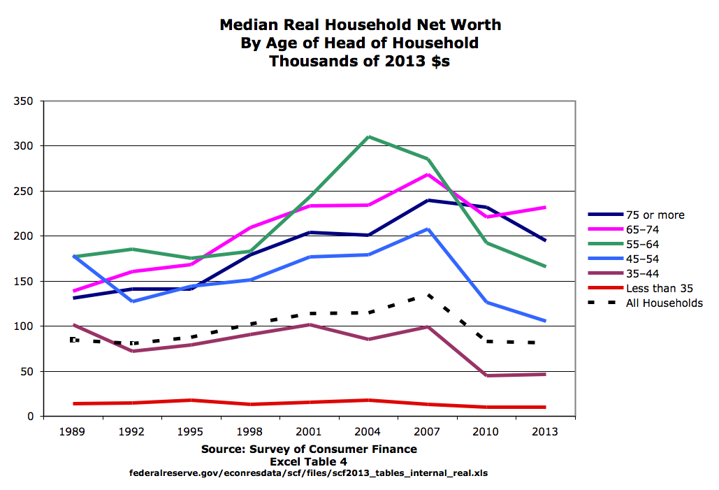
Key to understanding this graph: it’s not showing how individual households have changed — the age groups aren’t moving cohorts — it’s showing how the wealth of age groups has changed. People who are 65 today and have circa $232K (pink line, 2013) were in the 35-44 age group in 1989 and had circa $100K (dark red line, 1989).
The most obvious point: the typical American household is less wealthy today than the typical household in 1989 — down 4% from $85K to $81K. (So much for “the shining city on the hill” and the vaunted promises of trickle-down, supply-side, baby-drowning government, etc. etc. Would this measure look better if the Reagan Revolution had never happened, or never reached the fever pitch it has attained? That is the question, isn’t it? My answer: Yes. Profoundly better.)
Next: The typical elderly household (65+) is richer today than the typical elderly household was in 1989. The typical younger household (under 65, but especially under 55, and especially under 45) is poorer than it would have been in 1989.
(If you’re 65 or 66, please excuse me calling you “elderly.” It’s just a convenient shorthand.)
Another significant feature to note: the lines are more spread out on the right than they are the left. So elderly households are more richer relative to the youngest households than they were in ’89.
You may wish I’d zoom in so you can better see change in the youngest age group, but I’ll do you one better. Here’s a graph that shows changes in median wealth for different age groups:
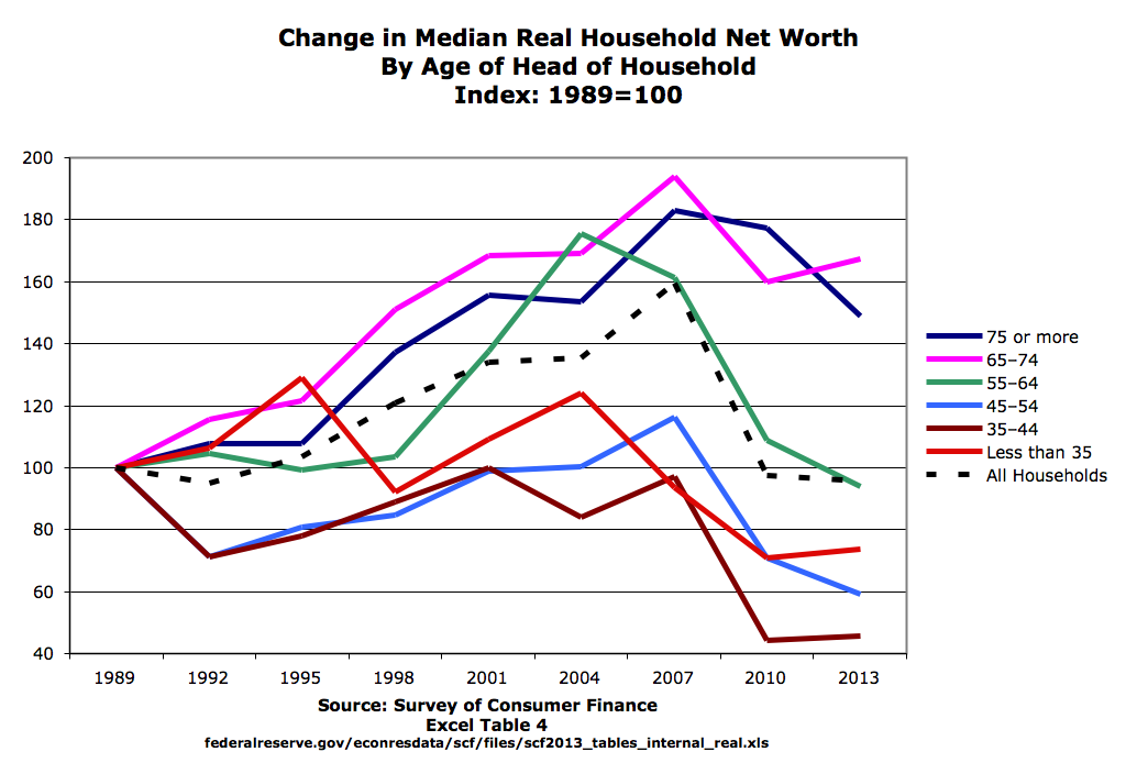
The typical elderly household is circa 60% richer than they would have been in 1989. All other age groups are poorer than their 1989 equivalents. 35-to-44-year-olds in 2013 are almost 60% poorer than that age group was in 1989 — exactly the inverse of older households. (The dotted line shows the aforementioned 4% decline for all households.)
“We’ve been transferring money to the elderly!” Right? That’s certainly or probably true, but it ignores a key demographic trend: people are living longer. So: 1. They have more time to accumulate wealth, and 2. Their children inherit later in life. And the proportion of people in the higher age groups is larger than it was in the past. How should we think about that, analytically and normatively? Further research needed.
Also worth noting in this graph: before the recent…debacle of 2007–2009, the median wealth of older households grew a lot, while younger households held generally steady. No age group got (much) worse off, while older groups got much better off. Sounds okay, though not stellar. The Great Whatever greatly accentuated that old-young distinction, eviscerating the median wealth of all but the aged while leaving the typical elderly household mostly untouched. (See: Recessions Are Nature’s Way of Keeping the Little Guy Down.)
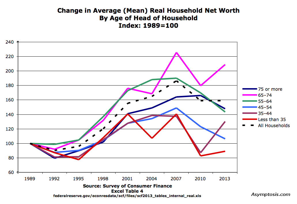
Next, average (mean) net worth by age group:
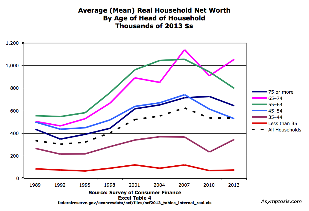
Similar, but quite different.
Older households are a lot richer today, by this measure, as they were by the median measure. (Much less true for the 75+ group.) Younger groups didn’t dive post-2007; they’re closer to the same. The 45–54s fall somewhere in between, and All Households are up a reasonable amount.
This is mostly explained by increased (and varying) wealth concentrations at the top — across all households and within each age group — which I’ll look at below. The shape of the wealth distribution has changed. Just to help visualize that, here’s how income distribution has changed.
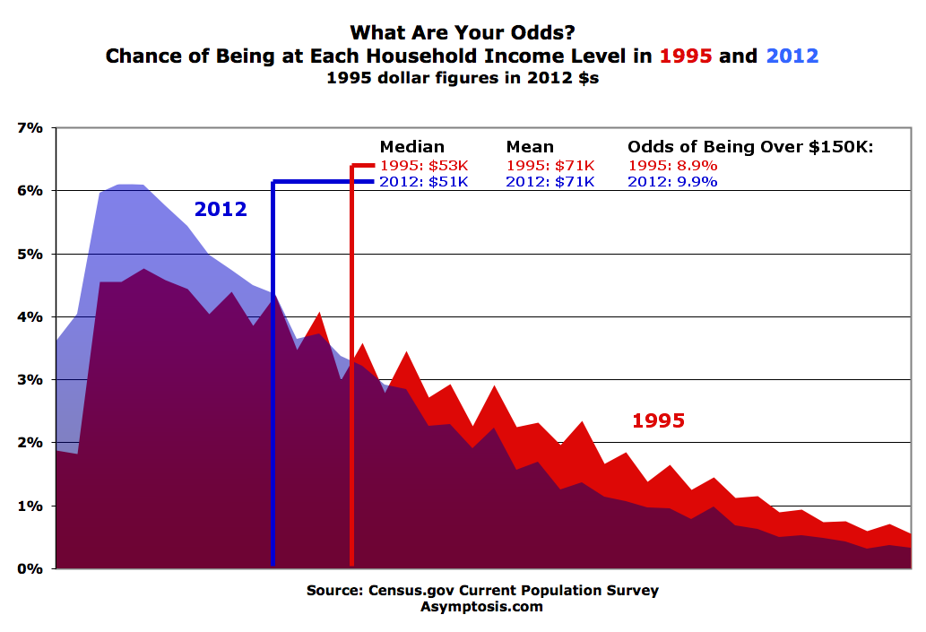
(The right side of this graph is cut off because the CPS doesn’t break out income levels at the upper end of the spectrum. )
Like the median graph, the mean graph shows a big increased spread going from left to right — older households are generally more richer today relative to younger households. Here’s a look at that change:
There are too many possible interactions going on in this for me to say much. But it seems to be influenced by the rising importance of big incomes at the top of certain groups when it comes to wealth building. Means get pulled around by big concentrations at the top, and that may be what’s happening, for instance, with the 65-74 group — a relatively small number of households in that group (company-owner and CEO-headed?) building extraordinary wealth in recent years. Those over 75 and 55-64, not so much.
All this shows us differences between age groups, now versus then. But what about inequality? Here’s a shot at that:
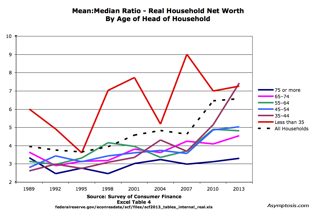
This is a fairly standard measure of inequality, wealth concentration at the top, here showing that measure within age groups over the years. (You could also compare the top 10% to 50%ers or to the bottom 90%, pull a GINI index, etc. This one’s handy.)
The most pronounced change is in younger groups. In 1989, the average (mean) 35-44 household was 2.6x richer than the typical (median) 35-44 household. In 2013, the ratio is 7.4x. The ratio has grown for every age group except 75+, though not nearly as much as for households under 35. For all households, the ratio has gone up from 3.9x to 6.6x.
And finally, just so you can collect the whole set, here’s the change in Mean:Median ratio over the years:
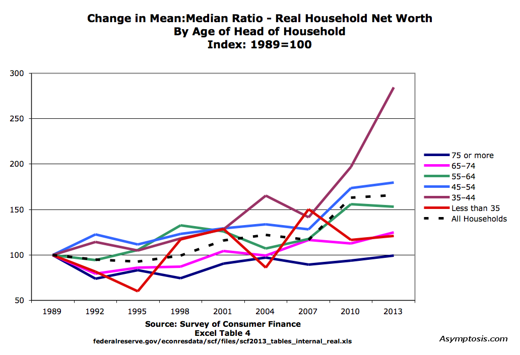
If you were in the 35-44 age group in 2010, or are in it now, you were, are, in a very competitive winner-take-all group compared even to similar households in 2007 — much less 1989.
All of these measures tell us that wealth inequality/concentration, growing wealth inequality, is a very real thing, even when you take age into account. Matt Bruenig came to a similar conclusion about the current state of age and wealth, presenting it in a graph that you may find more useful if less detailed than mine:

If you’ve read this far, you should read Matt’s whole post. It’s short and sweet.
Wealth inequality is extreme within all age groups. And as I’ve shown, it’s been getting more extreme. This especially for young households — both competing with their peers, and competing with older households.
Those are important conclusions. Wealth inequality data, pace Sumner, is not “nonsense on stilts.” It just requires some plodding, diligent legwork. Isn’t that what professional economists are supposed to do for a living?
Here’s the Excel source file I used (22mb). See Table 4:
http://www.federalreserve.gov/econresdata/scf/files/scf2013_tables_internal_real.xls
Here’s my spreadsheet, with the mean/median net worth data in more tractable form:
http://www.asymptosis.com/wp-content/uploads/2014/09/Mean-median-wealth-age-scf.xls
I’d be delighted to hear suggestions about other ways to look at this, and conclusions that might be drawn. And of course, please point out any errors.
Cross-posted at Asymptosis.
I don’t have a suggestion for the best way to adjust for it, given your underlying methodology of looking at net worth, but leverage ratios have increased since 1989 (= more debt/assets; Table 12) across almost every cut that the data is presented, and in some cases have doubled, yet debt burdens (debt to family income) haven’t increased nearly as much, and for the median family have declined.
If families (generally speaking) spend what they earn (and savings rates have declined over this period), and are roughly keeping their debt burden constant, the result is more borrowing as interest rates have declined, which all else equal makes people look poorer on a net worth perspective when measured by assets less liabilities.
The problem with adjusting is there is a cost to risks associated with increased leverage even if it’s not reflected in debt burden and how does one account for lower savings rates, whereby income is converted to wealth over time.
@M.Jed: Would be nice to see graphs of (depending what’s available) median/mean debt/assets, debt/income, and/or debt/net worth. Not sure what they’d reveal, but…that’s why I do them.
If you can put the numbers into a table like the ones in my spreadsheet, it’s easy to duplicate one of the charts, replace the data series with the new ones, tweak the Y axis and titles…
That’s assuming they have the data using the same age groups.
Two things I wonder abut the data.
How much of the household wealth is tied up in the house? The elderly are likely to be closer to paying off the house, so a swing in housing prices will have a larger impact. (but the 55-64 age range has the largest swing according to your charts – empty nest downsizing?)
How is the value of defined benefit pensions evaluated? I am 53. I have no pension, only 401k. My coworkers only a few years older than me do have pensions.
http://economistsview.typepad.com/economistsview/2014/09/links-for-9-13-14.html#comment-6a00d83451b33869e201b7c6df4b06970b
Anne and New Deal Democrat over at Economists View discuss….
The guys over at fivethirtyeight, the statistics, polling, sports guys, Nate Silver’s outfit, have this on the subject:
http://fivethirtyeight.com/features/the-american-middle-class-hasnt-gotten-a-raise-in-15-years/
Roth
don’t take this as adversarial, it’s only “how it looks from here”
i don’t think you are on the way to talking sensibly with a discussion that complicated at that level of abstraction, though i know the professionals love that sort of thing. could keep the “debate” going for a thousand years at that rate.
i assume there is some degree of “inequality” and it is growing and that it might be something that needs to be worried about because of social, political, and economic consequences.
but i don’t think either the economics “is it or isn’t it?” discussion helps, and I don’t think the people who think “inequality bad equality good” help.
suppose it were the case that the “poor” were doing just fine… well housed well fed well educated and with sufficient leisure to live a human life. but that, say, there were a few people who had ideas for a product they could sell to a hundred million people for one dollar and that mostly profit. Those hundred-millionaires would be much, much richer than “the poor.” Is that a problem? Even if they don’t mind paying enough in taxes to support the needful work of the government ?
I don’t think it’s necessarily so.
Of course we don’t have that kind of inequality. What we seem to have is some great wealth essentially stolen by criminal business practices, and we have some poverty so degrading that no society can tolerate it. That’s what needs to be fixed.
But if your standard of pernicious inequality is that some people drive Lexus while you only can afford a Ford, or some people drink Starbucks while you have to settle for Big Gulp… this is essentially a quote from one of our regulars at AB… then I think you are suffering from pernicious envy… and I hate making the right wing AH sound right.
So if you want to “talk sensibly” about inequality… begin by identifying the problem, and then try to put it in terms that the honest layman can understand. Your professional work will profit from the clarity.
I think