Why Spending/GDP is a Terrible, Horrible, No Good, Very Bad Metric For Judging Obama’s Performance
A post like this really shouldn’t be necessary, but part of the right wing canard that Obama has been a profligate spender is based on spending as a percentage of GDP.
It looks like this – Graph 1.

Sure enough, by the end of Clinton’s term the ratio had fallen from Reagan’s high of 24% to a modern low of 19%. But note that the 19% value wasn’t typical. It was the end point of a decade-long decline. And, yep, there’s Obama with an all-time-high approaching 26%.
What otherwise intelligent, and sometimes even famous people seem to ignore though, is that every ratio has not only a numerator but also that ol’ devil denominator. Let’s have a look at both of them. Graph 2 shows GDP and Expenditures since 1980, expressed in $ Billions. I’ve also added a line representing 5* Expenditures, since 20% of GDP is a reasonable rough estimate for the post WW II era.

Actually, the 5x Expenditures line runs pretty consistently above the GDP line, telling us two things that we should have already known from looking at Graph 1. First, Expenditures greater than 20% of GDP have been the norm since before 1980, and 2) Clinton’s final number is not representative of anything other than a single year. Using it as a comparator is cherry-picking and fundamentally dishonest.
The 5x line also emphasizes that the majority of the spending increase under Obama unavoidably occurred during the officially designated recession. The GDP line shows that, post recession, GDP growth has not recovered to the pre-recession trend line. In fact, growth has established a new trend line with a lower slope. This is unprecedented in the scope of FRED historical data. My guess is that insufficient Federal spending has been a big drag on this recovery. But it’s also true that GDP growth has been in secular decline since the Reagan administration. Note that skewing the denominator down will automatically skew the ratio up. This is what Bill Clinton calls “arithmetic.”
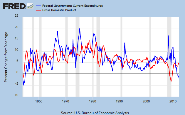
Slicing across this a different way, Graph 3 gives us year-over-year percentage growth in Expenditures and GDP, dating back to the Eisenhower administration.
A few simple observations:
– The spending increase during the recent recession was modest by any standard, and dwarfed by earlier surges.
– That increase, coupled with the most severe GDP decline since the other Great Depression gave our beloved ratio a terrible, horrible, no good, very bad double whammy.
– GDP growth during this recovery is only marginally better than it was during the 2001-2 low, and far below Clinton era levels.
– Clinton was the most consistently frugal president of the post WW II era – until now.
– Since the recession was declared over, B. Hoover Obama has been miserly.
One can legitimately argue that Obama’s approach to the economy has been excessively conservative. Krugman has made this point repeatedly. I often say that Clinton governed to the right of Eisenhower – who was a genuine deficit hawk – and that Obama is to the right of Clinton. That is intended to be slightly hyperbolic, but using this data as the benchmark, it’s dead on.
Any questions?
Cross posted at Retirement Blues
One question – why do you continue to attempt to defend the indefensible. We are drowning in debt – period.
Because of our low taxes and high military spending. Period.
JzB- What metric do you suggest?
Anon –
First off, your comment is both a naked assertion, and essentially meaningless. What does drowning in debt mean? What are its bad effects? Educate me.
Second, where do you see me defending anything?
Facts are facts, and I simply point them out and draw the conclusions that the data demands.
Oh – BTW – the debt we actually are drowning in is PRIVATE debt not PUBLIC debt. Your homework assignment is to go learn about it. FRED is a good starting point.
Interest rates are at historical lows. The governemnt can borrow money just about for free. This is the perfect time to pile on debt and get the economy moving.
A subtle, but obvious point I should have made in the post is that federal spending feeds into both the numerator and the denominator. That being the case, what meaningful information does the ratio give us?
I think it borders on nonsense.
JzB
little john –
I don’t think any single metric gives an accurate picture. And any metric has to be viewed in the context of its secular trend.
But that isn’t always good enough either. The current circumstances are unprecedented in my life time, so interpretations can’t be reckless.
I’m open to suggestion on metrics – as long as they are used honestly.
Despite the misgivings I expressed about spending/gdp in the previous comment, there is nothing fundamentally wrong with ratios. They have to be used intelligently, though, and that means understanding that the numerator and denominator both influence the number.
The hazard is that the ignorant or unscrupulous will use the number to mislead. It is that type of error that I am refuting.
JzB
JzB,
Ok, since you seem to not comprehend the current situation, let’s put a fact (and meaning) behind the naked assertion – the US debt is now $136,260 per houshold, a figure that is up 50% under Obama. If you need to be educated about the bad effects of this then there is no point in discussing it further.
Interest rates are indeed at historic lows. But the funny think about interest rates (as well as all markets) are that they are chaotic, nonlinear and unpredictable. In five years we could be looking at rates several times more than they are now (especially if the dollar loses its reserve status). To claim that the US debt will not have any ill effects under most future scenarios is ludicrous.
When economic assertions are made on a partisan basis (by either side), they don’t educate, they only inflame.
Anonymous
there is certainly no point in “debating” with you. you give us a big number… to six decimal places… that doesn’t mean anything, but it scares you stupid.
Anon –
Debt is the accumulation of deficits. Deficits are the difference between revenues and expanses.
Revenues are down because of the recession and historically low tax rates. Expenses are up because of the recession.
In 2009, expenses shot up and have been close to flat since. Revenues fell sharply, and have been close to flat since. The gap is about 1.3 trillion per year, ’09 though 11.
Expenses are flat, but the gap stays wide because the economy is still sluggish and tax rates are low, so revenues are also flat.
Year Rcts Exps S or D
2000 2,025.2 1,789.0 236.2
2001 1,991.1 1,862.8 128.2
2002 1,853.1 2,010.9 -157.8
2003 1,782.3 2,159.9 -377.6
2004 1,880.1 2,292.8 -412.7
2005 2,153.6 2,472.0 -318.3
2006 2,406.9 2,655.0 -248.2
2007 2,568.0 2,728.7 -160.7
2008 2,524.0 2,982.5 -458.6
2009 2,105.0 3,517.7 -1,412.7
2010 2,162.7 3,456.2 -1,293.5
2011 2,303.5 3,603.1 -1,299.6
Tell me what you expect Obama to do about that.
Then, please tell me what part of my analysis was partisan.
I’m pretty sure I know what part of yours is.
JzB
“First off, your comment is both a naked assertion, and essentially meaningless. What does drowning in debt mean? What are its bad effects? Educate me.”
Oh, stop!
Anonymous @ 3:41:00 said
the US debt is now $136,260 per houshold
meaningless figure; government debt is not like houssehold debt that has to be paid back; in fact it never is; some of that number you quote includes debt left from WW II and building the interstate highway system…
reducing the debt even effects us adversely domestically; Dr Randall Wray has shown that in each of the 6 times in US history where we had a depression, it was preceded by substantial budget surpluses and significant reduction of the debt; this was a concern of the Fed & bush administration economists early last decade; it became clear that if clinton surpluses continued & our debt was paid down, the financial system would soon experience a dearth of safe assets & would begin to lock up; so the bush tax cuts were initiated in order to keep levels of AAA assets high enough for the markets to operate..
Art –
As you well know, anon is talking about public debt; and as we both well know, that aint the problem.
“Drowning in debt” is emotionally charged language that communicates exactly zero content. Hence my follow up questions.
And what do I get in response?
If you need to be educated about the bad effects of this then there is no point in discussing it further.
A total cop out.
If a person has a position, let him defend it with facts and data.
That’s what I do, and I expect no less from anyone who challenges my position.
Beat me with solid information and erudite reasoning, and I’ll capitulate.
But I will not be shouted down by someone wielding ignorance and ideologically approved talking points.
JzB
@Arthurian: are you really defending the usefulness of THIS comment, on THIS blog? “One question – why do you continue to attempt to defend the indefensible. We are drowning in debt – period.” – Just as an exercise in English language, let alone logic, this post cannot be answered, as it really isn’t asking a question, it is making a statement. It is saying: “Jazzbumpa, your analysis and graphing of these numbers is irrelevant because the only thing that matters is debt, as I define it.”. It’s like someone from the cheap seats at townhall.com wandered here by mistake, saw the graph and, not understanding it, tried to pull the conversation down to his level of understanding. It is not only pointless, it is rude.
$136,000 is so bad. I wish my mortgage was so low!
That should be “isn’t so bad”.
The difference between FDG Expenditures today is that 70% are merely transfer payments where they were only about 10% as recently as 1960. Not all expenditures are created equally.
The better question is, how do you pay back debt when little or no knew wealth has been created? You show how Obama’s record is distorted by a couple of graphs, but what about the graphs you don’t show? What about a chart of future current government pension, social security, and medicare obligations? How about a chart of total debt versus total wealth?
In the past, increases in public and private debt corresponded with greater increases in net worth. We have added $5 trillion in debt and household net worth is flat since 2009 (still down compared to the bubble year of 2007).
The spending increase during the recent recession was modest by any standard, and dwarfed by earlier surges.
Er, yes and no. The Obama adminstration distributed a lot of social welfare spending via the tax code and then referred to this as cutting taxes. The Making Work Pay tax credit, the college tuition tax credits and the payroll tax cut were also devised along the neo-Keynesian idea of ‘putting money in people’s pocket. These types of tax cuts have no marginal supply-side effects, in fact they all phase-out at higher levels of income.
Think about it this way: If the Obama adminstration had not adopted these social welfare tax credits and tax holidays, and instead payed eligible households a welfare check equal to the value of these tax credits, what would be the result? Taxes revenues would obviously be higher and spending would be higher, but the deficit would be exactly unchanged.
As an earlier commenter pointed out, the modern day U.S. federal government is largely a transfer mechanism. When you attempt to pigoenhole every government initiative as either taxes or spending, you err in neglecting that a great deal of social welfare enhancement takes place via the tax code through refundable tax credits. Pretending that Obama is miserly because the spending side of the ledger does not display that revenue is foregone to enhance lower class social welfare and disposable income is a farce.
This type of social welfare distribution via the tax code has been growing with each new adminstration. If you recall, Dubya Bush had his two tax rebates in 2001 and 2008 as well as doubling the child tax credit. Before that, it was the Clinton adminstration that introduced the kiddie tax credit and the EITC has been expanded by Reagan, Clinton and Bush II.
Call it tax cuts, call it spending, call it whatever you darn well please — but be aware that a cut-and-dried measure of taxes and spending of the modern U.S. federal government does not exist.
Obama is to the right of Clinton.
I assume you’re joking?
Clinton, at least in terms of his economic policies, is arguably further to the right than Dubya.
Clinton signed NAFTA into law during his first term.
Clinton signed the Telecommunications Act in 1996 which allowed for the huge boom in telco spending via newly unleashed competition and also allowed for the first time, cross-ownership of media and distribution platforms.
Clinton cut the capital gains tax and introduced the Roth accounts.
Clinton also signed the 1996 Small Business Act which made it easier for businesses small and larger to register as S-corps under the individual tax code. One of the important aspects of the Act was to increased the number of shareholders an S-corp could have.
If that’s not enough, he also signed into law the always hotly-debated welfare reform bill.
Obama, on the other hand, has signed into law a public health care reform similar to the earlier rejected HillaryCare. Obamacare includes surtaxes on high incomes and capital income to pay for some of the reform’s associated costs.
Obama wants to retain current tax rates for middle and lower incomes, but believes high incomes deserve higher marginal and higher effective tax rates.
Unlike Clinton, Obama has not deregulated any industries or given greater tax and ownership flexibility to businesses and partnerships. The Obama adminstration has however invested directly into the auto companies and poured large subsidies into green energy.
Obama has attempted to use fiscal stimulus to aid economic growth — a mix of transfer to individuals, transfers to state and local governments and infrastructure spending. The Clinton administration did essentially none of this type of activity.
So, how is Obama to the right of Clinton? Other than pretending that the Obama adminstration has been sitting on its hands because its programs have been distributed partly through the tax code, where is the evidence that Obama is right-of-center?
The better question is, how do you pay back debt when little or no knew wealth has been created?
That is simply silly. Lot’s of new wealth has been created. The problem is that over the last 40 years, every penny of it has been captured by the top 50%, and that is steeply skewed towards the top.
JzB
Numeraire –
Your first comment is largely irrelevant to the point of my post.
These types of tax cuts have no marginal supply-side effects, in fact they all phase-out at higher levels of income.
So? Supply side effects in an aggregates demand shortfall situation are also largely irrelevant.
Your second posts is a long riff contra what I identified as a hyperbolic comment. But, hey – knock yourself out.
You’ve made a strong case for Clinton’s conservatism. But I don’t think you have Obama care right. It is not similar to HillaryCare. It is similar to what the Heritage Foundation proposed as a conservative alternative to HillaryCare.
Cheers!
JzB
I’m out for the rest of the day. If there are more comments, I’ll respond tomorrow.
JzB
apparently noone noticed my point that government debt should not even be paid back…even talking about reducing spending & debt when our long term interest rates are negative is a misdirection…at this time, the treasury will make money off of every dollar it borrows…its a once in a lifetime opportunity to invest in our future…
rjs
can’t honestly say i noticed, but “not paying off the debt” is pretty much the way things have been done since England invented the national debt about 300 years ago.
even the debt to Social Security needs never to be paid off. the growth in the economy, and the required Trust Fund balance will grow fast enough to reach the current balance (decreasing as a percent of “required”) before any of it needs to be paid back.
what this does, of course, is leave some interest being paid in perpetuity… but that interest is itself a decreasing amount relative to the size of the economy. and of course, the “original owners” of the debt have long cashed out so even the “unpaid” debt is really new debt bought by (owed to) some new person who thought it was a good deal.
what worries me a little, because i don’t completely understand these things, is if the new debt bought by the SSTF is paying that low, low rate of interest that you cite, what effect will that have on the required tax to ‘pay as you go.’ (I think it turns out to be not much… as 5% nominal interest on “one year’s reserve” turns out to be 5% of 12% of payroll, or about 0.6%… not enough to cry about if the 5% turns into 1%.)
Anonymous et al
what you are overlooking with your obsessive “supply side” understanding of the universe is that there are other factors to consider. i don’t have the time or heart to go into them again here..
but as for what you do with new debt that doesn’t result in increased supply…
well, you pay it back. it goes like this, see, if i borrow money and lose it at the track, then i have to cut my champagne budget for a week or two in order to pay my bookie.
on the other hand, if i am a sovereign nation, i can just wait for inflation to render the debt insignificant. this is not as much fun as “growth” but it is not the end of the world either.
try to keep in mind that the “cost” of the debt has already been paid. someone traded “dollars” for goods and services. that someone took “paper” in return for those dollars, knowing full well there was some risk of not getting back all of what he paid. it’s called “risk.” a part of capitalism that capitalists used to understand before they started fooling themselves that the government had a moral obligation to take the risk out of capitalism even if the people had to starve.
So? Supply side effects in an aggregates demand shortfall situation are also largely irrelevant.
That’s exactly my point. These “tax cuts” are purely Keynesian and designed to enhance social welfare and increase aggregate demand. They require no change in marginal behavior and are simply social welfare transfers that take place via the tax code.
How well have these measures worked to enhance aggregate demand? It’s fairly obvious they’ve made little or no difference.
Your second posts is a long riff contra what I identified as a hyperbolic comment. But, hey – knock yourself out.
Is the extent to which that you are going to defend the crux of your post? — namely, that the Obama adminstration has sat on its hands and been stingy and miserly. Give you readers more proof of your assertion.
But I don’t think you have Obama care right. It is not similar to HillaryCare.
It’s irrelevant, both programs offer greater public control and regulation of health insurance and mandate and subsidize insurance. The difference being that in the Clinton era of government, there was not enough progressive traction to pass such legislation.
“The difference being that in the Clinton era of government, there was not enough progressive traction to pass such legislation.”
No! Actually in the Clinton era of government, there was not enough conservative traction since Obamacare is actually the conservative’s position at that time.
No! Actually in the Clinton era of government, there was not enough conservative traction since Obamacare is actually the conservative’s position at that time.
Yikes, more hair splitting! So both parties had proposals for greater public control of health insurance in the Clinton era, yet no legislation was ever enacted.
Politicians proposals and promises often run the gamut of the political spectrum in an attempt to secure votes, but we are measuring what actually gets passed into law, aren’t we?
Does any of this change the fact that Obama has not in fact governed to the right of Clinton? That was the claim the author made in his/her original post.
“These “tax cuts” are purely Keynesian and designed to enhance social welfare and increase aggregate demand.” Numeraire
Enhance social welfare? Please be more specific as to whose welfare is enhanced and how that occurs. It sounds like that much misused comment about wealth transfer, but that’s usually noted in regards to tax increases. Still a canard in this country as most tax revenue is spent on government activities that have little to do with the welfare of the poor or working classes. When you say wealth transfer try to be specific as to who its transfered from and who to.
Jack,
Read my earlier comments for proper context. The Obama administration has extensively used tax credits and the payroll tax holiday as Keynesian measures to enhance social welfare.
Conceptually, a tax credit that enhances social welfare is no different than a spending program that does the same. This is especially true is the tax credit is fully refundable.
Jazzbumpa tells us that spending/gdp is a terrible, horrible, no good, very bad metric. I agree with him but for completely different reasons. He suggests that the Obama adminstration has sat on its hands and been miserly — I counter with the fact that the Obama administration has taken the trend of social welfare distribution via the tax code and Keynesian tax cuts to a higher level than any preceding administration.
Jazzbumpa is overlooking or perhaps even denying that the primary actions of the federal government involve making transfers to individuals. Furthermore, because these transfers increasingly take place via the tax code, there is less distinction between taxes and spending. Transfers that used to take place via spending or not at all are accomplished today through tax credits and gimmicky Keynesian tax cuts.
The proper metric is how much is being spent, not the derivative thereof. Obama bumped spending way up and then didn’t cut back after the recession ended.
Numeraire,
I’d agree in part that tax credits are a form of wealth transfer, but I’d also be careful to point out that such transfers go to people at both ends of the wealth continuum. The payroll tax holiday is not a transfer and has the added distinction of encouraging workers to spend their retirement savings now because the government doesn’t want to give them a real tax cut because the President isn’t yet in a position to insist upon such a cut at only
low end of the income spectrum. Of course the most direct approach to deficit reduction is revenue enhancement, and the only source of additional tax revenue is that which the wealthy haven’t been asked to pay for the past dozen years.
“Obama bumped spending way up and then didn’t cut back after the recession ended.” Anon.
There should be a rule requiring full identification of anyone making such an invalid remark. Obama didn’t bump anything. Congress controls spending, and most spending has been for war materiel.
Given that the recession has, as you claim, ended we must now be in a recovery phase now. That being the case it would be counter productive to cut back spending given that lack of aggregate demand is the most often cited factor holding back full recovery.
“conceptually.. a tax credit is no different from a spending program.”
good. we can get rid of one of the words.
actually, getting rid of words was part of the program of “1984” (the book).
now me, i think giving people who have money a tax credit does not necessarily do anything for the economy as they might just sit on it and wait for better time.
but, conceptually at any rate, a spending program actually puts money into the hands of people to do real work, who may not have had any money before the spending program.
what a concept.
now me, i think giving people who have money a tax credit does not necessarily do anything for the economy as they might just sit on it and wait for better time.
This doesn’t apply to the Obama tax credit initiatives. Making Work Pay credit was only eligible for a single year; the college tuition credit was only available in the actual years of college enrollment. The payroll tax cut is a tax holiday and only on the employee portion of the tax.
Your argument is better suited for the enterprise side of the economy, things like investment tax credits and R&D credits.
but, conceptually at any rate, a spending program actually puts money into the hands of people to do real work, who may not have had any money before the spending program.
Fine, that’s the way you see it, but that’s not even what the argument is about. The discussion is not about the quality of the Obama administration’s initiatives, it is about the quantity.
Jazzbumpa insists that the Obama administration has sat on its hands because the spending side of the ledger has not moved enough to his liking — but that ignores the actions taken via the tax code.
Numerator
Actually the argument isn’t about anything at all. Someone… you?… has a relationship in his mind that may or may not be valid, but with both ends unanchored in any kind of reality, it is meaningless.
the point i was making was about the meaningless use of “conceptually… they are the same thing.”
now it could be me who doesn’t get it. but what i really don’t get is what is it you are saying… how does it affect the real world. or is it just numbers to stick into a theoretical model that doesn’t explain enough of anything to be very useful?
at some risk of being totally, utterly, horribly wrong
i thought the argument was this:
R’s accuse O of being a big spender. cite govspending ratio to GDP.
Jzz says, wrong metric: spending is not up so much as GDP is down (relative to some historical trent.)
this makes sense to me. spending needs to continue, and even increase, if certain things that need to be done are to be done… whatever the ratio to GDP turns out to be. there is no magic in any particular ratio to GDP. in fact, if GDP is down because the big lenders won’t lend, or the big investors won’t invest, or the big spenders won’t spend, the government may “have” to spend more in order to feed the people, not to say “stimulate” the economy.
Now Numerator comes in and says, “no. really O has been spending by cutting taxes. well that might be true, though it is just off-key enough to make me grind my teeth. “cutting taxes” is what got us into this mess (along with deregulation), and basically what is wrong with cutting taxes as a stimulus is that the people who pay taxes are the people who have money, and if they are afraid to spend it, they won’t. whereas actual government spending actually does pay people who had no money to do things that need to be done.. so “conceptually” at least “tax cuts” are NOT the same as “spending.”
But in any case.. the claim that tax cuts are the same as spending hardly seems to me to address the “original” argument.. .which is that O hasn’t been spending “more”, but the ratio of spending to GDP has gone up because GDP has gone down (relative to trend).
So, where did I get lost?
If I had to fault Jazz, I’d say his graphs are too cute by half. I find it very hard to follow what they mean. certainly the end of his “five times expenditures” looks like it increases hugely… but we already knew that, that’s where we came in.
and YoY is very hard to keep track of because whenever the spending is high, any decrease is going to look like a huge decline… but is it a decline relative to anything but the previous increase… i don’t know. i can’t think that hard.
i’d be more interested in a discussion of where the money has been spent, and does it “make sense” in some defensible understanding of the economy?
i find it a lot easier to understand “keynesian stimulus” than i do to understand all the magical ratios that are supposed to “optimize” something, but don’t seem to make anything better for real people.
i would even bet that sometimes tax cuts make sense. just not all the time. especially not this time.
I said:
Your second posts is a long riff contra what I identified as a hyperbolic comment. But, hey – knock yourself out.
Numeraire replied:
Is the extent to which that you are going to defend the crux of your post? — namely, that the Obama adminstration has sat on its hands and been stingy and miserly. Give you readers more proof of your assertion.
Which has me baffled. At that point, we’re talking about what was basically a throw-away line, and only peripherally related to the crux of my post, which had a narrow focus that I will now spell out in detail.
1) Right wingers lie when they accuse Obama of being a big spender.
2) In an earlier post, I showed actual spending data that refutes this claim.
3) The winger response is – but, but, what about spending/GDP?
4) I use real data and simple math to show that this is a dishonest approach.
What more kind of proof would you want? I’ve proven it twice, with real spending data and FRED graphs.
numeraire said:
These “tax cuts” are purely Keynesian and designed to enhance social welfare and increase aggregate demand. They require no change in marginal behavior and are simply social welfare transfers that take place via the tax code.
Yes they are Keynesian. That is irrelevant to my point.
And you can transfer via the tax code all you want. That effects the revenue side of the ledger does not constitute spending.
Cheers!
JzB
Another excellent example of innovation, I am happy to locate it. There are so many developers working on this segment but this is one of the best innovative idea ever.IFSC Codes
Jzz says, wrong metric: spending is not up so much as GDP is down (relative to some historical trent.
Spending/GDP rose rapidly during the recession because the denominator shrunk and the numerator rose sharply because of active increases in spending (fiscal stimulus) and the rapid growth in the automatic stabilizers. Jazz and I can both agree on that.
Jazz, though, makes the claim that Obama has been miserly since the recession ended. However, his graph does not bear this argument at all.
Spending has grown only modestly slower than nominal GDP and that may be entirely because as GDP and employment began recovering, the spending on automatic stabilizers and the social safety net would have moderated (having increased so rapidly during the recession).
If the Obama administration had indeed been “miserly” as Jazz believes, then the magenta line on his graph should be rapidly hurtling towards the blue line. That’s not happening — government spending is still well beyond its historic relationship with GDP as evidenced by the gulf between the two lines.
The reason it is not happening is because the Obama adminstration has kept spending at the higher plateau that the recession + fiscal stimulus initially created. Add that to the fact that Obama has used the tax code extensively to put money in the pockets of low and middle income individuals (no different from social spending) and you end up with historically large deficits.
1) Right wingers lie when they accuse Obama of being a big spender.
That’s no lie. Spending has remained at an elevated level even as the growth in automatic stabilizers moderated post-recession. Your graph shows quite clearly the gulf between normalized spending/GDP and current spending/GDP levels.
Your quarrel seems to be that the Obama administration has not maintained the rate of spending present during the recession, which would require coming up with new spending plans to substitute for the declining rate of growth in automatic stabilizers.
And you can transfer via the tax code all you want. That effects the revenue side of the ledger does not constitute spending
That’s precisely why more and more distribution takes place via the tax code; it is more politically palatable in American politics to be able to claim that one did not raise spending but they did cut taxes. Obama is on the campaign trail as we speak, telling middle-income voters how much he cut their taxes through social welfare tax credits and tax holidays, instead of giving them a welfare check of the same amount. Makes no difference to give it away through tax credits or spending, the deficit stays the same size either way.
This comment has been removed by the author.
Numeraire –
Jzz says, wrong metric: spending is not up so much as GDP is down (relative to some historical trent.
If you are going to quote me, quote me. Do not put your interpretation of my words into my mouth.
I made no comparison as to which changed more.
If the Obama administration had indeed been “miserly” as Jazz believes, then the magenta line on his graph should be rapidly hurtling towards the blue line.
Are you being obtuse, or do you not know how to read a graph? Or maybe you expect the ship of state to turn on a dime. Before the magenta line can turn south it has to level off, and it has done that.
Spending has grown only modestly slower than nominal GDP
How can you look at graph 2, and especially graph 3 and make this statement? Spending growth has gone negative. Even graph 1 shows a drop at the end.
I don’t mind having an extensive discussion or point-counter-point on substance, but it is really tedious to have to repeatedly go over points I have already made, correct mis-statements and graph-reading errors, and chase down marginally relevant side tracks.
JzB
Jzz says, wrong metric: spending is not up so much as GDP is down (relative to some historical trent.
OK – Apologies to numeraire, who was quoting coberly.
Dale I mostly agree with your 9:00 comment.
But – Numeraire has hijacked the post with irrelevant and off-topic comments and generally being obtuse. This does not promote meaningful and informative discourse.
JzB
Obviously, I was referring to spending growth relative to nominal GDP since the recovery began. That is why the ratio between the two is at the elevated level.
And you should really dig deeper as to why the federal budget has shrunk, it’s because welfare spending has moderated and the ARRA-related spending disappeared, not because the various gov’t depts. have seen their budgets decline.
I also haven’t sidetracked on anything — except for my reply to coberly, I quoted directly from things you wrote in your original post.
You can try to pretend that I am mostly misinterpreting or misquoting you, but I feel I raised many important points and exposed a few flaws in your arguments.
jazz
i agree that Numerator has gone off on a tangent of his own.
my only “criticism” of you was that your graphs were not compelling. this is not a disagreement with you. It’s just that when a graph is of a derived concept, it is hard to hold in my brain exactly what is being compared to what. Hence, i was asking for a more straightforward argument… keep it simple for me.
Numerator
i went back through and really tried to understand what you are getting at. I think you may not realize that you keep referencing things that are truths in your own mind. You do not make a case. You make an assertion, that no doubt seems true to you, but leaves the rest of wondering “what the hell is he trying to say?”
I would be inclined to agree with you that Jazz’s magenta line does not make his case nearly as clearly as he would need to to convince a skeptic. But i’d also agree with him that the government can’t turn on a dime. or even a quarter.
note that GDP is till down relative to trend. that leaves room for spending/GDP to be still up relative to trend without “excessive” spending.
i really don’t like either of your arguments. i think Jazz has the advantage of actually being right. But i’d rather see an appeal to “real world reason” and not some magic ratios.. another way of saying i don’t give a damn if spending is up down or sideways. what i care about is that whatever they are doing is actually helping “us”… which, and here i think i agree with you… which it is not doing.
in fairness to jazz
he was not obligated to offer real world reasoning. his purpose was merely to point out that “spending/GDP” was a misleading… dishonest… measure of “spending.” which it is.
but i didn’t need a graph to tell me that.
Dale –
This is a follow-up post to my previous one.
http://www.angrybearblog.com/2012/09/a-quick-look-at-federal-spending.html
I showed there that Fed spending leveled, and the rate of spending increase dropped off a cliff.
I put this post up in response to comments about spending/GDP.
These posts are in no way intended to critique Obama, positively or negatively. The intent is to expose lies. That is never well recieved.
And, of course, I’m looking at these variable in terms of their historical trends. That provides context, and without context, a number is just an abstraction.
And also, of course, Anyone saying Obama is profligate has to be implicitly comparing trends vis-a-vis to someone who wasn’t. And according to the Forbes article linked by rjs in comments to the first post, that would be Eisenhower. Nobody else even comes close.
These facts are uncomfortable to those who have a need to see it differently. As these two posts how demonstrated, there is nothing you can do to help them.
JzB
jazz
i agree entirely. though it is never wise to incorporate a previous post by assumption.
Jazz can attempt all he wants to draw broad conclusions from looking at squiggles on graphs, but here is the reality;
FY2009 spending was $3517.7 billion, FY2012 is projected to come in at $3795.6 bilion. That is growth despite the fact that unemployment relief has declined $50 billion and other and other spending (namely ARRA and mortgage relief) has declined $175 billion.
In other words, the primary cause of slowing gov’t spending since the recession ended is the decline in automatic stabilizers.
I’d said Jazz is suffering from threshold illusion and that is likely what is clouding his thinking. It is impossible to deny that government spending rose rapidly during the recession because of automatic stabilizers and discretionary spending. This established a higher threshold level of government spending from which spending grew post-recovery. The recovery in GDP and employment naturally pushes down the value of the automatic stabilizers slowing the pace of growth of total expenditure.
Here’s an analogy: Let’s say gov’t spending is like climbing stairs. The previous trend was to climb stairs two at a time. Obama comes along and leaps four stairs in a single bounce. After that amazing feat, Obama then only climbs a stair, sometimes two, at a time. Jazz claims that Obama is not climbing stairs fast enough, even though Obama has made it furthest up the staircase. That’s threshold illusion.
Left-wingers want it both ways. Krugman et al. validly claim that spending during the recession grew rapidly in part because of automatic stabilizers. Then when the economy improves, the decline in automatic stabilizers is counted as part of gov’t austerity.
Numerator
your logic is uncompelling.
i am not much of a left winger myself. but you kind of explain your logic by your reference to “left wingers…”
you ignore a lot and make up more in order to reach a conclusion you want to reach… again and again. it makes you happy and it makes you feel smart.
but it is ultimately just another thought disorder.
Jazzbumpa you said:
“One can legitimately argue that Obama’s approach to the economy has been excessively conservative. Krugman has made this point repeatedly. I often say that Clinton governed to the right of Eisenhower – who was a genuine deficit hawk – and that Obama is to the right of Clinton. That is intended to be slightly hyperbolic, but using this data as the benchmark, it’s dead on.”
It is ironic that it’s actually Democratic Administrations that have the lowest amounts of spending in recent years.
Though I think that this has been a brilliant coup by the Republicans in achiveving this-Jude Wanniski made this argument in the 70s.
You can say for Clinton that if federal spending was cut, it was during an economic boom at least not during a recession.
What’s happened under Obama I’m not sure is mostly his fault. If the GOP Congress had passed his AJA we would be creating far more jobs.
It’s been the drop in state and local jobs which is the real problem.
Then again we don’t look so bad comapared with Britian-Cameorn is basically the British version of what a Romney Administration would look like