Debt, Recession, and That Ol’ Devil Denominator
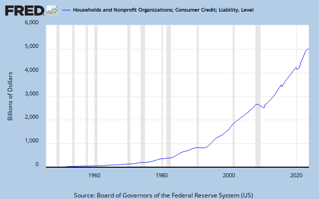
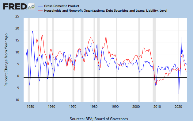
Krugman recently presented this graph, showing household debt as a percentage of GDP.

and made this comment.
Second, a dramatic rise in household debt, which many of us now believe lies at the heart of our continuing depression.
There are those who seem to believe that if Krugman says it, it must be wrong. Here is Scott Sumner’s reaction.
What do you see? I suppose it’s in the eye of the beholder, but I see three big debt surges: 1952-64, 1984-91, and 2000-08. The first debt surge was followed by a golden age in American history; the boom of 1965-73. The second debt surge was followed by another golden age, the boom of 1991-2007. And the third was followed by a severe recession. What was different with the third case? The Fed adopted a tight money policy that caused NGDP growth to crash, which in turn sharply raised the W/NGDP ratio. Krugman has another recent post that shows further evidence of the importance of sticky wages. Forget about debt and focus on NGDP. It’s NGDP instability that creates problems, not debt surges.
Bold emphasis is provided by Marcus Nunes, who goes on to say:
Why does the share of debt rise? I believe it reflects peoples “optimism” about future prospects. In the chart below I break down Krugman´s chart and separate mortgage and non-mortgage household debt as a share of NGDP. I also add the behavior of the stock market (here represented by the Dow-Jones Index).
[See the linked Nunes post for his chart.]
Eye of the beholder, indeed. Nunes makes an expectations-based argument, and adds:
Non-mortgage debt remains relatively stable after 1965, fluctuating in the range of 17% to 22% of NGDP. No problem there.
But the reality is that non-mortgage debt has grown quasi-exponentially in the post WW II period.
Sumner, as always, beats the NGDP drum.
My friend Art takes a jaundiced view of the Sumner-Nunes interpretation. He gets it exactly right. To see why, let’s go back and have a look at the data. Here is straight CMDEBT (Household Credit Market Debt Outstanding,) presented as YoY percent change – not distorted by a GDP divisor.
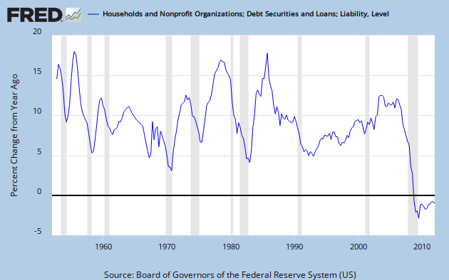
Sumner sees a debt surge from 1952 to 1964. I see a secular decrease in the YoY rate of debt growth from over 15% to under 5% by about 1966.
Sumner sees a debt surge from 1984 to 1991. I see a decrease in the YoY rate of debt growth from over 15% to about 5% over that same span.
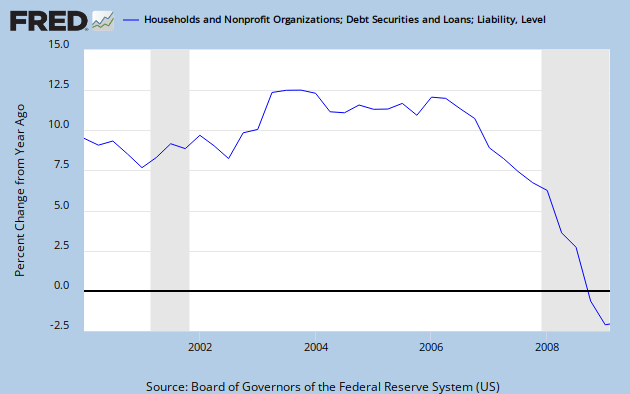
Sumner sees a debt surge from 2000 to 2008. I see a modest rise into a broad peak between 2003 and 2006, with a net decrease in the rate of debt growth over the 2000 to 2007 period. In CY 2008 debt growth goes negative. Here’s a close-up view.
So much for optimism-fueled debt growth.
Between the non-existent debt surges Sumner sees a golden age from 1965 to 1973. I’m a bit puzzled by a golden age boom that straddles one recession and leads directly into another; though I will admit that average GDP growth then looks impressive compared to the GDP growth of the last decade. But the thing that Sumner misses within his “golden age” is the big debt surge from 1971 to 1974.
By my reckoning, Sumner is incapable of identifying either a debt surge or an economic boom.
So what is going on here? Sumner and Nunes either fail to realize or deliberately ignore that the quantity CMDEBT/GDP has a denominator. Let’s look at GDP. Here is YoY GDP growth over the post WW II period. And, of course, this is NGDP – not inflation adjusted – the very quantity to which Sumner ascribes so much gravitas.
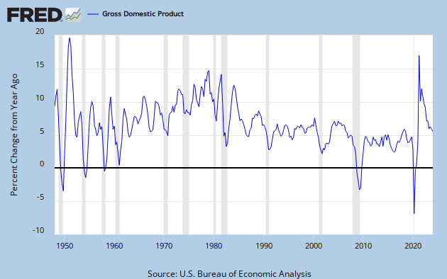
The average GDP growth over the period 1948 to 2007 is 7.04%
The average over the “debt surge” period 1952 to 1964 is 5.35%
The average over the “debt surge” period 1984 to 1991 is 6.85%
The average over the “debt surge” period 2000 to 2007 is 5.24%
What we have are three periods of below average GDP growth, two of them substantially so. The middle one is only slightly below average, but that is misleading since there is a steep decline in GDP growth over the period.
Consider C = A/B. If B is small or decreasing, it will tend to make C large or increasing. To ascribe all of the changes in C to changes in A is to ignore that Ol’ Devil Denominator.
Sumner does bring up NGDP growth late in the passage quoted above, but I don’t get his point. If I’m reading him correctly, he claims that NGDP growth crashed between 2000 and 2008, and that caused the Debt/GDP ratio to rise. But NGDP growth was sharply up from 2001 to 2003, relatively steady through 2006, and never crashed until 2008. If there is any sense in his argument, somebody will have to explain it to me.
What actually happened was a real debt surge – but it was between 1997 and 2004. Meanwhile, GDP growth both before and after the 2000-2003 dip was around 6 to 7%. Then, in 2006, household debt growth and GDP growth both started to slump, and in 2008 took a nose dive together.
Sumner and Nunes have made a very fundamental error – not so much in the math itself as in the application of logic. This is sloppy thinking, and any conclusions drawn from it must be highly suspect.
To get a handle on what is really going on, let’s look at debt growth and GDP growth together.
They don’t move in lock-step, but the similarity is striking. Specifically, every recession except 2001 corresponds exactly to a minimum in debt growth. So Sumner’s advice to “forget about debt” looks like it’s missing something very important – specifically that the household component of spending [aka GDP growth] has been debt financed. To put it in context, have a look at Krugman’s first graph in the article linked above. It shows what we all know, but some chose to ignore – that median wages have stagnated for 40 years.
In my narrative, the reason household debt grew to almost 100% of GDP is that stagnating incomes have not been able to support the cost of the American life style – due to decades of inflation, but probably largely driven by the costs of health care and education. Remember – contra the prevailing view of economists today – spending, and therefore GDP growth, is directly dependent on income, not on wealth.
Debt is a useful tool that develops into a problem when it becomes too burdensome to service. Looking at debt as a percentage of GDP provides a clue as to how serviceable the debt is. When you also consider that all of the GDP growth over several decades has gone to the top income earners, you can see that the debt servicing problem is made that much worse for the average person.
Nunes thinks debt rises when people are optimistic about the future, and he weaves a narrative based on that idea. He then blames the 2008 collapse on bad policy, including a contractionary Fed. He appears to want spending growth, but refuses to recognize the exhausted ability of ordinary people to spend.
In my view – and I think the data supports it – Krugman and Art have this exactly right. And, as is nearly always the case, those who disagree with PK on what is happening in the real word have to invent a fantasy-world explanation – or, if I can borrow an especially tortured metaphor from Nunes, pull a red herring out of a hat.
Cross-posted at Retirement Blues.
“Sumner and Nunes either fail to realize or deliberately ignore that the quantity CMDEBT/GDP has a denominator.”
Score 1 for the Jazz Man. 🙂
Debt/GDP has the potential for being particularly misleading, because the denominator is more variable than the numerator. Here is an interesting case study. 🙂
This is a great post.
Just wondering, do you have Steve Keen’s ideas about private debt in mind?
Debt measured against household incomes shows it took a bigger share of income up to 2008. After all that debt gets paid from people’s incomes, not necessarily GDP (though the graph is similar). Since 2008 people have been getting rid of debt. And I have to believe people never want to take on that level again. But, human memory can be short.
Hopefully this interactive chart works.
http://www.federalreserve.gov/datadownload/Chart.aspx?rel=FOR&series=767f957af5d4d8e28f95408bfb53e557&lastObs=&from=03/01/1980&to=03/31/2012&filetype=spreadsheetml&label=include&layout=seriescolumn&pp=Download
Cut off part of my post. In Q4 1992 the debt service ratio was .106, where in Q4 2007 it was .140. Now, it is around .109
Ah yes, you know what else happened around 1997? The share of income to the 99% feel below personal consumption and the share of income to the 1% rose above 15%.
http://www.angrybearblog.com/2007/12/its-big-one-honey-i-know-it.html
It is exactly the opposite of what happened in around 1949/1950 (oooh the other end of your charts).
Min –
Thanx!
Unlearningecon –
I’m only vaguely familiar with Keen’s private debt ideas, but I think we’re on the same wavelength.
Mcwop –
Yeah – there was a debt bubble. Deleveraging gets in the way of growth. The graph works.
Cheers!
JzB
1) can you number the graphs, wo we can keep track of them
2) how about better X axis, with more dates ?
3) the graph from your friend art, showing YOY change – it has a big problem.
The human brain is not equiped to understand that several years of YOY change have a large cumulative effect, and that the down side is tarting from a higher base.
Thus, as usual when in doubt, krugman is right: the % GDP is better.
of course, ymmv, depending on your point.
Anon –
1) I usually do number my graphs but forgot to this time. Anyway – the graphs are close to the accompanying text, so there shouldn’t be much confusion.
2) The graphs are from FRED, the database at the St. Louis Fed web site. If you want a better axis, feel free to make your own graphs.
3) If you have an issue with Art, take it up with him.
Actually – “When in doubt, go with Krugman” is rather good advice. But I actually used facts, data, and a little bit of rational thinking. What do you have to offer?
Cheers!
JzB
Dan –
I think that is completely consistent with what I showed here.
http://www.angrybearblog.com/2012/04/another-look-at-wealth-and-consumption.html
Anon –
Re: Krugman, right, and wrong.
http://krugman.blogs.nytimes.com/2012/08/21/kinds-of-wrong/
I rest my case.
Cheers!
JzB
Anon,
None of the graphs in Jazzbumpa’s post here are mine. You are right: numbering the graphs would help.
Jazz:
While I agree on the income thingee, did you consider Clinton openning up the mortgage appreciation Pandora’s box phenomena? People could extract equity from their homes, increase their debt by doing so and leverage whatever else they bought with tthe equity. A double whammy resulting in increased debt. The man on the street observation . . .
run –
It’s true that mortgage debt is the majority of total household debt and became more so in the last 2 decades.
Credit card debt also grew.
But debt is debt. You can pay it back or you can’t. After about ’05 a lot of buzzards came home to roost.
JzB
Jazz,
Seems anyway you slice it, the policy/mindset of shifting income from the many to the few as a viable economic approach to greater riches over all is what’s left as the core of our problems.
Still wondering how many freak’n times we’re going to have to relearn this lesson?
Jazz….
Welcome back, bud.
“But debt is debt. You can pay it back or you can’t.” Very true. The larger problem going forward is all that accumulating student debt, that virtually MUST be repaid. This will have serious negative growth consequences for the economy in the near and long term future. Conservatives in Congress in their infinite wisdom, forgot about the law of unintended consequences.
Dan –
I believe that number is finite, but unbounded.
nanute –
I firmly believe that the consequences are completely intended.
Infinity can also be negative.
JzB
It is very upsetting looking at this graph and seeing the increase of debt. It is time to learn steps to prevent this incline.
Jazz:
You missed my point.
Between the mortgage equity withdrawals and influx of foreign currency, there existed a period of easy credit for homes and otherwise which increased both.
The key to understanding this, and its relationship to monetary policy is “Fisher dynamics,” named after the economist Irving Fisher. Fisher dynamics are the mechanical effects of changes in interest rates, growth rates and inflation rates on debt levels independent of borrowing. Fisher dynamics tells us that, assuming zero borrowing, if nominal interest rates less inflation, or real interest rates, exceed the rate of growth in disposable income leverage increases, and if real interest rates are less than growth leverage falls. Now let’s see how this relates to household sector debt.
Components of Average Annual Change in Household Debt
(pdef=primary deficit, nint=effective nominal interest, infl=rate of change in Personal Consumption Expenditure Price Index, rint=real interest, gdpi=real growth rate of adjusted disposable personal income, fish=Fisher effect, gbal= growth in leverage, levr=ratio of liab to ndpi in percent) Note: liab, ndpi and levr are for 1928, 1933, 1945, 1964, 1980, 1999, 2006 and 2010.
Period-nint-infl-rint-gdpi-fish-pdef-gbal-levr
1928—————————————46.3
29/33-2.4-(-2.3)-4.7-(-2.3)-7.3-(-4.9)-2.5-64.5
34/45-1.9-0.8–1.1-2.5-(-1.4)-(-1.0)-(-2.1)-21.5
46/64-3.1–0.9–2.2–1.7–0.5–2.3–2.8–70.2
65/80-5.5-3.8-1.7-2.7-(-0.9)-0.8-(-0.1)-72.3
81/99–8.1–2.5–5.6–2.5–3.0–(-1.5)–1.4–99.7
00/06–8.0–2.5–5.5–3.8–1.6–3.3–5.0–134.6
07/10-7.9-2.6-5.3-0.6-4.6-(-6.7)-(-2.0)-122.5
The components of change can be found in Table 3 in this paper:
http://repec.umb.edu/RePEc/files/FisherDynamics.pdf
Household sector liabilities and disposable income comes from the Census Bureau and the Federal Reserve Flow of Funds.
And here’s graph of household sector leverage since 1952:
http://www.americanprogress.org/issues/2010/12/img/dec10_econ_snapshot_web-02.jpg
Adjusted disposable income is disposable income adjusted for some technicalities related to housing due to inconsistencies in the National Income and Product Accounts (NIPA).Effective interest is interest payments over the entire stock of debt. Consequently it is a weighted average of the rate of mortgage, installment and revolving debt and lags the current market averages. Real interest is approximately equal to nominal interest minus inflation. Real interest can be taken as a highly imperfect proxy for monetary policy stance. The Fisher effect is approximately equal to the real interest rate minus the growth rate of real adjusted disposable income. (It is also approximately equal to nominal interest minus nominal growth.) Assuming a zero primary deficit, the fisher effect essentially tells the evolution of leverage. It can be taken as a much better proxy for monetary policy stance. Note that whenever the Fisher effect is negative, both inflation and real growth accelerate. The primary deficit is net borrowing minus interest payments divided by adjusted disposable income. This is of course the same way that the primary deficit is calculated for governments. It is essentially the net new flow of funds from the credit markets to the household sector. And, finally, growth in leverage is approximately equal to the Fisher effect plus the primary deficit.
During the contractionary Hoover/Meyer phase of the Great Depression the household sector ran a large primary surplus but since the Fisher effect was even larger and positive leverage grew. Under FDR/Eccles the Fisher effect turned negative and since households continued to run a primary surplus leverage fell sharply. In the early postwar period largely governed by William McChesney Martin the household sector ran a large primary deficit as it increased its stock of housing and other goods as the Fisher effect went mildly positive and so leverage increased sharply. During the inflationary late 1960s and 1970s period mostly governed by Arthur Burns, households continued to run a primary deficit but the Fisher effect once again turned negative and so leverage remained more or less constant. During the disinflationary Volcker and early Greenspan era the Fisher effect went strongly positive so even though the household sector ran a primary surplus, leverage started to grow again. This was the opposite of the Burns period in terms of the Fisher dynamics and the first time that leverage grew despite a primary surplus since Hoover/Meyer. In the late deregulatory Greenspan era the Fisher effect remained positive and the primary deficit turned became its largest ever. Consequently leverage soared. This was a toxic combination of financial deregulation and tight monetary policy at work. And finally, in the era of Bernanke, the household sector has managed to run the largest primary surplus ever in combination with a strongly positive Fisher effect, enabling a slow deleveraging to take place. In fact this is the first time there has been a decline in leverage since the FDR/Eccles era but the Fisher dynamics are more similar to the Hoover/Meyer period than any era since.
This also relates to inequality. An unexpected increase in interest rates or decrease in inflation will benefit savers and hurt borrowers thereby generating an increase in inequality to the extent that savers are generally wealthier than borrowers. This hypothesis was tested with respect to the United States over the period from 1952 to 2004 and it was found that within the household sector, the main losers from accelerating inflation were rich, old households, whereas the main winners were young, middle-class households with mortgage debt:
http://www.stanford.edu/~schneidr/inflation1_7.pdf
Consequently both rising leverage and increased inequality are associated with tight monetary policy.
run –
Unless your point is: “It’s all Clinton’s fault,” I’m still missing it.
Mark –
Lots to digest there . . .
Isn’t it all really simpler just as Henry Ford understood? You have to pay employees enough to allow them to purchase your goods. Otherwise you have no market for whatever the hell it is you’re selling. Everything else is just the manipulation of money. Benefit to society? Nil.
Jazz:
You really do not know? Look to Greenspan and his signaling to the Global economy he would not raise FEd interest rates. The global economy went for the next best thing mortgages and other relatively safe investments.This in combination with released home equity caused the earlier decade. You do not need Fisher to understand this.
Does anyone read what took place betwen 2000 and when Fed Rates started to rise?
Jack –
I agree.
run –
I would really like to have a date book of the Fed’s clear signals. Short of reading and interpreting every Fed announcement for the last 60 years, I don’t know how to find that information.
But all of that is beyond the scope of this post. All I want to show here is that Krugman got some basic facts right and Sumner didn’t.
Cheers!
JzB