Testing and the 52 Petri dishes of democracy
Testing and the 52 Petri dishes of democracy
Since the federal government has abandoned the field, fighting the coronavirus pandemic has been left to the States, territories, and the District of Columbia. This means that there is no unified response and instead there are 52+ individual responses. That is the biggest challenge in tracking the pandemic.
Which means I’ve been looking for the best resources to show how the States are doing in comparison with one another. I’ve found a couple of good ones, so here are snapshots below.
The first is endcoronavirus.com . They have thumbnail graphs of the 50 States, DC, Puerto Rico, Guam, and the Virgin Islands, divided by the trend in their daily new cases. The list needs to be updated from May 5, as shown in the below sample of “States and Territories that are Nearly There”
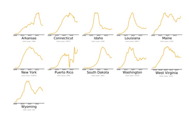
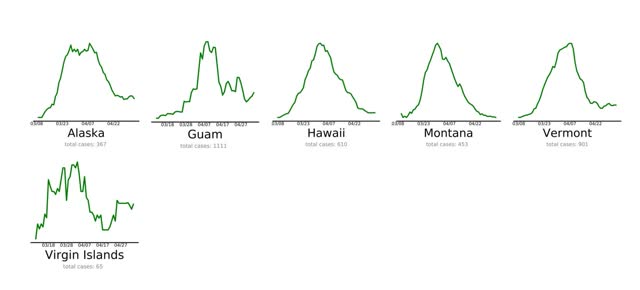
Aside from needing to be updated (PR and ME clearly aren’t “nearly there” anymore), the graphs are not to scale, so for example a decline to 1000 to 500 cases daily shows the same as a decline from 20 to 10 cases daily.
The problem of scale is addressed by 91-divoc.com . For example, I have been examining in a lot of detail the relative success of NY vs. other States in attempting to “crush the curve.” Below is a graph from this site showing the 7 day average of new cases in New York State (highlighted in blue) per capita, compared with all other States (faded lines):
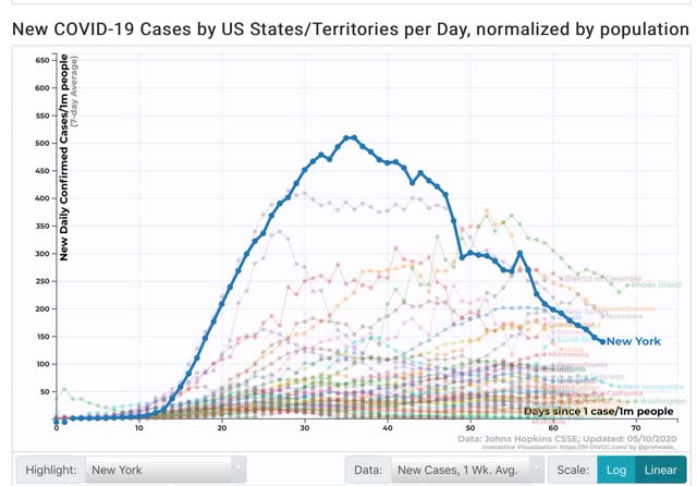
This shows that, although new cases in NY have declined by over 70% from peak, on a per capita basis NY is still among the top 10 jurisdictions. In other words, despite its success, NY still has a long way to go to actually “beat” the coronavirus.
The two shortcomings of this site are that it does not have a screen for comparing testing, and that it does not allow highlighting two or more jurisdictions and eliminating the rest, so graphs are too junked up.
Another big issue is how well, or poorly, various States are ramping up testing. In particular, as I wrote yesterday, NJ is doing very poorly in testing and is undoubtedly missing many new cases of coronavirus. Hence the idea that the NYC metro as a whole is beating coronavirus compared to other States is fatally flawed.
The best site to show this is via NPR, which compares the amount of testing done by all 50 States plus DC with the amount of testing they *should* be doing to catch all of their cases according to several models. The jurisdictions are listed in order of the number of tests they should be performing. Below are two graphs showing all of the jurisdictions aside from Montana, Alaska, and Hawaii, which have minuscule cases and plenty of testing:
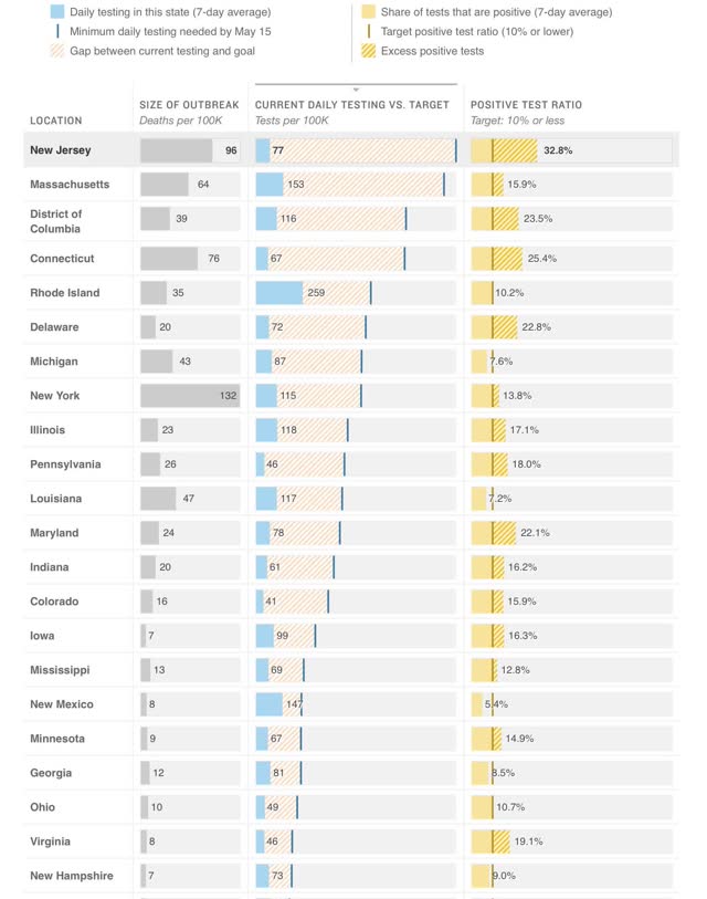
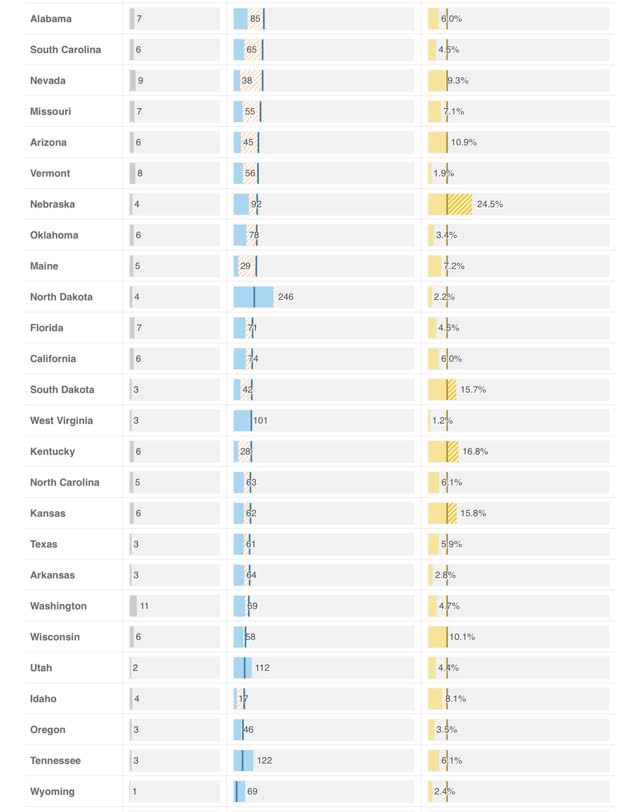
The absolute worst by far is NJ, which is probably missing over 30% of its new cases. In numerical order CT, DC, NE, DE, and MD are missing over 20%. Also in numerical order PA, IL, KY, IA, ID, IN, CO, KS, SD, MA, MN, NY, MS, RI, AZ, and WI are all missing over 10% of theirs. That’s 20 States plus DC in total, including almost all of the Northeast corridor plus much of the Midwest and a smattering of others.
Although both NJ and CT have seen a sharp decline in the number of new cases (because they are also missing a huge % of new cases at peak as well), the idea that the NYC metro outside of the State of NY is doing a good job is simply not justified.
Going forward I anticipate relying much more on these sources. I will be looking for States that show:
(1) at least a 50% decline in new cases averaged over 7 days
(2) to less than 50 cases per day,
(3) normed by the percentage of missed tests,
(4) which missed tests are less than 10%.
At the moment, outside of a few sparsely populated and island jurisdictions, they don’t exist.
NDd:
I believe I saw this on MSN yesterday. I am happy you put it up. It puts an emphasis on states which are doing the most complaining and still not having turned the peak of the curve needing to do more to insure the health of their citizens.
This can also be separated state by state.
I agree this is a far better tool top quote from on AB.
Also the charts are accurate to May 10th which I saw on the site itself.
How does the New York Times state coverage compare to these sources?
Interesting and surprising. Makes me wonder how TX ended up with so many fewer cases than VT. VT has proximity to hotspot MA NH and NY but Dallas and Houston both have major airline hubs. Lots of tourism there too especially in winter months.
Who told you Vermont was more? 53 deaths and 926 cases as of the 10th and peaked April 4th. Texas: 1137 deaths and 40,928 cases Peaked April 7. (as of May 10th also). Also as NDd said the graphs are not to scale, so for example a decline to 1000 to 500 cases daily shows the same as a decline from 20 to 10 cases daily.