February JOLTS: a mirror of the poor jobs report
February JOLTS: a mirror of the poor jobs report
The JOLTS report on labor is noteworthy and helpful because it breaks down the jobs market into a more granular look at hiring, firing, and voluntary quits. Its drawback is that the data only goes back less than 20 years, so from the point of view of looking at the economic cycle, it has to be taken with a large dose of salt.
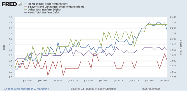
With that disclaimer out of the way, Tuesday’s JOLTS report for February generally mirrored the poor jobs report (+20,000, revised to +33,000) for that month. With the exception of one new high, the other series are off their best levels, and two continued to decline:
- Quits declined -0.1% from their peak of one month ago.
- Hires declined and are -3% off their October peak.
- Total separations rose slightly but remain about -2% off their peak in last July.
- Job openings declined about -7% from their October all time high, which was virtually tied one month ago. While this is a sharp decline, it has typically happened once or twice a year in this series even during expansions.
- Layoffs and Discharges rose slightly and remain about 9% higher than their September 2016 low, although well below their levels of most of the past 18 months.
Let’s update where the report might tell us we are in the cycle.
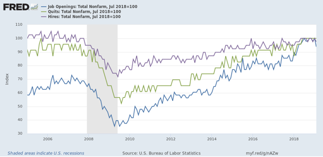
First, below is a graph, averaged quarterly through the fourth quarter, of the *rates* of hiring, quits, layoffs, and openings as a percentage of the labor force since the inception of the series (layoffs and discharges are inverted at the 3% level, so that higher readings show fewer layoffs than normal, and lower readings show more):
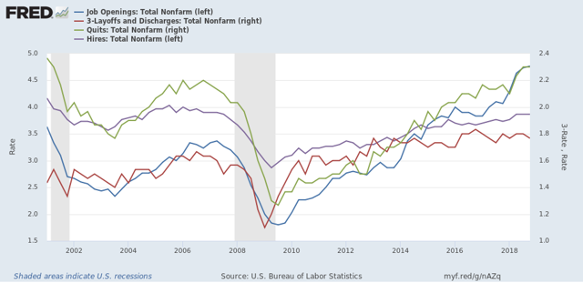
During the 2000s expansion:
- Hires peaked first, from December 2004 through September 2005
- Quits peaked next, in September 2005
- Layoffs and Discharges peaked next, from October 2005 through September 2006
- Openings peaked last, in Spril 2007
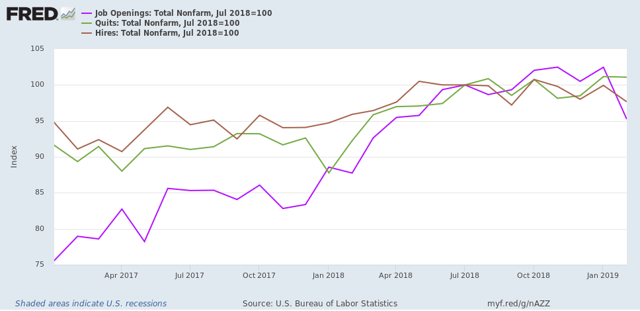
Now here’s what the four metrics look like on a monthly basis for the last five years:
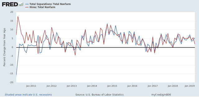
Next, here’s an update to the simple metric of “hiring leads firing,” (actually, “total separations”). Here’s the long term relationship since 2000 through Q4 of 2018:
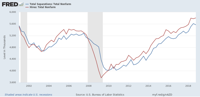
In the 2000s business cycle, hiring and then firing both turned down well in advance of the recession. Hires *may* have made their cyclical peak last July. If so, that would be sin line with what happened during the 2000s expansion, when hires peaked first, but it is obviously too soon to know for sure.
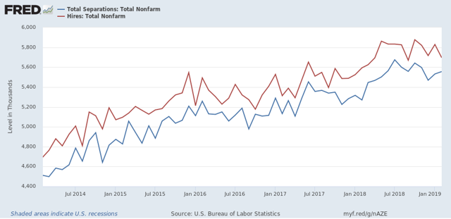
Further, while gains in each have decelerated on a YoY basis, as shown in the graph below, there is no sign of a significant downturn:
In 2018, my take was that employees have reacted to the employer taboo against raising wages by quitting at high rates to seek better jobs elsewhere. If the dam were finally breaking, we should see the hiring rate increase, and quit rate level off. With the most recent revisions, that is not the case, as quits have continued to increase slightly, while hires have decreased slightly.
In summary, the February JOLTS report reflected some of the same weakness we saw in that month’s jobs report, but there is no evidence of significance of any more profound downturn.
NDD:
Thank you . . .
Nice analysis. I posted it in a comment over at Menzie Chinn’s place. You see Menzie has to endure some smug and incredibly stupid troll named Princeton Steven who accuses Menzie of manipulating data when he uses FRED to graph BLS data. Steven even thinks BLS data is suspect as is inferior to JOLTS even though JOLTS is from BLS.
If you have the time and want a great laugh – look at all the dumb comments this troll made under a post simply on “data sources”.