Tracking profits with Kalecki
I saw this graph tweeted on twitter by Jesse Livermore, but I do not see who actually made the graph and how. It is a graph showing Kalecki’s profit equation.
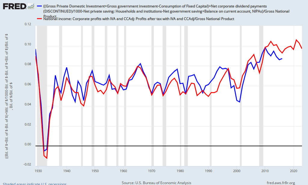
The thing that struck me is how similar it is to my own graph of aggregate profit rates based on an analysis of the NIPA accounts and effective labor share. Even the values of the y-axis are close.

could you explain what the first graph shows please?
I dug up the tweet in question: https://twitter.com/Jesse_Livermore/status/403651872621219840
And from there found the FRED link to the chart: http://research.stlouisfed.org/fred2/graph/?g=oJd
OK, line 1 (blue) is: (Gross Private Domestic Investment + Gross Government Investment – Consumption of Fixed Capital + Net Corporate Dividends – Net Private Saving – Net Government Saving + Balance on Current Account, NIPAs)/(Gross National Product)
Line 2 (red) is: (Corporate Profits After Tax)/(Gross National Product)
So, it’s basically checking whether the profit equation “Corporate Profit = Investment + Dividends – Household Saving – Government Saving – Foreign Saving” holds. Which it appears to, except when corporate lagged behind from about 1988-1998.
Thanks Jeremy