More on infant mortality: What’s with the USA
A post based on joint work with Tilman Tacke got 45 comments which is a lot for one of my posts. Many were excellent. One weak point is that people seem a bit obsessed with the USA. The post discussed cross country regressions with 71 countries (The first comment started “Why only 71 countries?”). The USA is just one data point and did not drive the result.
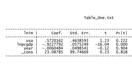
OK so now I will look at the USA in the context of the 71 other countries. First, as we all know, the USA has an alarmingly high reported infant mortality rate given how rich we are (see table 1).
lnim is the natural logarithm of the infant mortality rate, lnpcgdp is the log of real per capita GDP corrected for purchasing power parity, year is the year infant mortality was measured, USA is an indicator for the USA.
The coefficient on the US indicator is statistically insignificant (this is just one observation of US infant mortality and we are alarmed because the pattern persists over time). The point estimate states that the US infant mortality rate is 76.8% higher than one would expect given per capita real GDP and the year. Is is possible to learn something about what is going on with simple OLS regressions of a cross section of 71 countries ? If you want to decide the answer read on.
One possible explanation, which I can’t address, is that this happens because the US counts births as live births followed almost immediately by death when other countries count similar tragedies as still births or late miscarriages.
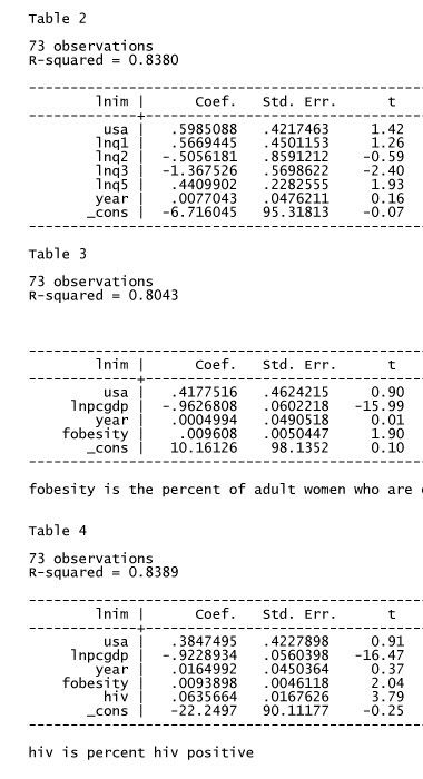
A very natural guess is that this has something to do with high inequality in the USA. This guess shows that the obsession is with the USA compared to Europe and Japan. Compared to the average country in our data set, the USA does not have huge inequality (the share of income going to the top quintile in the USA is 46% which is less than the average among the other countries — 47%. US inequality is anomalously high compared to other rich countries, or, in other words compared to the expected level given the Kuznets curve. In fact, controlling for income distribution by considering separately the log per capita income of different quintiles has almost no effect on the coefficient on the USA indicator (but it does explain why there are only 71 countries in the sample).
Now notice my personal obsession. The coefficient on lnq5 (log per capita income of the fifth quintile) is positive and borderline significant. This is a pattern that was found in the old data by uhm me, not found in data from the 80s and early 90s and now it’s BAAAACK ! But not as robust as it was in old data (very robust it was ah I remember).
see table 2
OK so what is it ? We have some other variables related to infant mortality. Let’s toss one in. How about female obesity ? The USA is, you know, the fattest country in the world. This causes the coefficient to drop see table 3.
How about hiv prevalence — a bit high in the USA for a super rich country. This causes a very small decrease in the coefficient (see table 4).
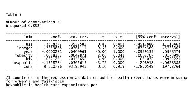
How about public health care spending as a percent of GDP, the USA is a bit low compared to STATA’s guess, because the level is similar to that of other rich countries and the US is richer than other rich countries (except for Luxembourg which isn’t in the sample).
That gets the coefficient down to 0.33 slightly over half the original coefficient and corresponding to an increased risk of 40% of the predicted infant mortality rate. See table 5.
So a few variables (really 2 as hiv prevalence doesn’t do much) account for about half of the mystery in an OLS sense.


