An extended look at jobless claims, and a note about payrolls
(Dan here…better late than not)
by New Deal democrat
An extended look at jobless claims, and a note about payrolls
First, I have started to monitor initial jobless claims to see if there are any signs of stress.
2. If the YoY% change in the monthly average turns higher.Here’s this week’s update.
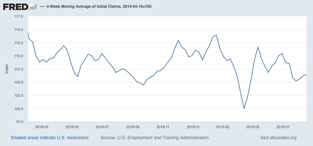
Initial jobless claims last week were 215,000. This is in the lower part of its range for the past 18 months. As of this week, the four week average is 6.5% above its recent low:
Additionally, the YoY change remains -1,500 below where it was last year:
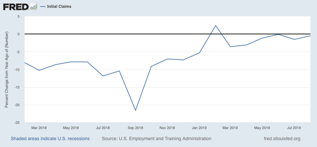
With one week to go, so far this month is averaging about -1,000 less than August of last year.
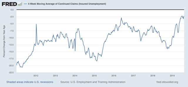
The less leading but also less volatile 4 week average of continuing claims was essentially unchanged, and remains slightly (-2.2%) below its level of one year ago:
Bottom line: jobless claims are still positive, if weakly.
Second, with all the brouhaha about the yield curve inversion, I thought I’d take a look at the history of jobless claims (red in the graphs below) vs. the 10 year vs. 3 month yield curve (blue):
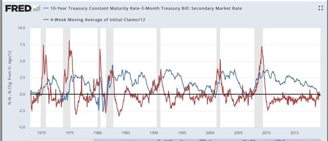
This is a 50+ year history, and every single time the yield curve inverted, during the period of that inversion initial claims turned higher YoY.
Here is a close-up on the past several years:
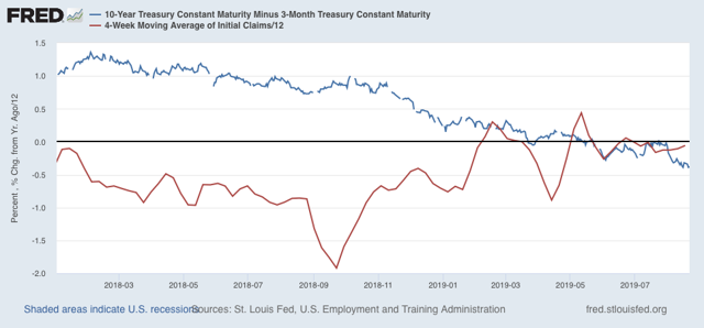
If the yield curve inversion persists, there is every reason to believe that jobless claims will increase YoY, which, as outlined above, would be a serious short term negative indicator for the economy.
In this next graph, I also added the Fed funds rate (green, right scale). All we care about here is when it declines in comparison with the other two data series:
The inflationary era:
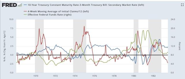
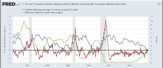
When the Fed has waited beyond the point where initial claims have turned meaningfully higher YoY to start to lower rates, that has meant a recession is on the way.
Third, and finally, yesterday the BLS indicated that the comprehensive measure of employment records from the states revealed that about -500,000 fewer jobs were added to the economy between March 2018 and March 2019. That’s a major downward revision.
While we won’t have precise monthly revisions for another 6 months, here is the best graphic estimate I found yesterday of what that will look like:
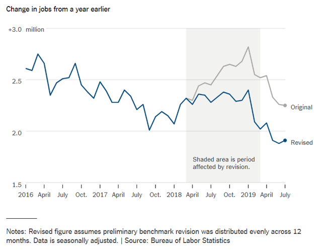
Since the average revision was about -40,000 jobs per month, if it were to have persisted through July, here is what that would look like (blue) compared with the existing alternative jobs number from the household survey (red):
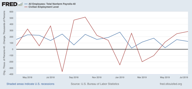
This strongly suggests that the weak household employment numbers we’ve been seeing this year have been signal, not noise. According to that survey, only about 350,000 jobs have been added this entire year so far.
Beyond that, we’ve been seeing a series of important downward revisions to a variety of data recently, including in monthly payrolls reports and unit labor costs. This is the kind of thing that happens at negative turning points. Which means it is especially important to keep an eye on data, like jobless claims (after one week) and the ISM manufacturing index, that don’t get revised.