Rational Nonexuberence – Part 1
In comments to this post, the idea is floated that capacity utilization (TCU) is about to surge.
Mark Sadowski, in comment 5 at this post, reminds us that, “Capacity utilization only applies to industrial production, and industrial production consists of only manufacturing, mining and utilities. Thus it is not very representative of the entire economy, and it has been growing less representative over time.”
Graph 1 shows employment in those three industries. Mining and Utilities are placed on the right hand scale, because the numbers employed are much smaller than those in manufacturing.

Graph 1 – Employment in Mfg (blue), Mining (red) and Utilities 9green)
Manufacturing employment stopped growing in 1970, but didn’t really fall off a cliff until the big outsourcing boom in this century. To illustrate Mark’s point, since 1970 NGDP has increased about 15 times, and industrial production now accounts for only about 14% of national income, down from about 27% in 1970. [Mark’s FRED graph]
But in some small way, a surge in capacity utilization would certainly be good news. Unfortunately, though, I don’t believe it’s in the cards. Here’s why. Graph 2 shows total capacity utilization (TCU) since 1967.
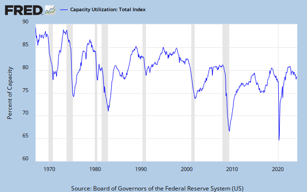
Graph 2 – Total Capacity Utilization
The main trend has been down since the beginning of FRED data. Furthermore, TCU has now stagnated for over a year and a half, and might even be ready to roll over. It has never increased from this type of condition. In fact, the only surges (except for one in the late 80’s that followed a slight decline) have come off of deep troughs.
But – just because something has never happened doesn’t mean it will never happen. Still, things happen for reasons, and I’m trying to suss just what those reasons might be.
Graph 3 shows TCU vis-a-vis YoY % change in GDP. As GDP growth goes, so goes TCU. Not exactly lock-step, but the contours are generally similar as both have declined over time. Coming into the Great Recession (GR), the decline in GDP growth led the decline in TCU, and something similar might be happening again now – and from already historically low levels in both.

Graph 3 – TCU and GDP Growth
In this post, Art suggests that private fixed investment as a fraction of total debt is a fair barometer for economic growth. I’ve modified that idea to look more specifically at non-residential private investment (PNFI) as a fraction of non-financial corporate debt (NFCD, or NCBTCMDODNS in FRED-speak), since industrial activity is what I’m chasing. Graph 4 shows that ratio, vis-a-vis TCU.

Graph 4 – PNFI /NFCD and TCU
Except for the late 80’s bump that TCU and GDP growth share, the motions are generally consistent. The PNFI/NFCD ratio is already rollng over – from by far the lowest peak on record.
As graph 5 shows, fixed investment has barely eked out a new recovery high, while borrowing, which barely slowed down during the GR, has soared to unheard of highs. I wonder where the money is going?

Graph 5 – PNFI and NFCD
Nothing in these pictures gives me any reason to be optimistic. With the anemic stimulus package now long gone and the FED getting ready to taper, everything looks contractionary. Help me if I have any of this wrong.
There are several more non-encouraging factors to consider, and I’ll get to them in part 2.
When I first saw my name I thought I had said something that you disagreed with, so I’m actually quite relieved.
I specifically made that FRED graph in response to your comment on another post. I had thought about doing it before in response to discussions with, of all people, Edward Lambert, but I never got around to it.
It was a pain because of all the different series that had to be spliced together. Now that it’s done I’m very pleased with it and I’m very glad that you made use of it.
part of the reason TCU doesnt hit new peaks is that we are continually adding to plant and equipment; over year ending JUly, for instance, we added 1.5% to manufacturing capacity, 1.1% to utilities, and 4.1% to mining equipment, most of which is drilling rigs…continually lower interest rates probably contributes to more investment in plant & equipment than is immediately needed…
so what would put all that excess capacity to use? a record hot summer & cold winter would do it for utilities…for manufacturing, maybe we could start another world war & convert all those factories to munitions production, like krugman has suggested with tongue in cheek…and if that war should close the strait of hormus, we’d have to run every drilling rig in the country full time just to fuel the military…
Mark –
Credit where it’s due. Your comment and the graph were very informative. Thanx!
Rjs –
That’s interesting information. What is your source?
And how does it correlate with the lost capacity due to the closure of thousands of factories over the last decade?
Plus, the rate of investment 1) has been steadily declining since 1977 and 2) moves pretty much in lock step with TCU.
My experience in industry is that capacity is NEVER added beyond immediate or very short time horizon need. And corporations are sitting on record amounts of cash.
I’m a lot more interested in mfg than mining. There’s [potentially] a much greater opportunity for job growth.
Cheers!
JzB
Meant to include this graph.
http://research.stlouisfed.org/fred2/graph/?g=mlO
well, JzB, non residential fixed investment includes non-industrial buildings, and now with the revision, intellectual intangibles…i cover every monthly GDP report and investment in plant and equipment had been a steady contributor to GDP throughout the recovery…
line 9. table 1 and line 30, tables 2 & 3: http://www.bea.gov/newsreleases/national/gdp/gdpnewsrelease.htm
i also cover industrial production evry month; my data is from the G17:
http://www.federalreserve.gov/releases/G17/Current/default.htm
last table, last column
Jazzbumpa,
“Rjs – That’s interesting information. What is your source?”
You can find the capacity growth figures here:
http://www.federalreserve.gov/releases/g17/Current/default.htm
You can also download capacity indices in text form there and open them in Excel to save as an Excel file in order to manipulate the data.
FRED doesn’t have capacity figures but if you divide production by capacity utilization you can derive a capacity index. However they only have capacity utilization for industrial production and manufacturing.
I’ve done that and made an adjustment to both here:
http://research.stlouisfed.org/fred2/graph/?graph_id=106928&category_id=0
http://research.stlouisfed.org/fred2/graph/?graph_id=137086&category_id=0
Where do the 81.9 and 80.6 come from?
I regressed each measure of capacity utilization on the gap between the unemployment rate and the natural rate of unemployment and those are the resulting constants. Essentially those are the values of capacity utilization that correspond to full employment.
You do not believe there are capacity issues in a service industry?