What Caused the (Next) Housing Bubble? (Six Graphs)
Political Calculations gives us this chart of median new home prices versus median incomes over the last 46 years. The rising tip at the upper right (!) is May 2013. What do you think: sustainable?

Here’s the zoomed-in version of recent years, from inside the red dashes:

As they say,
…new homes are, virtually by definition, at the margin for all real estate markets. Their prices are therefore especially sensitive to changes in the levels of both supply and demand in the overall market.
Wow. THE RULES OF THE GAME MUST HAVE REALLY CHANGED between 2000 and 2001.
They suggest it was “money leaving the U.S. stock market” and flowing into the housing market, which is no doubt somewhat true. But:
1. A great deal of that dot-bomb money didn’t “go” anywhere; it simply vanished. You gotta ask: this would result in more money going into real estate, with the off-the-charts results we see above?
2. Have we ever seen a stock-market crash causing a real-estate bubble? I can’t think of an instance, but I could be wrong…
3. That’s your typical lump-of-money/loanable funds incoherence, ignoring the fact that the financial system creates new money and lends it to the real sector to buy houses.
I’d suggest that there was a sudden increase of availability of new money. Yeah, Greenspan spiked the punch bowl at the same time, so the money was cheaper. But I’m thinking that lending standards plummeted starting in 2001.
The Fed asked loan officers if they were loosening their standards in that period. They said no:
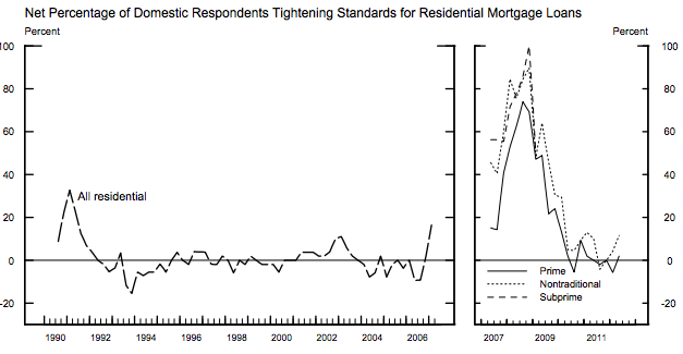
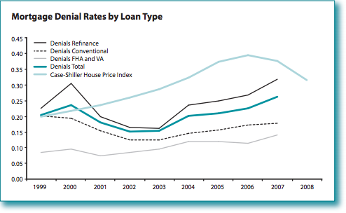
But — surprise — the rate of loan denials tells a very different story:*

This is in the midst of a massive stock-market crash. Denials declined? Those loan officers apparently didn’t even know they were loosening their standards.
Here’s another Fed graph that’s less dramatic, and that doesn’t seem to match the ’99-00 Conventional Mortgage numbers in the data I graph above, even though they’re drawing from the same data set. (Je ne sais pas.) But the 2001-2003 trend’s the same, and even more pronounced for refinancing:
So what could possibly cause this sudden decline in lending standards? I’ve got a guess; again, it’s about the fundamental rules of the game being changed. Nothing else could cause such a radical shift. Here’s my guess:
Wikipedia: Commodity Futures Modernization Act of 2000
Pushed through by Lindsey Phil Graham in the dark Christmas-recess nights and signed over Clinton’s powerless, almost-dead body in the midst of the Lewinsky crisis (signed December 21st, 2000), this act empowered and deregulated all the collateralized debt vehicles that stood behind the runup, and emasculated any putative regulators. (It apparently took the financial players most of a year to take advantage of the new rules.)
AIG and its ilk were given free rein to sell any default-insurance contracts (CDSes) on banks’ bundles of mortgage loans (CDOs) that contributed to their personal bonuses– no matter that they could never fulfill those insurance contracts if the S hit the F.
The ratings agencies (for their pieces of silver) issued their blessings on those CDOs, which meant the CDS insurance on the CDOs was ridiculously cheap.
The main-street loan-shark mortgage brokers had no problem foisting their shitty loans off to the banks for bundling into CDOs, which were “insured” by AIGers who never intended to pay off anyway. They figured they’d never have to, based on their self-serving models, crafted under intense pressure from their sales and executive (what’s the difference?) teams.
Is it any wonder that lending standards plummeted? I’ve heard it said that incentives (and institutions) matter.
So where are we now, with the home-price/income ratio trending up off the charts again, and even higher now? Maybe it’s just that home builders aren’t building any inexpensive homes anymore, because the people who buy those homes have been eviscerated:
If that’s true, that scary runup in the upper-right corner of the first graph is the top .1% — having extracted everything they can from the 90% who have no money, really — finally going all Willy Sutton on us and going where the real money is: the top 10%. I wonder: how will those ten-percenters will feel about the glory and wonder of “free markets” a few years from now?
* You’d be amazed how hard it was to dig up these numbers. Even though the Fed’s been collecting this data for decades, the report I found it in didn’t include the data in the tables (and said so, explicitly, in the text). The micro-level data is available through the FFIEC interface to the HMDA data, but you have to be a serious wonk to download and crunch it. And nobody else seems to have compiled this time-series on percentage of loans denied. All the research is about comparing denials for different income classes and races. Liberals are looking at just one thing (the wrong thing, for what I’m describing), and conservatives are just ignoring the whole thing.
Cross-posted at Asymptosis.
Another example of how lowering social standards have led to problems in the economy. Grade inflation is just an analogy, but in real economics, we have low real wages, low minimum wage, low interest rates, low effective tax rates on corporations and now we add to the list, low lending standards… What else can we add to the list?
Funny how all these lower standards led to more wealth for the richest, which is simply not socially efficient.
Interesting how the Shiller price index peaks right where the denial rate takes a turn up, except for the conventional loan that flattens off it’s rise?
It is misleading to say money left the stock market for the stock market is a secondary exchange and for every seller there is a buyer. It is better to say new money deserted the stock market, both ipo and secondary, and invested in housing instead. What is left out is the change in mortgage rates as well as lending standards. Interest rates are needed to relate the stock of home sale prices to the flow of income and when rates change sharply and for an extended while, this results in a shift in slope.
Shouldn’t it be Phil Graham & not Lindsey Graham?
Lord
i am not sure about this, but if I buy a stock for a hundred dollars, and later i sell it for fifty… didn’t fifty dollars leave the stock market?
and if the guy i bought the stock from took his hundred and used it to buy a house… isn’t that an example of money leaving the stock market and flowing into the housing market?
and this does not address the “money” which is usually described in the press as ‘destroyed’ when the stock i bought for ten dollars is now “worth” a hundred dollars because someone else just paid that much for some similar shares, but when i go to sell my stock and can only get ten dollars for it… “ninety dollars has been wiped out!”