Why You Should Never Use a Supply and Demand Diagram for Labor Markets
by Peter Dorman (published originally at Econospeak)
Why You Should Never Use a Supply and Demand Diagram for Labor Markets
You would know this if you read your Cahuc, Carcillo and Zylberberg, but you probably won’t, so read this instead.
A standard S&D diagram for the labor market might look like this:
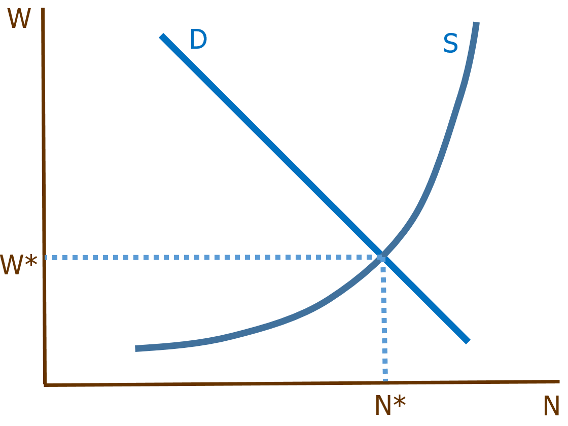
It’s common to use W (wage) on the price axis and N (number of workers) on the quantity axis. Equilibrium is supposed to occur at the W where quantity supplied equals quantity demanded. From here you might introduce statutory minimum wage laws, or jobs with different nonpecuniary benefits and costs, etc. The default conclusion is that free markets are best.
But hold on a moment. S and D don’t tell you how many workers actually have jobs or how many jobs are actually filled—these are offer curves. The S curve tells you how many workers would be willing to accept a job at various wages, and the D curve tells you how many jobs would be made available to them. That’s not the same as employment.
They would be the same in a world in which labor markets operated according to a two-sided instantaneous matching algorithm, something designed by Google with no human interference at any stage of the process. In such a world all offers would enter a digital hopper, and all deemed acceptable by someone else’s algorithm would be accepted immediately. Maybe not Google but Priceline.
But that’s not the world we live in. Finding out about job openings and job applicants is somewhat haphazard and time-consuming. Applicants and jobs differ from one another in lots of obscure, subtle but crucial ways. You really wouldn’t want an algorithm to make these decisions. And so only some workers who offer their labor, even at what might be an equilibrium wage rate, are taken on, and only some job openings workers willingly apply for are filled. When we measure unemployment and vacancies à la JOLTS, we are not seeing offers but changes in actual employment and disemployment.
So let’s redraw that diagram.
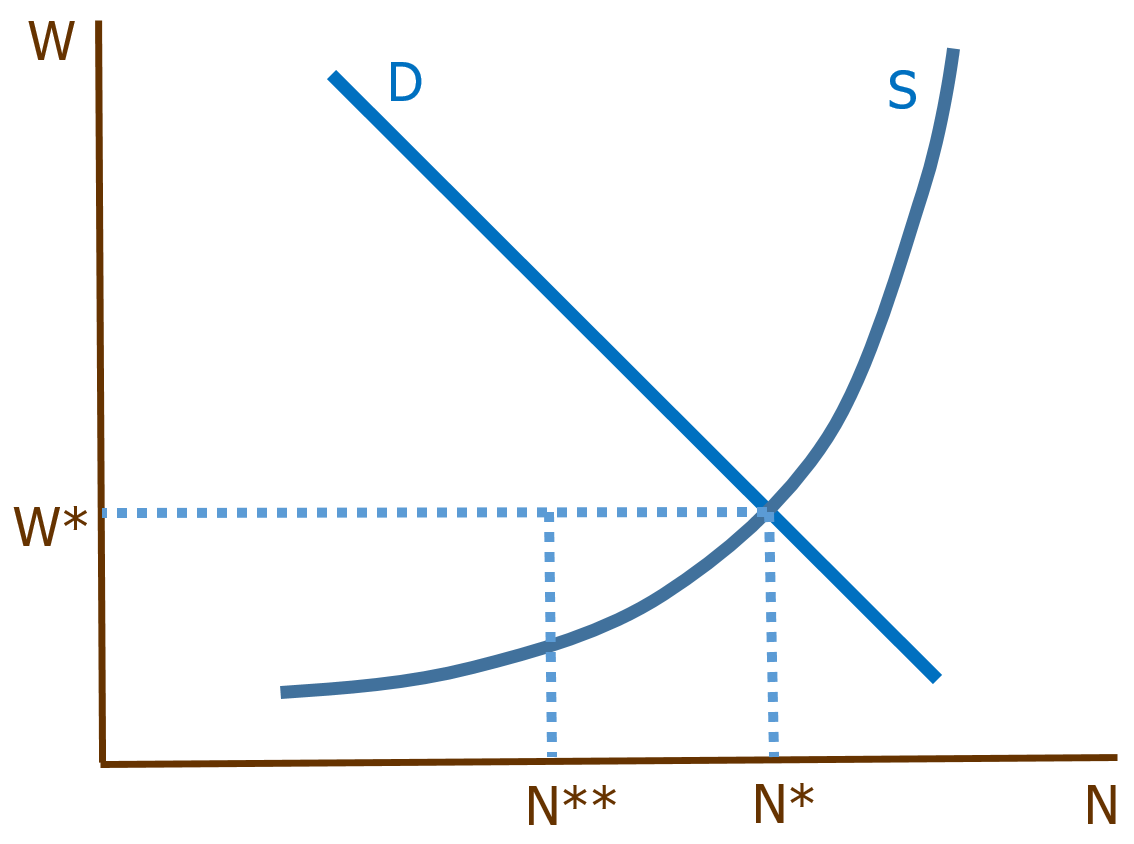
To the left of N*, the equilibrium number of employment offers, we find N**, the number of workers whose offers have actually been accepted and are now on the job. A little reflection should be enough to indicate that S&D is a lousy way to frame this distinction.
First of all, what determines this gap between wanting to work (or fill a job) and actually working (or filling it)? What does this apparatus tell you about N*–N**? Nothing. It isn’t built to answer that question, and it doesn’t answer it.
But it’s worse. The apparatus indicates that N*–N** is the same on both sides of the market: the number of workers looking for work is exactly equal to the number of jobs looking for workers. But why would we expect that to happen? What reason is there to think that it’s equally easy for workers to find jobs and jobs to find workers? On the contrary, the ratio of unemployed workers to job openings never falls to 1.0, or hasn’t since we’ve had JOLTS to inform us.
S&D is simply the wrong model, based on a failure to distinguish between offers and transactions. Fortunately, there’s a better model out there, search theory, with fairly straightforward intuitions and tons of available data.
Anyone who waves an S&D model at me and makes claims about the labor market is simply advertising that they know less about economics than they think they do.
Look; labor is bought more or less — or something like — “on margin.”
As long as labor is a fraction (usually small) of the price of a product or service (exception: baby sitting?), then, employees of (super efficient) Walmart for instance could swing themselves a 100% pay raise and the price of their end product would only go up 7% — leading to relatively little loss of demand.
You could say the price of labor is “hard-linked” or something (make up your own phrase) to the price of the product.
Nevertheless, one cannot artificially increase the price of unskilled labor without reducing the demand for that labor. We saw that in 2007, when the Minimum Wage went up 13.6% on July 24, and Black employment fell the very next month and kept going down.
The market for unskilled labor, obviously, is not free. Minimum Wage laws and our welfare system distort the market. Thus free-market models are not so applicable.
9 August 2007. 15 September 2008. 2 April 2009. 9 May 2010. 5 August 2011. From sub-prime to downgrade, the five stages of the most serious crisis to hit the global economy since the Great Depression can be found in those dates.
Phase one on 9 August 2007 began with the seizure in the banking system precipitated by BNP Paribas announcing that it was ceasing activity in three hedge funds that specialised in US mortgage debt. This was the moment it became clear that there were tens of trillions of dollars worth of dodgy derivatives swilling round which were worth a lot less than the bankers had previously imagined.
https://www.theguardian.com/business/2011/aug/07/global-financial-crisis-key-stages
Just a coincidental side effect of minimum wage? (sarcasm alert)
Denis, why doesn’t Walmart just raise it’s prices 7%?
In 2016, Walmart had a net profit margin of about 3%. Turnover ratio was about 8. So, on average the profit margin for each item sold was 0.4%. If they increased all their prices 7%, the profit margin for each item would be 7.4%. Multiply that by their turnover ratio, and their net profit would go from 3% to 60%.
I guess those Walmart executives are pretty stupid — taking a 3% profit when they could be getting 60% by just raising their prices 7%.
Warren, I hate to break the news to you but this is the place where you have to come up with the explanation.
What would you like me to explain?
Warren, let me try to help you. Maybe Walmart would raise prices a lot more than 7% if they could collude with other sellers. Maybe Walmart stores being generally more inconvenient to shop at and so desperately attempt to keep the maximum price differential between them and others’. Maybe they make so much money the way they are pricing now — that the only thing that could worry them would be maintaining market share, desperately.
If you ask Walmart I’m sure the tell you they are only thinking of the public good.
Thing is Walmart labor is not making even enough money for a decent lower middle class life (not even with the help of food stamps and Medicaid) — labor is no way desperately trying to keep its price down. Going by Walmart’s super efficiency — thank you Walmart and we think we will take the maximum cut of that efficiency premium for ourselves — if you want anybody to show up for work; you cannot move to Mexico.
To put it in more realistic situational relief, Walmart going on strike would take place in a world (very different from our current world) where all American employees could effectively withhold their labor from the market to cut a better deal. This would mean more spending power to the typical — today downscale income — Walmart consumer. Possibly work something like the minimum wage hike scenario below:
[cut-and-paste]
My minimum wage angle is to suppose the wage is priced so as to sell fewer hours for more overall dollars (the right way to sell potatoes). By definition jobs will be lost (the first week) in higher paying firms — diverted demand. Come first payday, if newly flush min wagers spend their extra bucks back at the exact same higher wage businesses the end result will be fewer min wage employees making more up scale purchases than they did before.
In real life people tend to spend more proportionately at firms employing people at their own wage level. Likely end result (found in Card’s and Krueger’s seminal study): minimum wage employment increases.
********************
http://www.forbes.com/sites/groupthink/2016/08/03/the-minimum-wage-hike-is-good-for-business/#d8512ea34bcd
The Minimum Wage Hike Is Good for Business
Guest post written by
Bill Phelps
“As the CEO of Wetzel’s Pretzels, a company with more than 3,000 employees system-wide—many of them in California—I’ve paid very close attention to our business as California has raised the minimum wage over the past couple of years. And what I found was stunning.
“When California increased the state minimum wage from $8 to $9 an hour in July 2014, our same-store sales doubled in the next two weeks and stayed that way for six months. When the minimum increased again in January of this year to $10, the same thing happened; our same-store growth rate more than doubled. In fact, I recently received an email from a multi-unit Wetzel’s Pretzels franchisee who said his business has never been better and he’s convinced the minimum wage increase has a lot to do with it.”
Hat tip to Wetzel’s Pretzels. 🙂
“Thing is Walmart labor is not making even enough money for a decent lower middle class life….”
Why should they? That work is not lower middle skill work, it is essentially unskilled labor. It is not particularly gross or arduous so that fewer people are willing to do it. So why would you expect such work to be compensated as though it required significant training, or were particularly hard or unsavory?
Warren, I expect them to be compensated by the max they can squeeze out of the ultimate consumer (not out of Walmart). The measure of worth is what the consumer thinks them showing up for work is worth.
You know what the libertarians say: “It’s the market.”
PS. Barbers in France are better paid than barbers in Poland because France (being more productive) has more money to pay barbers. Ditto for barbers in 1917 compared to 2017.
Big missing insight from almost everybody in the whole world’s equation (not just pesky trolls) on what’s left after the loss of manufacturing jobs — down 16% to 12% since 2000; half due to foreign outsourcing — is that low skilled jobs could have been paying a lot more all along.
Eighth-grade math:
Fed min wage $11 in 1968 — at half today’s average income.
Bottom 50% of workforce took 20% of overall income in 1980 (figures rounded — maybe very — took 20% in recent memory anyway) — bottom 50% takes a little over 10% today.
Top 1% up from 10% to 20%.
Very suggestive that labor market is seriously out of balance. 50 years after min wage $11 — now 7.25 (was $7.50 in 1950 — 2 2/3 average income growth since)!
https://data.bls.gov/cgi-bin/cpicalc.pl?cost1=0.75&year1=1950&year2=2017
Do you have any (silly) objection to criminal law protecting legal right (there’s a law now but no enforcement) of employees’ everywhere to organize collective bargaining without be muscled out of it (troll)?
“I expect them to be compensated by the max they can squeeze out of the ultimate consumer….”
Why would you expect that, when they do not negotiate with the ultimate consumer who, in turn, has no idea who does his job well and who does not?
“Barbers in France are better paid than barbers in Poland because France (being more productive) has more money to pay barbers.”
Barbers negotiate directly with the ultimate consumers.
“Big missing insight from almost everybody in the whole world’s equation (not just pesky trolls) on what’s left after the loss of manufacturing jobs — down 16% to 12% since 2000; half due to foreign outsourcing….”
To what planet is “the whole world” outsourcing manufacturing jobs?
“Do you have any (silly) objection to criminal law protecting legal right (there’s a law now but no enforcement) of employees’ everywhere to organize collective bargaining without be muscled out of it (troll)?”
None at all. Do you have any (silly) objection to criminal law’s protecting the legal right of employees everywhere to NOT join the union if they don’t want to without being bullied into it?
Just one point Warren: when we argue about the minimum wage the number one point of contention on both sides is always how it will affect business (you know; how much the ultimate consumer may be squeezed).
Now you’re saying BUSINESS is the “ultimate consumer”?
Anyway, I disagree with that assertion, too. Many people push the point that the Minimum Wage prices unskilled laborers out of the market, which has a disparate impact on Blacks.