Real aggregate wage growth: August 2016 update
by New Deal democrat
Real aggregate wage growth: August 2016 update
In my opinion the best measure of how average Americans are doing in an economic expansion isn’t jobs, and it isn’t wages per hour. Rather, it is real aggregate wage growth. This is calculated as follows:
- average wages per hour for nonsupervisory workers
- times aggregate hours worked in the economy
- deflated by the consumer price index
This tells us how much more money average Americans are taking home compared with the worst point in the last recession.
Why do I believe that this is the best measure of labor market progress? Let me give you a few examples.
First, compare an economy that creates 1 million 40 hour a week jobs at $10/hour, with an economy that creates 2 million jobs at 10 hours a week at $10/hour. If we were to count by job creation, the second economy would be better. But that’s clearly not the case. The second economy is paying out only half of the cold hard cash to workers as the first.
Next, let’s compare two economies that both create 1 million 40 hour a week jobs, but one pays $10/hour and the other pays $12/hour. Clearly the second economy is better. It is paying workers 20% more than the first.
Finally, let’s compare two economies that create 1 million 40 hour a week jobs at $10/hour. In the first economy, there are 3% annual raises, but inflation is rising 4%. In the second, there are 2% annual raises, but inflation is rising 1%. Again, even though the second economy is giving less raises, it is the better one — those workers are seeing their lot improve in real, inflation-adjusted terms, whereas the workers in the first economy are actually losing ground.
In each case, the economy creating more jobs, or more hourly employment, is inferior to the economy that pays more in real wages to its workers, In other words, the best measure of a labor market recovery is that economy which doles out the biggest increase in real aggregate wages.
In short, at the end of the analysis, people generally work not for hours, and not for jobs themselves, but for the cold hard cash that is put in their pockets. That’s why I believe that real aggregate wage growth is the best measure of a labor market recovery.
With that introduction, here are real aggregate wages for the entire past 50 years:
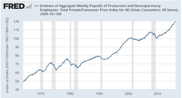
So how does the current expansion compare with past ones? Here is the graph, normed to 100 at the post-recession bottom in real aggregate wages in October 2009:

To compare, here is a chart I created last year showing the real aggregate wage growth in every economic expansion beginning with 1964:

* start of series
The most recent trough for aggregate real wages was in October 2009. In the 81 reported months since, real wages have grown 20.0%, or just shy of .25% per month.
If you want to see the graphs for each expansion, just click here.
As shown in the above chart, four of the past 7 recoveries have been better. Three were worse. Wage growth per month has improved, but is still lower than almost all of the earlier expansions. This recovery has been helped by a big increase in the total number of additional hours worked.
Finally, here is how it compares with the much-vaunted labor recovery of Ronald Reagan the same number of months in:

Currently the Obama labor market recovery only lags by -0.5%, or about -.006% per month. The peak in Reagan’s wage recovery, at +21.6%, happened after only 2 more months. If Obama’s recovery continues through the end of his term, it will be the second longest wage recovery, and it may yet surpass Reagan’s in terms of real aggregate wage growth for average Americans, lagging only the 1960s and 1990s..
All fine and dandy but there are a few flaws in your thinking in my view. First you are using the grossly BLS statistic (Bureau of Liars Statistics) consumers price index for inflation that is totally rigged. It does not include energy, food or medical cost increases which just happens to be the biggest part of everybody’s major cost of living increases. Why do you Not ever comment about that? (Go see PaulCraigRoberts.org for the real story) Secondly you did not include the labor participation rate factor that has been steadily falling for wages in real terms has actual spending power less than 20 years ago…Yes the system is rigged by our own government to make it look like we are in a thriving ,growing ,robust economic recovery but the problem is we are not…IMHO.
Because income follows a Chi-squared distribution, the average is much higher than the median. According to the SSA, median income for 2009 was $26,261.29, and in 2014 was 28,851.21, up 9.86%.
https://www.ssa.gov/oact/cola/central.html
Meanwhile, the CPI was 214.5 in 2009, and 236.7 in 2014, up 10.35%.
https://www.minneapolisfed.org/community/teaching-aids/cpi-calculator-information/consumer-price-index-and-inflation-rates-1913
That means that real median income has DECLINED 0.44% during this “recovery”.
That’s not good.
Meanwhile, during this “recovery,” our labor force participation rate has declined from 65.7% in January, 2009, to 62.7% in June, 2016.
What recovery?
The labor force participation is irrelevant. I keep on saying that for the sheep, maybe they will figure it out. What recovery? Look at real wages fool. Look at oil prices. Your problem is not understanding how “labor force participation” is calculated. Notice in the 90’s it barely grew at all from the 80’s cycle peak. I mean, not much. That must have meant the expansions sucked compared to 83-89 and even 75-79. Come on dude, look how it is calculated. The growth in the labor force peak in 1997 and it began flattening out.
Both the 80’s and 10’s recovery in real wages was spurred by the drop in oil prices.
GO back and read what I wrote, Bert. There has NOT been a recovery in real MEDIAN wages, which have actually gone DOWN a little. The “recovery” has been in AVERAGE wages, meaning the people at the top are doing better but the people in the middle are not.
are average nonsupervisory wages a good measure? As another comment pointed out the average is skewed by the rise in income inequality. Also, “nonsupervisory workers” seems to be a pretty broad category of employees which could include janitors to 5th year BigLaw associates making 200k.