Why You Probably Don’t Understand the National Accounts. In Pictures.
If anyone means to deliberate successfully about anything, there is one thing he must do at the outset: he must know what it is he is deliberating about. Otherwise he is bound to go utterly astray. Now, most people fail to realize that they don’t know what this or that really is. Consequently when they start discussing something, they dispense with any agreed definition, assuming that they know the thing. Then later on they naturally find, to their cost, that they agree neither with each other, or with themselves. That being so, you and I would do well to avoid what we charge against other people.
—Socrates, in Plato’s Phaedrus
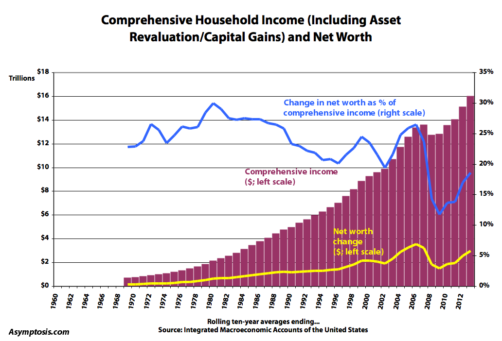
A recent post of mine, How Do Households Build Wealth?, got a fair amount of attention (even a radio interview) because its takeaway graph seemed to surprise people (as it did me, when I put it together). Here it is again, presented more sensibly as a bar rather than an area chart. Click for larger.
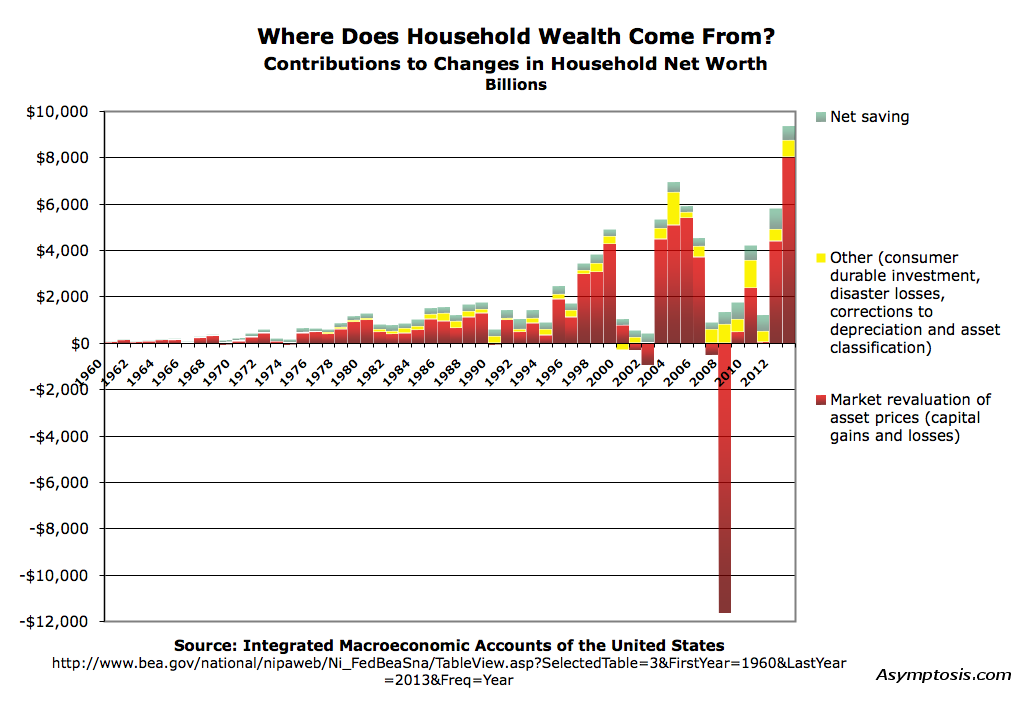
Note: the revaluations shown here are not “realized” capital gains (which really only matter for tax purposes). They’re changes in asset values. If your portfolio’s value goes up by $20,000 this year, that bumps your net worth by $20,000 even if you don’t sell any assets. Ditto your house, but without the second-by-second reporting of prices.
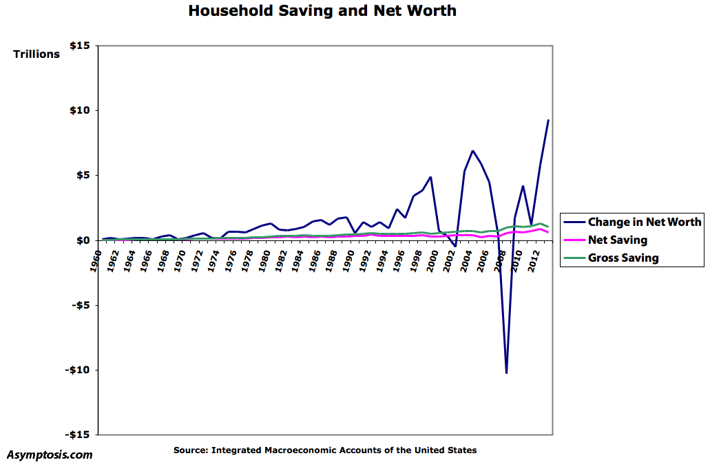
What surprised people: capital gains and losses completely overwhelm Saving (net or gross) when it comes to changes in Net Worth. Here’s an even starker depiction, showing both magnitude and volatility:
I think these graphs are surprising to people because they don’t understand what Saving means in the national accounts, or how it relates to Net Worth. Thinking of households, for instance, many might be surprised to find that:
Starting Net Worth + Saving ≠ Ending Net Worth
Household Saving ≠ Change in Household Net Worth
As you can see in the charts above, it’s not even close. Why? In the national accounts, capital gains/revaluations aren’t counted as part of “Income.” It’s no wonder the Saving/Net Worth equality doesn’t balance; a whole bunch of household “Income” is missing from “Saving.” (Should capital gains be counted as Income and included in Saving? More on that below.)
The somewhat particular, stylized measure labeled “Income” in the national accounts serves an important purpose, but it also makes the word’s meaning opaque and confusing to many. That’s even more true of Income’s residual, “Saving.” The estimable Nick Rowe went so far as to title a post “Why ‘saving’ should be abolished.” Sez Nick: “it’s the most confusing concept in macroeconomics.”
But it doesn’t have to be confusing. The Integrated Macroeconomic Accounts of the United States (IMAs) — based on the modern international System of National Accounts (SNA) — calls out the particularity of “Income” by explicitly labeling the measure “Primary Income” (or more precisely, Balance of Primary Incomes). Drawing on that, the following chart may help render the relationships more transparent, adding a few named measures as aids to understanding.
| Household Income | |||
| Comprehensive Income (gross contributions to net worth, before netting out expenditures) | Non-Property Income (compensation for labor) | Other Labor Income | Social benefits and other transfers received (including employers’ social contributions) |
| Primary Income | Wages and salaries | ||
| Comprehensive Property Income (compensation for ownership) | Primary Property Income: Dividends, interest, proprietors’ income, rental income, and operating surplus | ||
| Other Property Income | Market asset revaluation (capital gains) | ||
| Other changes in asset volume | |||
Using these terms, here’s how the national accounts tally up Income and Saving:
Primary Labor Income
+Primary Property Income
– Interest Paid
= Primary Income
+ Benefits & Transfers
– Taxes
= Disposable Income
– Consumption Expenditures
= Saving (net or gross of capital consumption/depreciation, your choice)
We could call this final measure Primary Saving, because it’s a construct built from Primary Income. I discuss its meaning below.
This all balances, of course, but it’s confusing at least in part because it combines sources and uses of funds into Income, rather than keeping them distinct so Sources = Income. (See Interest Paid and Taxes — both “uses.”) If you’re not holding this whole construct clearly in your head when discussing Income and Saving — and likewise your fellow discussants — you (and they) are probably not adhering to Socrates’ dictum.
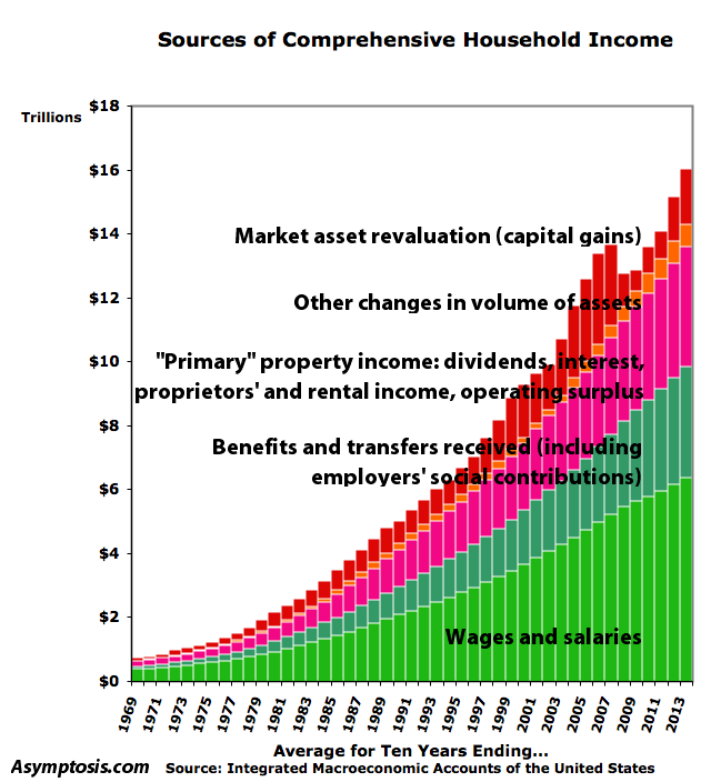
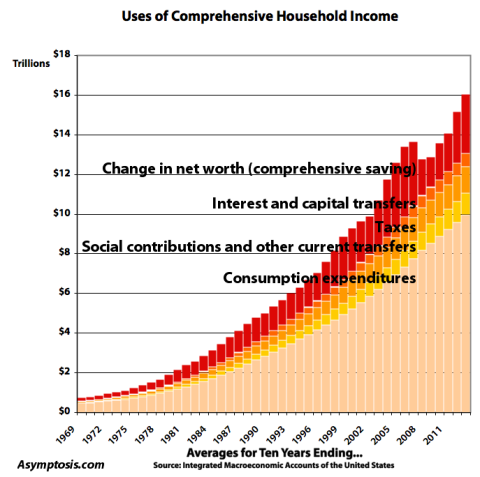
A different approach may help. Below is a breakout of Comprehensive Income sources for U.S. households over the last half century, smoothed with rolling ten-year averages to hide confusing noise and make long-term trends apparent. This presentation alters one named measure in the IMAs: Primary Income is displayed before deducting Interest Paid; that’s tallied with Uses, below. Interest Paid comprises 3–7% of Primary Income, 2–6% of Comprehensive Income. Note that everything balances. The spreadsheet’s here. See the balance checks in rows 86–93.
First, sources as nominal dollar values:
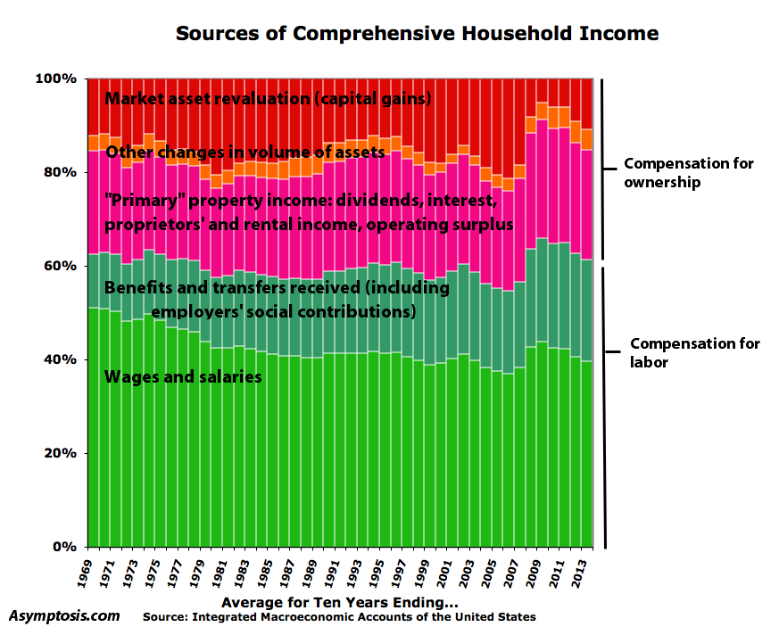
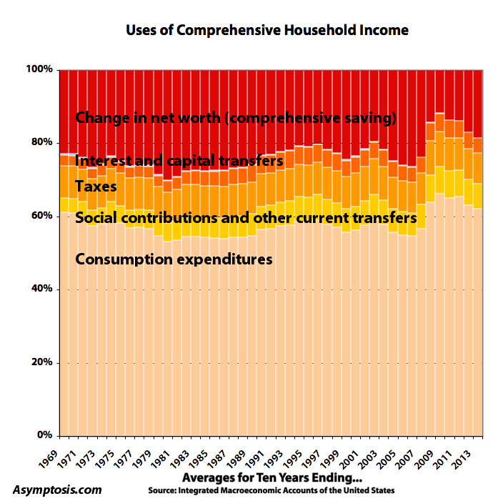
And here displayed as shares of the total:
Next, uses. Note that the total matches the total of Sources, with change in Net Worth as the balancing item. (Net worth is the starting and ending balancing item in the IMA/SNA presentation, which starts and ends with the balance sheet, Assets minus Liabilities.)
And here as shares of the total:
We could call changes in Net Worth “Comprehensive Saving,” since it’s a residual of Comprehensive Income. I find it to be a more straightforward and easier-to-understand residual than Primary Saving, partly because uses — here taxes and interest paid — are kept separate from the sources. But mainly because:
Comprehensive Income – Expenditures = Comprehensive Saving = Change in Net Worth
A necessary aside at this point:
I’m concentrating on the household sector here because household-sector net worth represents all private-sector net worth. The net worth of all firms is included in household net worth, because households ultimately own all those firms as shareholders or proprietors (or owners of those quasi-“firms,” households that own their homes).
Firms own (pieces of) firms which own (pieces of) firms (America’s founders would aghast at that, by the way), but ultimately households own it all.
You can think of the firm sector here as one big subsidiary of the household sector, with the accounting of its operations and net worth consolidated and telescoped into the accounting statements of their “parent company,” households. Details are obscured in the process, of course. But we’re looking at the big and arguably most important picture here.
By contrast, firms don’t own households. Households don’t issue equity shares — stock — and nobody, including firms, owns shares of, has ownership equity claims against, households. (Run don’t walk to read the Kollin brothers’ The Unincorporated Man.) This asymmetry means you can telescope firms’ value into households’, but you can’t do the reverse. The buck stops at households.
So household net worth comprises all of national net worth except for the net worth of government (plus/minus foreign net net ownership of U.S. assets/liabilities — equalling 1.5–5.5% of U.S. households’ net worth).
A further aside: in this telescoped, consolidated view, almost all household debt is owed to…households: the owners of the lending firms’ assets and liabilities. So this discussion ignores the important issues of lending, borrowing, and debt — important because different households are in different positions. Some (many) households are net debtors in this telescoped view, while others (few) are net creditors because they own the lending firms.
Returning to the key question I asked above: should asset revaluation, capital gains, be counted as income? It depends on our purposes, what we’re trying to display and understand. But the following simplified, stylized scenario may be useful in considering the question:
You buy a company that has a “book,” accounting value of $1 million. You buy it for $1 million. It produces stuff for ten years, makes $100,00 a year in profits, and retains them all. It doesn’t distribute any as dividends. A the end of ten years its book value is $2 million. You sell it for $2 million.
Capital gains: $1 million, with no Primary Income over those ten years. But: all of those gains resulted directly from ongoing profits from production. All of the “revaluation” of the firm as an asset was a result of the company’s increased book value due to retained earnings. The company’s value, and your net worth, increased by $100,000 a year, even if your household didn’t “realize” that by swapping the company for cash. Your annual $100K net-worth increases look decidedly like income from profits (quacks like a duck…), even if those profits happened to be sequestered off on the books of your wholly-owned subsidiary.
There’s a pretty good case for calling that $1 million in cap gains “income.”
Now of course, not all revaluation/cap gains come from retained earnings and increases in book value. Asset values often go up just because the market has decided that assets are worth more than it thought they were — that they’ll produce more in the future (output and income) than was previously expected.
Here’s a useful way to think about it:
Primary Saving represents the net new stuff we’ve created in the period (the stuff we can count and measure, at least). Produced stuff minus consumed stuff. Net Saving = Net Investment — increases in the stock of fixed assets (and inventories) due to investment spending. We’ve saved in the sense of increasing our stock of stuff.
Comprehensive Saving (change in Net Worth) represents the net new wealth we’ve created. Sources minus uses, income minus (total) expenditures. New wealth ≠ new stuff, because market revaluation of existing stuff (not created within the period) causes wealth/net worth to increase and decrease even as those existing real-world assets remain unchanged. (See: We Have No Idea What Our Capital Is Worth.)
In the big, smoothed, long-term aggregate picture shown here, the market is consistently underestimating the value of current production — the net new created stuff. People are paying less for it than it turns out (in later periods) to be worth. Maybe the market’s undervaluing new human capital, or organizational capital, or future productivity increases, or…who knows. Whatever the case, the market catches on eventually, and (in volatile fits, starts, jumps, and reversals) revalues those previously created assets in later periods. That revaluation of previously produced assets adds to household Net Worth. So at any moment, household Net Worth (“savings,” or wealth — claims on future output) represents the market’s best guess at the value of existing assets and their future output.
When existing-assets markets go up, they quite literally create new wealth (we could call it “money”) out of thin air — new claims on those existing assets — to represent their best guess at the value of those real assets and the output they will produce.
So yes: capital gains are quite reasonably seen as income from production — production in previous periods. Even the parts that aren’t just book value increases due to retained earnings represent the value of production that we didn’t realize we’d produced. The market, in its infinite wisdom, realizes the error and in later periods, delivers that previously-unrecognized production value to households as…income, delivered via the mechanism of capital gains.
Going back to the chart showing income sources as shares of Comprehensive Income: we can see it as depicting the mechanisms whereby we (market and government) deliver and divvy up household income resulting from production. It shows the methods of slicing the production/income pie, and how the methods and slices have changed over time.
The first thing to notice: capital gains (and other volume changes) don’t dominate as they did in the “contributions to net worth” graph at the top of this post. That’s because that graph is somewhat unfair. It posts all household expenditures against Primary/Disposable Income (yielding Net Saving), and posts no expenditures against capital gains. It’s no wonder capital gains appear to dominate; they get a free ride in that picture — going straight to net worth, while Primary/Disposable Income are first drained through expenditures to yield Net Saving.
The Sources graph, by contrast, ignores expenditures; it just shows the Household sector’s sources of funds. Not uses.
This income/sources-only depiction still shows capital gains and other asset-volume changes comprising a significant (and volatile) 15–25% of comprehensive household income. And it displays some familiar features over time:
• Compensation for ownership has increased as a share of comprehensive income, from 37% in the 60s to 45% in the decade ending 05/06. (Now recovered to 39% after the 08/09 decline, as ownership gains from recent years overwhelm the 08/09 losses.)
• The wages and salaries share has declined from 51% of comprehensive income in the 60s to 40% today. (It’s currently on a four-year downtrend following the brief jump from the 05/06 low of 37% to 44% during the financial crisis.) Benefits and transfers have buoyed total labor compensation over the decades, but not enough to counteract the overall increase in ownership compensation.
That’s all useful and interesting, if not terribly surprising. We see the same results in many other measures. But this accounting construction lets us look at the economy in some other ways that my gentle readers may find valuable. For instance, changes in Net Worth as a percentage of Comprehensive Income:
Our income keeps increasing (yes, also when adjusted for inflation but of course more slowly). But post-Reagan, a smaller and smaller percentage of it has gone to wealth-building — from 30% in 1980 down to the low twenties in recent decades (and briefly, the low teens). Piketty watchers: what does this mean in the context of his thinking on capital and wealth?
Putting all the uses together in one place (rather than including some of them in the sources) also gives us a clearer picture of expenditures. We can remove the Net-Worth-changes balancing item, for instance, just looking at household expenditures, and see household consumption expenditures as a percent of total household expenditures:
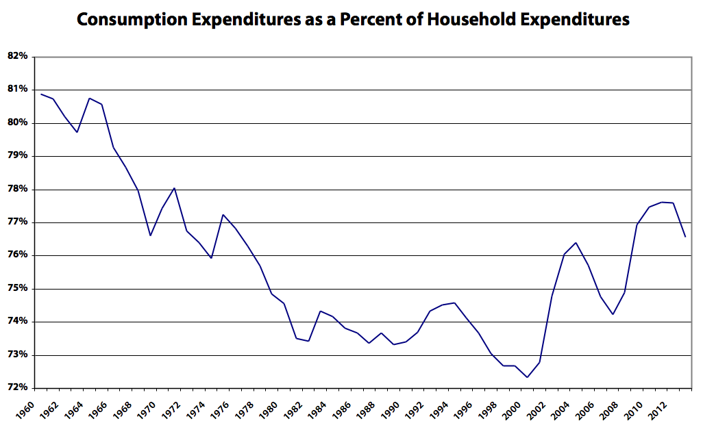
This measure’s forty-year decline might give pause to economists (notably and vexingly, often liberal economists like Paul Krugman and Jared Bernstein) who pooh-pooh “underconsumption” explanations for The Great Secular Stagnation. (Though the runup over the last 15 years must also be explained.) Item: increased shares for interest payments and social contributions/current transfers were the two big contributors to this measure’s 8% decline (from 81% down to 73%), with each of those shares increasing by roughly 4%.
There are many other interesting depictions, which I’ll save for later posts. Before ending, though, I’d like to share a mental model that may provide a useful way of understanding all this.
Imagine that humans consume something we’ll call money. It’s the only thing they consume. And imagine that our whole economy, all our production processes, just produce money for humans to consume.
Next, imagine that we all produce for a year without doing anything else — no payments of wages, interest, or dividends, no stocks traded, no exchanges of any kind. We just put in 1. labor, 2. real capital services, and 3. natural resources, and money comes out.
We end up with a big reservoir of produced, consumable money at the end of the year.
The next day, the reservoir administrator (let’s call him Walras) transfers that reservoir of money to households. Wages and compensation are paid, dividends are distributed, interest is paid (to households; they’re not spending yet), and people furiously trade stocks, bonds, and houses.
At the end of the day the reservoir is empty; all that produced, consumable money has been divvied into the hands of households. (At this point, household net worth has skyrocketed!)
The next day, households spend. They buy food and other consumables for the year, pay interest to their creditors and taxes to the government, and give some money to the government to hold for them for the future. Whatever’s left over stays into their personal reservoirs of money, increasing their net worth compared to the previous year’s balance.
This stylized picture obviously misrepresents the economy in various ways, through omission at least. But I find it useful, along with the sources-and-uses bookkeeping depicted above, as one way to understand how markets and government divvy up our production pie over the years and decades. I hope others find it useful as well.
Merry Christmas!
Cross-posted at Asymptosis.
In other words, James Clavell was right. You don’t get fuck you money out of cash flow. Given the popularity of his novels, I’m surprised that this surprised anyone.
well, the value of my house has increased over a hundred k over the last twenty years.
doesn’t make me a bit richer. does increase my taxes.
@Coberly: “doesn’t make me a bit richer”
Don’t be silly; of course it does. When it’s time to move into long-term care and you sell your house?
That’s $100K you didn’t have to reserve out of income in preparation for that eventuality.
Really: if you didn’t have that $100K in extra equity in your pocket, you think you could or would spend, have spent, just as much?
Steve:
Or you can borrow against it as the bank will recognize some of the equity in a typical “Potter” manner.