Equity Extraction and Personal Consumption Expenditures
In comments to my previous post I made this statement of historical fact: “home price bubble equity was an ATM that grew consistently as a fraction of PCE after 1996, and accounted for over 2% in 2005 – and I got this from Greenspan and Kennedy, Table 2.” In my estimation, this implies that the collapse of the housing bubble eliminated the possibility of equity extractions, and was therefore a major contributor to the decline in personal consumption expenditures [PCE] that led into the Great Recession.
Here is the explanation.
Bill McBride at Calculated Risk has been following the equity extraction data. Here is the March, 2014 update. Dr. James Kennedy, mentioned above, wrote that for technical reasons, the data set that he and Greenspan were using was no longer valid after 2008, and presented an alternate calculation method [link at the linked CR post.] McBride uses this alternate measure, calculated from the Fed’s Flow of Funds data and the BEA supplement data on single family structure investment. Also linked at the CR article is a spread sheet with the two data sets. Graph 1, from CR, shows how the two data set compare.
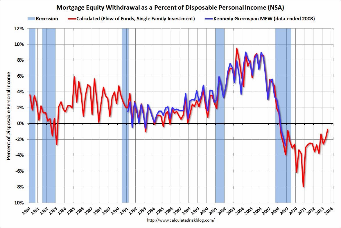
Graph 1 – Equity Extractions – G-K Data vs CR Calculation.
I’m looking at the correlation between equity extractions and personal consumption expenditures during the housing bubble and collapse to support my claim. The method is to compare McBride’s calculated data, which extends past the end of ’08, and FRED Series PCE. Graph 2 shows Equity Extractions [blue, left scale] and the YoY dollar change in PCE [green, right scale] from 1991 through Q1, 2010, both in billions, quarterly data.

Graph 2 – Equity Extractions and PCE Change
The traces start rising together after the 1991 recession. There’s a disconnect during the 2001 recession, when PCE takes a dive, but extractions continue to increase. From 2003 until the crash, they are close to being in lock-step; but from the peak, extractions fall farther and faster leading into the recession. One objection to my claim is that extractions decline a year earlier than PCE. We’ll get to that.
Graph 3 shows a scatter plot of Year-over-year PCE dollar change vs equity extractions from Q1 2001 through Q3 2008

Graph 3 – PCE Dollar Change vs Equity Extractions – ’01 to ’08
The period from Q1, ’01 through Q2, ’03 is highlighted in red. During this time, PCE falls and levels off without a correlation to extractions. After mid ’03, extractions and PCE rise together into the peak values highlighted in yellow, then fall together into the crash. R^2 for Q3 ’03 through Q3 ’08 is .75. This includes the blue and yellow points.
Graph 4 is a scatter plot of the Q1 ’91 through Q1 ’10 period. I’ve color coded data subsets representing different coherent realms.

Graph 4 – PCE Dollar Change vs Equity Extractions – ’91 to ’10
Starting from the 1991 recession in red, PCE increased into the cluster of purple dots representing Q1 ’92 to Q1 ’98. From Q2 ’98 until Q1 ’01 is another [less tight] cluster representing a greater change in PCE but only slightly higher equity extractions. This is the peak of the dot com bubble. Q2 ’01 to Q2 ’03 is again in red, the slide into and climb out of that recession. The blue dots, as in Graph 3, represent the period from Q3 ’03 to Q3 ’08 – the housing bubble peak and decline into the crash. The green dots are from Q3 ’08 through Q1 ’10, when everything collapsed and the correlation fell apart. The R^2 for all the data points except the green is .49. Eliminate the red dots as well, and it rises to .70. Take out the top 4 yellow dots, Q4 ’99 to Q3 ’00, and it rises further to .81.
This suggests that outside of recessions and the peak of the dot com bubble, which can be considered as distortions to a underlying trend, from 1992 on, changes in consumption expenditures were strongly correlated to mortgage equity extractions.
I used an ATM analogy for equity extraction, but there’s a big difference. You can go to the ATM as often as you like, but extracting equity is an event that is unlikely to be repeated very often. So it’s not out of the question to expect that the flow of equity dollars into consumption expenditures would be spread over several months – possibly a year or more.
I also looked at the correlation between extractions and the PCE dollar change 4 quarters later. This is shown in Graph 5.

Graph 5 – PCE Dollar Change vs Equity Extractions – ’91 to ’10
Color coordination, based on the PCE values, is the same as in Graph 4. The blue dots now make a more spiky array, but there is almost no loss in the coherence of the data sub sets. Only the green dots, now extended though Q1 ’11, look substantially different. R^2 for the blue dots slips from .75 to .56, but for the entire data set [except the green dots] it increases slightly from .49 to .55.
Extraction data is seasonal, with local peaks in Q’s 2 or 3, and valleys in Q’s 4 or 1. This accounts for some of the data scatter. PCE dollar change data is smoother, with no consistent seasonal pattern. Graph 6 shows a scatter of 4Q averages of each variable, same color coding as graphs 4 and 5. Not including the recession-related red and green dots, R^2 is .75. Include the red dots and R^2 drops to .588.

Graph 6 – PCE Dollar Change vs Equity Extractions – ’91 to ’10 – 4 Q Avgs
It’s now very easy to see the two variables rise and fall together from the time after the 2001 recession into the Great Recession.
I know correlation is not causation, but I have a coherent narrative that is completely consistent with the data. The behavior of the [blue dot] data from 2003 until deep into the collapse is striking, either with or without a 4 Q lag. Non-conforming data [other color dots] are explainable variances. I think the counter assertion that equity extractions had not a darned thing to do with the collapse into the great recession is not supported by real world data.
What you are seeing is the increase in debt leading up to the Great Recession.
Irving Fisher (1867-1947) the economists wrote that the Great Depression had been caused by debt.
These are available for download:
Booms and Depressions: Some First Principles (by Irving Fisher 1932)
http://fraser.stlouisfed.org/publication-series/?id=104
A History of the Federal Reserve: Volume 1: 1913-1951
Chapter 5 Debt-Deflation Theory of Great Depressions (by Irving Fisher 1933)
http://fraser.stlouisfed.org/meltzer/record.php?id=4252
I can just imagine Bernanke’s response upon seeing the two papers by Greenspan , the first of which came out in Sept. 2005 , only a few months before the end of his term :
” Gee , thanks , Al. This is really useful to me. Now I know that much of our economic growth during your term has been based on the growth of asset bubbles which are , of course , unsustainable. I also know now that I’m totally screwed. Thanks again , good buddy ! Now , go scoop up some of those million-dollar speaking fees.”
While it’s a rather good demonstration of correlation there and reduced equity extraction is a fairly plausible contributor (at least by way of debt, as JimH mentioned), I’d be leery of presuming that reduced equity extraction was a primary trigger for this crisis. Consider the leveling and then decline in employment that went along with the decline in availability of home equity. Reduction in home sales sacked a lot of jobs, not just in home construction but also in related industries (e.g. furnishings). It seems highly probable that the job losses from reduced home sales contributed as much as or more than reductions in potential for equity extraction.
JimH –
Yes, debt load is pretty much the point, I think.
Thanks for the links.
Marko –
Yeah – BB came in at a rough time. Greenspan had such a great reputation at the time. I don;t think he is so highly regarded any more.
SoT –
No argument here. I was pretty careful to say A major rather than THE major contributor. Certainly a lot of other things were going on at the time. I was making a specific point about this particular phenomenon.
Cheers!
JzB
“I think the counter assertion that equity extractions had not a darned thing to do with the collapse into the great recession is not supported by real world data.”
Actually my counter assertion was (to quote myself):
“So nonresidential private investment fell sooner, faster and further than PCE. Moreover this happens in all recessions. What does this have to do with equity extractions or wealth and income inequality? Not a darned thing.”
I don’t see anything at all in this post that contradicts that claim.
And just to reiterate…
Although year on year nominal PCE fell 3.2% at trough, year on year nominal private nonresidential investment fell 27.7%:
http://research.stlouisfed.org/fred2/graph/?graph_id=164620&category_id=0
More importantly, year on year nominal PCE did not fall significantly until 2008Q4 whereas year on year nominal private nonresidential investment started plunging in 2008Q1. PCE growth was 4.8%, 3.9%, 4.1% and 3.3% in 2007Q4 through 2008Q3, whereas nonresidential investment growth was 7.2%, 4.1%, 0.0% and (-2.9%) in the same four quarters.
Although nominal PCE fell a total of $350 billion from its peak in 2008Q3, nominal private nonresidential investment fell a total of $600 billion from its peak in 2007Q4, nine months earlier.
Mark –
I guess it depends on what your definition of “fall significantly” is.
PCE growth had been slowing for 3 years. If you look at monthly PCE YoY % change data, from the July 2005 peak of 7.2%, there was a series of continuous lower lows and lower highs.
For the first 7 months of 2008, PCE growth averaged 4.0%, 44% less than the 2005 peak value. After that, it dropped hard and fast.
http://research.stlouisfed.org/fred2/graph/?g=t1n
Maybe I misread your comment.
It’s certainly true that private nonresidential investment [is that FRED series PNFI?] fell farther, faster and sooner than PCE.
And that they have no clear or direct connection. But that doesn’t make PCE and equity extractions irrelevant.
Cheers!
JzB
Mark A. Sadowski wrote: Although year on year nominal PCE fell 3.2% at trough, year on year nominal private nonresidential investment fell 27.7%:
http://research.stlouisfed.org/fred2/graph/?graph_id=164620&category_id=0
But your link is showing a graph for Gross Private Domestic Investment (GPDI) – Private Residential Fixed Investment (PRFI).
How is this related?
Private Residential Fixed Investment (PRFI) would seem to be home prices falling after the housing bubble was popped.
JzB seems to answered the rest.
Should have looked a more carefully at your link.
Okay, now I see that you are subtracting Private Residential Fixed Investment (PRFI) from Gross Private Domestic Investment (GPDI) to get to nonresidential investment.
But, that nonresidential investment didn’t start to fall until after the Great Recession started in December 2007.
That fall in appears to track the DOW:
http://finance.yahoo.com/echarts?s=%5EDJI+Interactive#symbol=%5Edji;range=20070103,20101231;compare=;indicator=volume;charttype=area;crosshair=on;ohlcvalues=0;logscale=off;source=;
I should have had my morning coffee before I made these comments.
Then hopefully I would have added that ‘Private Residential Fixed Investment (PRFI)’ started to fall in about the second quarter 2006. (The change was negative)
http://research.stlouisfed.org/fred2/graph/?graph_id=164620&category_id=0
But nonresidential investment did not start to fall until about the second quarter of 2008.
And as I wrote before that fall appears to track the DOW. The DOW fell as it became obvious that the banking industry was in deep trouble. (As a result of loans and securities made during the housing bubble.)
JazzBumpa,
“PCE growth had been slowing for 3 years. If you look at monthly PCE YoY % change data, from the July 2005 peak of 7.2%, there was a series of continuous lower lows and lower highs. For the first 7 months of 2008, PCE growth averaged 4.0%, 44% less than the 2005 peak value. After that, it dropped hard and fast.”
This is equally true, if not more so, for private nonresidential investment. Peak year on year growth was 14.6% in 2005Q1. In the first half of 2008 it only averaged 2.0%. And year on year nondefense capital goods shipments excluding aircraft industries (ANXAVS) , which is a good monthly frequency proxy for the equipment portion of private nonresidential investment (equipment is by far the largest component), turned negative in August 2008, three months before PCE did the same.
“It’s certainly true that private nonresidential investment [is that FRED series PNFI?] fell farther, faster and sooner than PCE.”
PNFI is private nonresidential fixed investment, which excludes inventories. By private nonresidential investment I mean PNFI plus private inventories. Businesses started consistently drawing down private inventories in 2008Q1.
“But that doesn’t make PCE and equity extractions irrelevant.”
I never suggested it was irrelevant. But I do think you overemphasized their role in the recession. First of all, when nominal PCE fell in 2008Q4, that was essentially the other shoe falling off, as nominal private nonresidential investment had been falling since 2008Q1. Secondly, your own regressions (Graph 5) show a huge residual between fitted PCE and actual PCE in 2008Q4 through 2009Q3 suggesting that gross equity extractions (GEE) were not the proximate cause of the sharp decline in PCE during those quarters. That is not surprising since Greenspan and Kennedy’s own data show that less than a fifth of GEE is used for PCE (nearly half is used to acquire other assets) and the proportion of PCE attributable to GEE was negligible by 2008Q3.
JazzBumpa,
Your welcome for the links, I thought the Irving Fisher’s work on debt deflation might be useful.
We would all be better off, if a proof could be developed for the true cause of the Great Recession.
I never believed that any bank or group of banks failing would have been enough to bring us down. (And only a few of them actually failed.)
Consumer spending represents the largest component of GDP, and anything that impairs that is a candidate for the primary cause of the Great Recession. Consumer debt quickly became the best candidate for the impairment. And the Greenspan/Kennedy study of equity extraction documented a mechanism for running up huge amounts of debt.
And when the housing bubble collapsed, the underlying collateral was reduced in value. That and more conservative underwriting standards would guarantee that future borrowing would be much more limited. So it turned out that bailing out the banks so they could continue lending, was of very limited value.
Borrowers had been borrowing money to supplement their stagnant real incomes. And when that avenue was limited, then their spending had to be reduced, thus reducing the GDP.
That sent me looking for parallels in history and I found the Great Depression. If there was no Social Security, no unemployment insurance, no Medicare, and no Medicaid then we would be in a Great Depression 2. (Government spending of one sort or another.) Then I discovered Irving Fisher and his debt deflation theory. He believed that the Great Depression had been brought on by debt.
The end of the Great Depression seems to be wrapped in myth. Spending on building tanks and planes only to have them destroyed is not a formula for sustained recovery. Sooner or later the war would have ended and 8 million men would have come home to unemployment and as war production ceased, their future wives would have been unemployed too.
The true cause for the end of the depression was a multi step proposition. During the war, 8 million men were in the military, most in war zones where spending was at least reduced. The war brought on full employment and brought many young women into war production plants. Personal incomes were quickly raised which cause inflation which inspired wage and price controls. Next came rationing, it was a key component of the very large increase in personal saving, and as a bonus, rationing created pent up demand. Personal savings was between about 25% for three years and not much less for another year. That accumulated savings was the key to recovery. The war ended in 1945, young men came home and married young women and during 1946 they used their personal savings for personal consumption expenditures. Inflation in 1946 was 18.1% as pent up demand emptied the shelves and caused manufacturers to quickly convert back to a consumer based economy. That was the end of the Great Depression and it came when consumers had pent up demands and money to spend.
That is my larger narrative and it is based on government reported statistics. But ideas are not proofs.
Your graphs in this post are very interesting.
JimH,
“Then hopefully I would have added that ‘Private Residential Fixed Investment (PRFI)’ started to fall in about the second quarter 2006.”
Residential investment was probably already close to reaching bottom when the recession hit. Nominal residential investment at an annual rate declined by $280 billion between 2006Q1 and 2007Q4. This was over half the ultimate decline of $520 billion which was itself probably boosted by the recession. In 2008Q1 and 2008Q3 residential investment declined by the two smallest arithmetic amounts since the housing bubble burst. Had the economy not gone over a cliff the following quarter the declines probably would have decreased in magnitude still further.
“And as I wrote before that fall appears to track the DOW. The DOW fell as it became obvious that the banking industry was in deep trouble.”
I agree that there is a strong relationship between the stock market and fixed investment (Tobin q), but I disagree that the banking industry plays much of a role in this.
First of all, financial industries account for very little nonresidential investment. Secondly, corporate profits in nonfinancial industries peaked in 2006Q3 and had fallen by over 20% by 2007 Q4 (line 4):
http://www.bea.gov/iTable/iTableHtml.cfm?reqid=9&step=3&isuri=1&910=x&911=0&903=239&904=2006&905=2009&906=q
This helps to explain why nonfinancial stocks were also falling in value.
Finally, Tobin’s q theory provides a mechanism through which monetary policy affects the economy through its effects on the prices of equities. Tobin defines q as the market value of firms divided by the replacement cost of capital. If q is high the market price of firms is high relative to the replacement cost of capital, and new plant and equipment is cheap relative to the market value of business firms. Companies can then issue equity and get a high price for it relative to the cost of the plant and equipment they are buying. Thus investment spending will rise because firms can buy a lot of new investment goods with only a small issue of equity. On the other hand when q is low, firms will not purchase new investment goods because the market value of firms is low relative to the cost of capital. If companies want to acquire capital when q is low, they can buy another firm cheaply and acquire old capital instead. Investment spending will be low.
Here is Tobin q and investment for the *nonfinancial corporate sector* since 1993Q1:
http://research.stlouisfed.org/fred2/graph/?graph_id=131638&category_id=0
The correlation is significant at the 1% level with Tobin’s q explaining over 56.9% of the variation in investment. Note that Tobin q appears to lead investment as well. Thus it should not be at all surprising that Tobin q Granger causes private nonresidential fixed investment (PNFI) and that the impulse response is positive.
“In 2008Q1 and 2008Q3 residential investment declined by the two smallest arithmetic amounts since the housing bubble burst.”
should read
“In 2008Q2 and 2008Q3 residential investment declined by the two smallest arithmetic amounts since the housing bubble burst.”
Mark A. Sadowski “Residential investment was probably already close to reaching bottom when the recession hit.”
Using PRFI which you used in your earlier comment against you:
http://research.stlouisfed.org/fred2/graph/?graph_id=164620&category_id=0
I have customized the graph to show PCE and PRFI (Private Residential Fixed Investment) between January 2006 to December 2009.
As you can see the low point of -30% in PRFI occurs in the second quarter of 2009. PRFI had been about -23% in December 2007 when the Great Recession began.
And coincidently PCE reached reached it’s low point at about the same time as PRFI.
We will agree to disagree about whether the banking industrys’ problems scared the hell out of investors in the stock market.
It is my carefully considered opinion that economic theories and models may have some significance when trying to predict the future but I assign them almost no credibility in predicting the past. If economic theories have been so grand, then how did we get into this Great Recession?
Please support your claims with data. If my ideas are incorrect than I want to know why, and that requires data.
I would think that when someone copies and pastes a direct quote from an academic , they should at least disclose this fact , and the source :
“Tobin’s q theory provides a mechanism through which monetary policy affects the economy through its effects on the prices of equities. Tobin defines q as the market value of firms divided by the replacement cost of capital. If q is high the market price of firms is high relative to the replacement cost of capital, and new plant and equipment is cheap relative to the market value of business firms. Companies can then issue equity and get a high price for it relative to the cost of the plant and equipment they are buying. Thus investment spending will rise because firms can buy a lot of new investment goods with only a small issue of equity. On the other hand when q is low, firms will not purchase new investment goods because the market value of firms is low relative to the cost of capital. If companies want to acquire capital when q is low, they can buy another firm cheaply and acquire old capital instead. Investment spending will be low. ”
I don’t know , I suppose Mishkin might be flattered , and pleased by the way his acolytes parrot his words :
( p.6 )
https://notendur.hi.is/ajonsson/kennsla2005/mishkin.pdf
PCE spending would be worse if the decline in wages as a share of gdp had not been offset by an increase in transfers as a share of gdp. As tranfers taper off , wages better taper up , or we’ll start to see the effects. It may be happening already .
http://qvmgroup.com/invest/wp-content/uploads/2012/05/US-Transfer-Payments-as-Pct-of-GDP.png
Companies can pay their workers , or taxpayers can pay them , but somebody has to pay them if consumption is to be maintained.
JimH,
“I have customized the graph to show PCE and PRFI (Private Residential Fixed Investment) between January 2006 to December 2009.”
Actually you’ve just posted a link to my graph again.
“As you can see the low point of -30% in PRFI occurs in the second quarter of 2009. PRFI had been about -23% in December 2007 when the Great Recession began.”
As I said, in 2008Q2 and 2008Q3 residential investment declined by the two smallest *arithmetic* amounts (i.e. subtraction) since the housing bubble burst. Had the economy not gone over a cliff the following quarter the declines probably would have decreased in magnitude still further.
“We will agree to disagree about whether the banking industrys’ problems scared the hell out of investors in the stock market.”
Profitability was plunging at nonfinancial corporations so there was already plenty of reason to get out of nonfinancial stocks anyway. There actually wasn’t much indication of a financial crisis until credit spreads widened in August 2007, and it’s not my impression that the markets were displaying the kind of 20/20 foresight at that time that you evidently think they had.
“It is my carefully considered opinion that economic theories and models may have some significance when trying to predict the future but I assign them almost no credibility in predicting the past. If economic theories have been so grand, then how did we get into this Great Recession?”
Well the subject of the 2008 FOMC transcripts are precisely what ultimately led to this post. The claim by David Beckworth and many others was that there were serious mistakes made in monetary policy in the two years previously and they reached a resounding crescendo in 2008.
“Please support your claims with data. If my ideas are incorrect than I want to know why, and that requires data.”
The claims I have been making are both specific and quantitative. Where necessary I have even provided links or named the data series by their FRED codes. So I don’t think this is at all a fair criticism.
Marko,
“I would think that when someone copies and pastes a direct quote from an academic , they should at least disclose this fact , and the source.”
Thank you for keeping me honest and providing the link.Incidentally there is more than one summary of the MTM by Mishkin:
http://myweb.fcu.edu.tw/~T82106/MTP/Ch26-supplement.pdf
The above one is a companion piece to Chapter 26 of his number one selling intermediate textbook on monetary economics. Here’s a diagram from that chapter detailing the MTM:
http://static.cdn-seekingalpha.com/uploads/2013/1/533843_13577148579922_0.png
Mark A. Sadowski “Actually you’ve just posted a link to my graph again.”
http://research.stlouisfed.org/fred2/graph/?graph_id=164620&category_id=0
I hate these interactive graphs because you can not send the settings with the link. I had customized the graph for Jan 2006 to Dec 2009 and I removed the GDPI component.
If you make those changes then you will see what I see. There will be PCE compared to PRFI(Private Residential Fixed Investment).
And on the left side of the graph is written “(Percent Change from Year Ago), (Percent Change from Year Ago of (Billions of Dollars)” And bottom of the graph is labeled with the years.
So I have no idea where you are getting “*arithmetic* amounts”. Certainly not from this graph, which is your graph as you noted.
As you can see the change in PRFI went negative in the second quarter of 2006. The low point of -30% in PRFI occurs in the second quarter of 2009. PRFI had been about -23% in December 2007 when the Great Recession began.
I certainly don’t consider a 7% difference in the change to PRFI as insignificant.
And coincidently PCE reached it’s low point at about the same time as PRFI.
And as I said” We will agree to disagree about whether the banking industrys’ problems scared the hell out of investors in the stock market.” I will add that Bear Stearn’s two special purpose entities had failed spectacularly in July 2007 and drew wide attention to the oncoming subprime-securitization disaster. The Great Recession came 5 months later.
http://www.reuters.com/article/2007/07/02/us-bearstearns-funds-idUSN026030220070702
“Well the subject of the 2008 FOMC transcripts are precisely what ultimately led to this post.”
I commented on this post in isolation and I didn’t realize that there was some much larger conversation. After a quick review it appears that this post should be able to stand on its own. It will be supported by the data or not supported.
JimH,
“So I have no idea where you are getting “*arithmetic* amounts”. Certainly not from this graph, which is your graph as you noted.”
From the series itself. Here’s the textfile associated with FRED’s PRFI:
http://research.stlouisfed.org/fred2/data/PRFI.txt
One can also go to the BEA for the numbers directly:
http://www.bea.gov/iTable/iTableHtml.cfm?reqid=9&step=3&isuri=1&910=x&911=0&903=5&904=2006&905=2008&906=q
PRFI decreased by $27.1 billion in 2008Q2 and $31.0 billion in 2008Q3, which was the smallest, and second smallest decrease since the bubble burst.
Mark A. Sadowski
This is starting to get hilarious.
First you were citing this (Year over year change):
http://research.stlouisfed.org/fred2/graph/?graph_id=164620&category_id=0
Now you are calculating the quarterly change using this (Quarterly data):
http://research.stlouisfed.org/fred2/data/PRFI.txt
Now here is the trick question! Why aren’t you using the quarterly data itself?
By my crude reckoning, the first low for PRFI after 2006 occurs in the 2nd quarter of 2009.
Which is about where the low for PCE occurred.
And as I pointed out before “But nonresidential investment did not start to fall until about the second quarter of 2008”. Which was after the Great Recession started. By that time PRFI was about 40% down from its peak.
The truth is that we disagree. It has been a civil disagreement but we disagree.
I will leave it at that. You have a good day! LOL
JimH,
“Why aren’t you using the quarterly data itself?”
I’m using quarterly data for PRFI because I’m making the argument that the negative impact of residential investment declines on the economy was largely dissipated by the time the recession occured. By 2007Q4 PRFI had already fallen $280 billion. The declines in 2008Q2 and 20008Q3 were the smallest arithmetic declines since the residential investment started to decline in 2006Q1:
http://research.stlouisfed.org/fred2/graph/?graph_id=165550&category_id=0
If everything had not gone over the cliff in 2008Q4 I believe the declines would have continued to get smaller.
“And as I pointed out before “But nonresidential investment did not start to fall until about the second quarter of 2008″. Which was after the Great Recession started.”
Actually it peaked in 2007Q4. The first decline was in 2008Q1 which coincided with the first of a series of drawdowns in private inventories.
http://research.stlouisfed.org/fred2/graph/?graph_id=165554&category_id=0
“By that time PRFI was about 40% down from its peak.”
Which is partly my point. PRFI had already undergone a precipitous decline before the recession even started.
ISTR lots of discussion about equity extraction over at CR during the RE bubble. Anecdotally, large item purchases follow equity extraction, but small purchases often PRECEDE it. People build up CC debt and then pay them down with home equity. They THINK that they’re being responsible by converting CC debt to lower rate mortgage rate, but really they’re simply demonstrating a persistent inability to live within their means.
Marko: “I would think that when someone copies and pastes a direct quote from an academic , they should at least disclose this fact , and the source.”
Mark A: “Thank you for keeping me honest”
Marko’s not keeping you honest. He’s exposing your dishonesty. Your proper response would be some sort of apology-to-all, rather than a frivolous dismissal of the criticism.