Six Decades of U.S. Population Growth
The growth rate of the U.S. population has been in a generally downward trend since the post-war baby boom peaked in 1957. Graph 1 shows the YoY percent change in the total population.
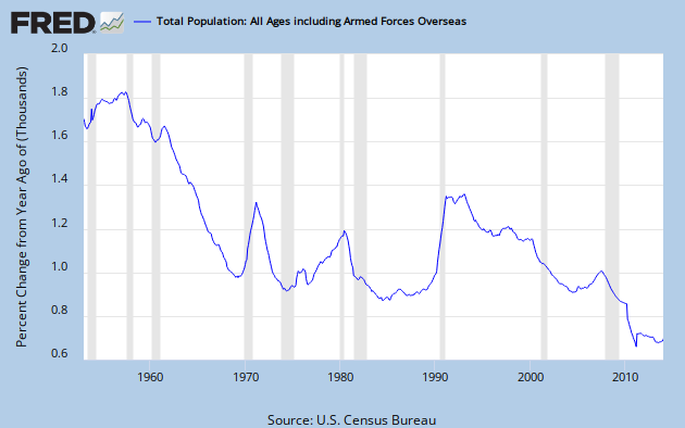
Graph 1 – U.S Population Growth since 1952
The precipitous growth rate drop through the sixties came to an abrupt halt in 1969, when early boomers like me started having our families. My son, daughter and two step sons were all born in the blip spanning 1969 to ’73. There might be a similar reason for the mid to late 70’s growth rate, but there also might be a bit more to it.
Graph 2 shows the birth rate per 100 population since 1950. [1980 – 2010 data from CDC.]

Graph 2 – Birth Rate per 100 Pop
The drop in population growth rate through the 60’s is explained by this data. You can also see the mini-peak from 1969 -73, the initial wave of boomer offspring. Then there is another peak at 1990. But that doesn’t do much to explain the simultaneous big jump in population growth. We’ll see what does, shortly. Also note the drop after the slight maximum in 2007.
To avoid any chance of getting a mistaken impression, let’s also look at the annual birth numbers, shown in Graph 3.

Graph 3 – Number of Live Births
Without the per population denominator, the post 1980 portion of the graph looks quite different. Now the 1990 peak seems a lot more significant, with the greatest number of births since 1968. And the barely discernible blip in 2007 on Graph 2 is revealed as the greatest number of births ever, just slightly edging out the 1957 post war baby boom peak. But the drop from 2007 to 2012 is meaningful. The 2012 birth rate of 1.27/100 pop is a record low. It corresponds to a total fertility rate of 1.93 births per woman over her lifetime. The replacement rate to keep native-born population from declining is 2.1.
The other source of population growth is immigration. And, as Graph 4 shows [data from Table 1 at this link.] it accounts for a big chunk of the population growth in the early 90’s.

Graph 4 – Immigration from 1950 on
The peak runs from 1989-93, with the maximum value in 1991. I’ve imposed an exponential base line by putting an Excel generated best fit curve through the highlighted data points. The raw number of annual immigrants has generally increased over time, and has mostly run well above the base line since 1989. But now it has been basically flat since 2007. The above-trend numbers of the late 70’s contributed to the increased population growth at that time.
Graph 5 shows that, in raw numbers, for recent years births outnumber immigrants by not quite 4 to 1.

Graph 5 – Ratio of Immigrants to Births
The final component to population change is the death rate. This data was not as easy to locate, is less detailed, and there are some discrepancies among various sources. I took data before 2000 from info please, and from 2000 on from indexmundi. I don’t put a lot of faith in the 2nd decimal point. Graph 6 shows the data.

Graph 6 – Death Rate per 100 Pop
The big drop in mortality during the 70’s and 80’s isn’t hard to understand. There were big medical advances leading to increased disease survival and longer life expectancy. At the same time, there were huge improvements in automotive safety that saved thousands of lives every year. On-the-job safety might also have been a factor, since OSHA was formed in 1971. The slight increase in the late 90’s and sharp drop after 2000 are more mysterious, but that might just reflect the quality of the data.
My first thought was that before about 1980, births dominated population growth, and after about 1990 immigration took over. During the early 90’s, at least, immigration dominated. That may still be true. As the number of births has dropped sharply, the birth rate has fallen to an all time low since 2007. Population growth has stabilized at an historical low level, and hasn’t declined further in the last 3 years.
One thing that is clear is that without immigration, the U.S. population would go into decline as my generation passes on.
Looking at the relationship between births and recessions (using graph 3 and my poor memory), I predict that we will see a statistically notable boom when more people start feeling better about the economy. The desire for babies is more pent up than at any point in your data (which does not go back to 1946).
Arne –
Graph 1 has recession bars. I don’t see any consistent relatoinship between birth rate and recessions. Note ’69, ’80, and ’91.
I don’t know where your pent up desire idea comes from, when the birth rate has been trending generally downward for 57 years.
Other than being the year I was born, what does 1946 have to do with anything?
I didn’t go on a quest to find older data. Putting this together was more time and effort than you can imagine.
Here’s the data for earlier years through 1960 from the graph 2 source.
Year Rate/100 Births (millions)
1910 3.01 2.777
1915 2.95 2.965
1920 2.77 2.950
1925 2.51 2.909
1930 2.13 2.618
1935 1.87 2.377
1940 1.94 2.559
1945 2.04 2.858
1950 2.41 3.632
1952 2.51 3.913
1953 2.51 3.965
1954 2.53 4.078
1955 2.5 4.104
1956 2.52 4.218
1957 2.53 4.308
1958 2.45 4.255
1959 2.43 4.295
1960 2.37 4.258
I comes from looking at the tail of the chart at wondering why would there be another drop in rate at the end. Since its beginning it reasonably consistent with the beginning of the current economic malaise, I looked back. Other slope changes at 2000, 1990, 1980, 1971. I would conclude that economic conditions are a likely factor in causing changes in birthrates. Not symmetrical, however, so predicting an upturn comes with a willingness to bet only the change in my pocket.
“what does 1946 have to do with anything?”
The post-war boom came post-war.
The line of reasoning that the general pessimism during a recession leads to a lower birth rate is attractive. Maybe it had an effect during the GR. But we’ve been below 1.5/100 pop every year since 1995, and was only at 1.43 in 2007, before the GR hit.
The Pop series at FRED starts with 1952, and that is where I started with this post. Data before then is generally sketchy. In fact most FRED series that I’ve looked at over the years start in 1947 or later. Some, much much later.
Anyway, in this particular instance, there was little to be gained by going back further. The big story line is post 1957.
The tobacco NSA was in 1998. Usually the major benefits of stopping smoking in terms of excess risk of heart disease, coronary failure and stroke kick in in that period.
I wonder if there might have been a spike in smoking cessation in the US related to that settlement. It’s the only major public health item I can think of that might have been causative in that period.
JazzBumpa wrote:
“One thing that is clear is that without immigration, the U.S. population would go into decline as my generation passes on.”
I agree completely with that statement. And when that happens the US should allow more legal immigrants into the country.
Paul Krugman has argued that much of the death reduction is due, not to the bulk of people living longer, but to a drop in infant mortality. Also, besides seat belts, we also phased out lead in both gasoline and paint in the early 1970’s, which would have depressed death rates.
J. Goodwin –
Smoking rates have been declining steadily for men since the 50’s and for women since the 60’s. There is no big drop off at any particular time.
http://www.infoplease.com/ipa/A0762370.html
WillH –
Interesting thought, re: lead. I don’t know how much that would affect death rates, per se, as compared to mental health and other quality of life issues.
Cheers!
JzB
JimH –
There are some Republicans you need to talk to.
JzB
First, I am an Independent not a Republican, thus I have no influence with them.
Second, I will be dead before this is actually a problem for my working class friends and relatives. At that point I trust that they will see the advantage of allowing increased legal immigration from around the globe. We have never had a problem attracting immigrants, so why should we hurry?
The why should we hurry argument might be best appreciated if you looked into the Japanese or German experience with labor migration.
These are somewhat different situations because each country is not nearly as diverse as the US is, but Turks in Germany and Japanese-Brazilians/Peruvians in Japan (dekasegi) provide interesting counterpoints to the normative American immigrant experience.