Are wages poised to rise sharply in 2018 ?
For the first time since the Great Recession my wage equation says average hourly earnings growth should be higher than the actual data shows. Moreover, the fitted value is rising sharply. Each of the three variables in the equation — the unemployment rate, capacity utilization and inflation expectations — is now pushing the fitted value higher. This is the first time since that the fitted value is both above the actual growth of average hourly earnings the Great Recession and rising sharply. Rising wages should contribute to higher nominal income growth and this in turn is a major determinate of bond yields.
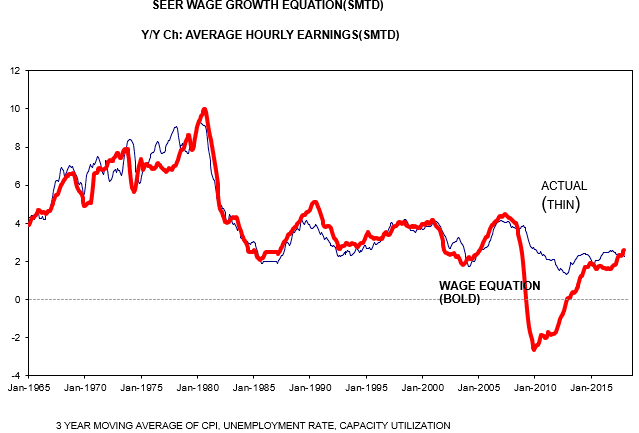 Figure 1
In your posted text you call it your “wage equation” but under the chart it says “… moving average of unemployment rate & capacity utilization”.
Not to mention that the vertical axis isn’t even labeled.
So where’s your chart for wages? or does the unemployment rate and capacity rate = wages? or are you overlaying your wage equation result on a chart of some index combination of capacity utilization and unemployment rate (labeled “actual” on your chart)? Or is the chart description under the chart wrongly identified?
If your chart is comparing apples to apples, then in any event Isn’t the more relevant point that your “wage” equation so grossly undershot “actuals” from ~ 2008 until now… for 8 or 9 years?
I also note on eye-ball inspection that”
Until the 1980ish peak your equation lagged “actual” + growth 2/3 times and peaked above “actual” on the last peak.
But after the 1985 lows & before the 2008ish period, the + “actuals” growth lagged (reverse of prior periods) your equation 2/3 times and also peaked above “actuals in 2/3 cases .
Have you done a residuals analysis with the std dev so that your data can be objectively marked to “actuals”?
It is a 3 year moving average of the CPI, not of all three variables. The index is a regression based index of the three variable.
What the gap between the fitted value and actual value after the Great Recession demonstrate is that wages are sticky and that neither labor or capital actually cut wages, they just let them stay flat until they get back to normal The question I wonder about is that because we had a period where actual wages were above the fitted value will we now offset with a similar gap withe the fitted above actual values. I doubt it.
The actual and fitted vale are charted on the same axis, as they have about the same values.
Spencer,
thanks, but still clear as mud. When you use visuals (like charts) it’s no only customary but required to label each plotted variable and it’s axis values, as well as make sue there’s no discrepancies in the chart name and the data is visualizes.
So the reason you can’t run residuals analysis is your comparing aples and pears. or avocado’s
Worthless chart imo.
I do not understand what you fail to see.
I clearly pointed out that both series are charted on the same axis.
Second, if you look at the labels above the chart it shows that both are year-over-year change.
Why is that so hard to comprehend?
You make a good point that the bottom definition should be unemployment rate first, capacity utilization second and the three year moving average of the CPI last so as to limit misunderstanding.
Spencer,
the “thin”blue line is “actual” of what result or variable ? You said in your response to me that it was CPI.
the thick red line says “Wage Equation”, which I presume means “your own equation” but that’s confusing because above the chart it says SEER Wage Growth Equation (SMTD) which seems to be some official equation, though since there’s no equation actually shown it’s impossible to tell.
So is the chart comparing Y-Y % growth of CPI and your wage equation?
And when you say the vertical axis values for the two variables are “similar” that’s a purely subjective measure of what you call “similar” but without any objective definition / measure of the differences — or even if they are scaled identically.
Spencer,
About that large post Recession “gap” you stated
“…gap between the fitted value and actual value after the Great Recession demonstrate is that wages are sticky”
Wages are always “sticky” and thus must enter into any equation as one of the independent variables. The fact that your equation misses by a zillion miles during the post recession period only means that your equation isn’t including a major and significant independent variable does it not?
That there’s an proximate relation (perhaps- — the values of each variable on the vertical axis are not the same by your own statement, but only “bout the same” or “similar”) prior to the Great Recession and those periods also contain “sticky” wages isn’t reconciled with the large discrepancy after the Great Recession began. You are obviously therefore ignoring some critical and very significant variable s.. besides ‘sticky” wage variables.
And then what validity does your equation have at all?
Like I say it’s clear as mud.
So what if wages are always sticky, it only matters when it impacts wage setting. That only happens when there is a realistic possibility that wages would be falling if wages were not sticky. I could easily put in a dummy variable for sticky wages, but all that would do is make the results look better.
I do not understand what is your problem. For some reason you have decided you do not like my presentation and you are coming up with all kind of factors that seem to be just deliberately making up thing. I simply regressed the growth of average hourly earnings against three variables and charted the results. But you claim I’m doing something else. I never said the chart was of the CPI. I said nothing of the sort and the variables are clearly defined. Moreover, the fitted value is of wage growth and is on the same axis as actual wage growth. Why do you keep making up statements to contradict that.
This is an equation I have used for over 15 years and it has provided me with very good insights. For example, in September 2015 the Fed, most of Wall Street and many independent economists were very worried that wage growth was going to rise sharply.. But my analysis said that we did not have to worry about accelerating wages. I posted the results at Angry Bear and have been proven right.
http://angrybearblog.com/2015/09/wages-and-the-fed.html
I don’t know what to make of your comments. Are you just some sort of troll? The more you post the more I’m driven to believe that because you comments are just getting to the point that they do not make any sense.
Spencer,
Longtooth gets carried away.
Spencer:
Like Dan said, LT does get carried away.
“It is a 3 year moving average of the CPI” per your Jan 22, 10:53 am response to me.
if by “getting carried away” you mean I’m simply trying to unravel a chart that doesn’t describe what each of the two plotted lines (variables) are, and that plots them on a vertical axis that Spencer says “are about the same”) as applied each variable, and that shows a huge discrepancy between the variables after the great depression.
If some undefined home grown so-called “equation” some character has been using for 15 years misses the “actual” variable by that much for years on end, then how can anybody think it has anything to do with the price of tea in china at any time after the onset of the Great Recession????
The more questions I ask to clarify the more unclear the responses I get.
And I love this part: “an equation I have used for over 15 years and it has provided me with very good insights. For example, in September 2015 the Fed, most of Wall Street and many independent economists were very worried that wage growth was going to rise sharply.. But my analysis said that we did not have to worry about accelerating wages.”
And this explains the huge misses for several years after the Great Recession?
This is called “I have a neat equation (which I don’t disclose), and once in a while it predicts reality.. See. Here’s one example of when it worked”. This is pure and utter bulllshit. It’s called cherry picking what you want to see and ignoring everything you don’t..
Done with you Spencer. You’re a bullishitter. Now I know I’ll call you out again on your Bullshit when I see it posted..
Glad to hear it., more power to you. But even though I doubt it, I hope your good manners takes you far.
Longtooth, just one more question. Can you tell me what this quote from the text of this post means?
Moreover, the fitted value is rising sharply. Each of the three variables in the equation — the unemployment rate, capacity utilization and inflation expectations — is now pushing the fitted value higher.
I’m asking you because you can not seem to read he labels at the top of the chart so i have serious doubts about your ability to read and understand simple eight grade English.
LT,
You defeat your argument when you use such tactics. Consider this a warning.