The best measure of labor market recoveries: March 2016 update
by New Deal democrat
The best measure of labor market recoveries: March 2016 update
In my opinion the best measure of how average Americans are doing in an economic expansion isn’t jobs, and it isn’t wages per hour. Rather, it is real aggregate wage growth. This is calculated as follows:
- average wages per hour for nonsupervisory workers
- times aggregate hours worked in the economy
- deflated by the consumer price index
This tells us how much more money average Americans are taking home compared with the worst point in the last recession.
Why do I believe that this is the best measure of labor market progress? Let me give you a few examples.
First, compare an economy that creates 1 million 40 hour a week jobs at $10/hour, with an economy that creates 2 million jobs at 10 hours a week at $10/hour. If we were to count by job creation, the second economy would be better. But that’s clearly not the case. The second economy is paying out only half of the cold hard cash to workers as the first.
Next, let’s compare two economies that both create 1 million 40 hour a week jobs, but one pays $10/hour and the other pays $12/hour. Clearly the second economy is better. It is paying workers 20% more than the first.
Finally, let’s compare two economies that create 1 million 40 hour a week jobs at $10/hour. In the first economy, there are 3% annual raises, but inflation is rising 4%. In the second, there are 2% annual raises, but inflation is rising 1%. Again, even though the second economy is giving less raises, it is the better one — those workers are seeing their lot improve in real, inflation-adjusted terms, whereas the workers in the first economy are actually losing ground.
In each case, the economy creating more jobs, or more hourly employment, is inferior to the economy that pays more in real wages to its workers, In other words, the best measure of a labor market recovery is that economy which doles out the biggest increase in real aggregate wages. In short, at the end of the analysis, people generally work not for hours, and not for jobs themselves, but for the cold hard cash that is put in their pockets. That’s why I believe that real aggregate wage growth is the best measure of a labor market recovery.
With that introduction, here are real aggregate wages for the entire past 50 years: 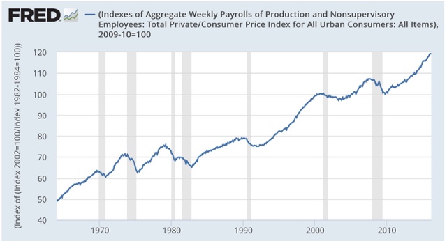 IMPORTANT NOTE: This graph shows *aggregate* real wages. It is not divided by households or per capita, so this measure doesn’t try to convey how much improved individuals’ lots might be. It conveys how much more income has become available to the middle/working class as a whole.
For that, we can divide by population to see real wage growth per capita: 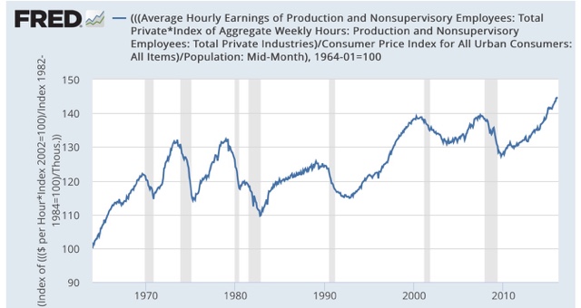
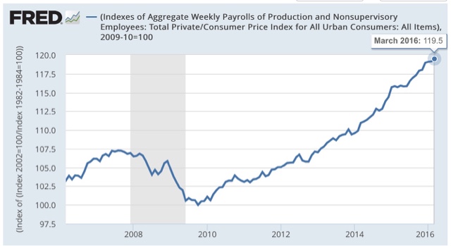
So how does the current expansion compare with past ones? Here is the graph, normed to 100 at the post-recession bottom in real aggregate wages in October 2009:
To compare, here is a chart I created last year showing the real aggregate wage growth in every economic expansion beginning with 1964:
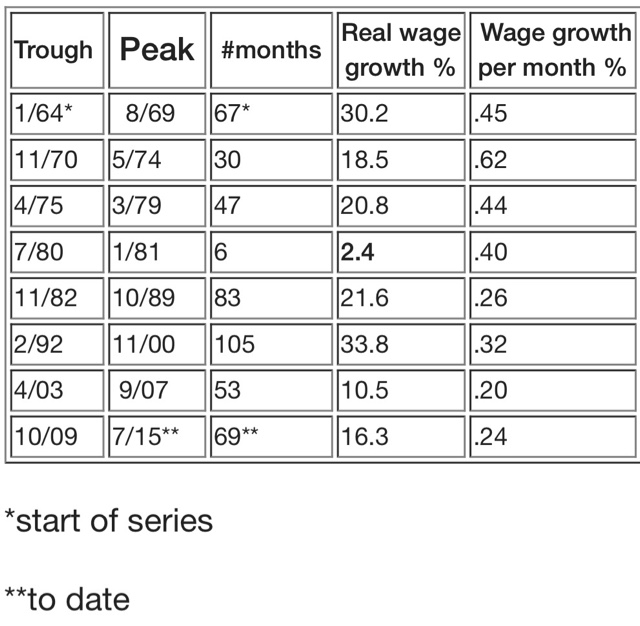
If you want to see the graphs for each expansion, just click here.
Because the above chart was created 8 months ago, the result for the current expansion has changed. Since the bottom 77 months ago, real aggregate wages have improved by 19.5%, an average of .25% per month. Four of the past 7 recoveries have been better. Three were worse. Wage growth per month is still anemic, although better than the George W. Bush expansion, . This recovery has been helped by a big increase in the total number of additional hours worked.
Finally, here is how it compares with the much-vaunted labor recovery of St. Ronald Reagan:
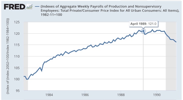
Currently the Obama labor market recovery has almost completely equaled the Reagan recovery 77 months in. If there is continued improvement for the next 6-12 months, it is likely to surpass Reagan’s record.
cross posted with Bonddad blog
The “real wage growth per capita” chart shows a 40% increase since 1964. This sounds great, but that is not per worker. As such, most of that increase comes from women’s coming into the workforce (32% of the workforce in 1964 vs. 49% in 2012).
http://www.theatlantic.com/sexes/archive/2012/11/converging-toward-equality-female-employment-from-1964-to-today/264625/
And those working women in 1964 were more likely to be part-time then.
This puts middle class families into what Sen. Warren dubbed “The Two-Income Trap.” If you have not heard this speech, it is well worth the hour of your time.
Sorry — that is also a good video in which she explains the Two Income Trap, but this is the one I wanted to post:
What is the difference between your measure and real weekly earnings?
Warren: The aggregate measure tells us how much, in total and in real terms, is labor earning? Since peoople not in the labor force also need food, clothing, shelter, etc., I divided by populatoin rather than labor force participation. That measure tells us how much is availale to spent on each person by the money earned by labor? What neighter tells us is the median wage of all workers – but that isn’t the question I am trying to answer.
Spencer: If I understand correctly, the denominator in real weekly earnings is the number of workers. Therefore the outcome is affected by the share of part-timers vs. full-timers. For example, it plummeted in the 1980s as spouses entered the work force, disproportioinately in part-time jobs.
Yes, it is impacted by changes in the composition of employment.
But that is exactly what you want to know.
Right now one of the reasons wages are weak is that we are losing very high paying and high work week jobs in the oil patch and gaining low paying, part time jobs in retail, restaurants and hospitality. So one way
to raise wages is to raise the price of oil.
So the way to increase average hourly earning
“The aggregate measure tells us how much, in total and in real terms, is labor earning? Since peoople not in the labor force also need food, clothing, shelter, etc., I divided by populatoin rather than labor force participation. That measure tells us how much is availale to spent on each person by the money earned by labor?”
That’s all well and good, but there are a lot of people “in the labor force” doing things that women did before they went into the labor force.
For instance, we consider a nanny to be in the labor force, but a woman who stays home with her children doing the same work is not. A man cutting his own lawn does not count, but hiring someone else to do it does. (Unless he’s an illegal immigrant, of course.)
The above charts like most statistics would have one believe we are living in a golden age and prospering. When in truth we have something like 45 plus million living in poverty, and a doubling of poverty in some sector’s since 1970.
But the examples posted by Warren, are a more accurate explanation of what is occurring in our economy.
You have lies, dam lies, and then you have statistics.
For greater economic theory insights on this go see the Economic Policy Institute.com or Paul Craig Roberts.org and you will get s different perspective of economic reality in America. I would read Michael Hudson’s book “Killing The Host’ and ProsperousAmerica.org to get a more accurate picture of the economy. For those who have stronger hearts I would recommend reading Michael Chossudovsky 113 world economic points at GlobalResearch.org