Different Views of Real Median Household Income and Recessions
Using data from Census Bureau Historical Income Table H-08 and CPI data from FRED (index 1982 to 84 = 100), I was able to calculate real median household income (RMHI) from 1984 to 2011. Graph 1 shows the results – annual data.
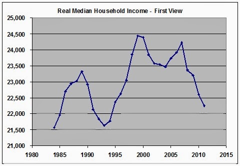
Graph 1 RMHI – First View – 1982-4 $
Except for the bump during the housing bubble, it been a downward track for this century. During the alleged recovery from the great recession, median income has dropped badly.
From this post at EconoSpeak,I found out that Census Beareau Table H-06 has a greater data range, from 1975 to 2012, and also an RMHI calculation. So I plotted their data in Graph 2.
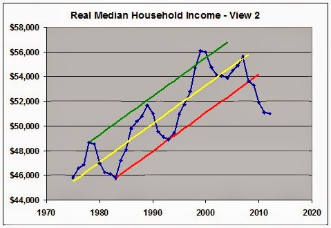
Graph 2 – RMHI – 2nd View – 2012 $
Instead of CPI, the Census Bureau uses CPI-U-RS, a research series based on constant 2012 dollars. So the numbers are different, but the picture is the same. I’ve added a trend channel, because I’m amused by that sort of thing. Presumably, the Great Recession [GR] ended in 2009, but that’s the year that the RMHI value fell below the trend channel lower boundary – possibly forever. A channel violation that severe almost always indicates that the previous trend is well and truly dead. The new trend looks pretty dismal. Welcome to hard times. By my calculation, RMHI is down by over 8% since 2000.
As far back as the data goes, RMHI has taken a hit in every recession. In days past, RMHI would recover to a new high after the recession was over. There was no recovery after the 2001 recession until the bubble years of 2005-7. That ephemeral gain to a new lower high was completely wiped out by the GR in 2008. Since then, things have only gotten worse.
In the Econospeak post linked above, poster Econoclast suggests that the standard way of viewing the start and end of recessions is flawed. His alternative is to consider that a recession is occurring when and as long as RMHI is falling. He then presents this table.

Table 1 – Two Views of Recessions
If we consider recessions as he suggests, then the oxymoronic concept of the jobless recovery can be discarded – and good riddance.
Via Mish, I found Doug Short’s article on the Deflating American Dream. He presents longer view graphs based on data from Sentier Research, who estimate RMHI on a monthly basis. Short did a lot of homework, and was able to graph RMHI back to 1967. He also compared the two inflation series and found that CPI-U-RS understates inflation, relative to the CPI. The difference is minuscule in recent years back to the mid 90’s, but expands quickly as you go back into earlier years. Graph 3 shows RMHI as adjusted by these two indexes, and also a third, PCE from BEA. There’s a lot more in the linked post by Short and in this one, as well. Both are highly recommended.
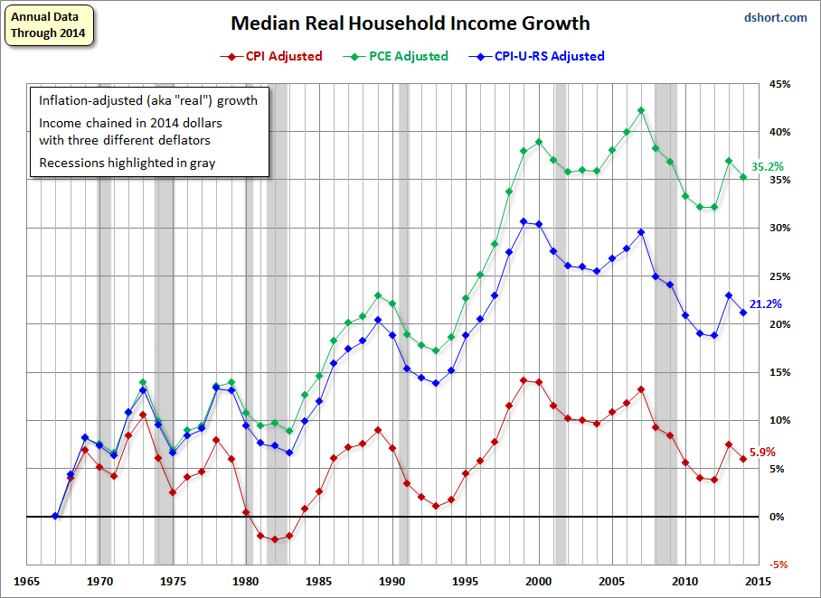
Graph 3 – RMHI Growth – Three Views
The three curves don’t disagree much on the timing of declines and advances, just on the magnitudes. By my count, using CPI as the adjustment index and Econoclast’s idea of recession timing, we have been in recession for 21 of the previous 46 years, or 46% of the time.
There’s your great moderation – I mean stagnation – in one simple, easy to understand picture.
Krugman points out that, “Adjusted for inflation, the income of the top 1 percent rose 31 percent from 2009 to 2012, but the real income of the bottom 40 percent actually fell 6 percent.”
By my calculation, based on the data in Graph 2, RMHI fell by 4% from ’09 to ’12. So the folks below median got hit even harder. In the words of an old song, “There’s nothing surer, The rich get richer and the poor get laid off!”
I’ve come to believe that greed really is the root of all evil.
Depending on the deflator, there may be or may not be Census defined median household income stagnation.
What happens, when Census defined median household income is adjusted for taxes and transfer payments?
Winship seems to be focusing on this adjustment.
JazzBumpa,
People say that wages have to compete with wages from countries like China. It’s a false logic. Take walmart for example. They intentionally push down wages.
Here is a video about wal-mart called, “When is it greed?”
Wal-mart came into the market and started paying wages to retail workers that were lower than in other stores. Wal-mart forced the wage standard down. They were cruel with many of their suppliers. Forcing low profit margins on them, and many times not paying. I know some of those suppliers. Some in China too.
Wal-mart goes to a town and for the first two months offers ridiculously low prices to get people sucked in. Then you see the prices rise. Other companies have had to compete with them and it is not easy. Wal-mart is a bully behind the scenes and their greed is huge.
Here are some other videos about the greed of wal-mart.
Full length movie – “Walmart: The high cost of low price.”
https://www.youtube.com/watch?v=Jazb24Q2s94
Video showing the growth of walmart in the US…
Walmart is a pervasive example of greed. There are great negative externalities due to them.
In economics, the highest principle for me is that marginal social benefits equal marginal social costs. But walmart simply values the highest marginal private benefits and thus raises the relative incidence of social costs. … not good.
Looks like your word greed, set me off.
2 thoughts. First, your trend line are interesting in that the 2000 peak is above it and that was the dot com bubble. Consider that the next rise was also a bubble, then we were not actually as well off at the 2000 peak as we think and the trend has truly (as in not a bubble) been downward since the artificial peak of 2000.
Combine that with the 80’s being the increase of two worker households (women entering labor force and men wages leveling) and the entire rising median income is an illusion compared to post New Deal.
All of which works with data I posted a few years ago showing that the income of the 99 had not doubled in years while the 1% was doubling faster than the GDP. Specifically since 1976, the top 1% income had doubled 4 times in the period the GDP double 3 times and the 99% double twice with their last point of doubling being 1996 (the same point their income drops below personal consumption). I only calculated up to 2005.
continued.
Marmico –
Well the Title of this post says “Different Views” and the link you provided presents a different one, and lots of food for thought.
My immediate take-away is that assistance and transfers helped keep the wolf away from millions of doors.
Next thought is that the data can be pretty cloudy.
Third thought is what sort of inflation adjustment do you like? I like CPI because it tracks pretty well with the independent Billion Prices index, which currently suggests that CPI is a bit understated.
http://bpp.mit.edu/usa/
Cheers!
JzB
Daniel –
I think that’s an important post. The table is unreadable, and I couldn’t get it to expand. Also, it’s 5 years old now. If you’re up for it, I think an update and repost would be well worth the effort.
Cheers!
JzB
Second thought.
I like to use the site Measuring Worth. It gives a few ways to look at the value of a dollar over time. I like to use the measurement: Unskilled Labor.
What is missing in the above numbers of the post and those of D Short’s post that may also address his results when he included the Shadow Stats deflator is labor value. I used his income numbers from 1969 and the latest number from Sentier, plugged them in and got:
In 1969, the relative worth of $52,236.00 from 2012 is:
$8,340.00 using the Consumer Price Index
$10,800.00 using the GDP deflator
$8,340.00 using the value of consumer bundle
$8,290.00 using the unskilled wage
$7,160.00 using the Production Worker Compensation
$5,080.00 using the nominal GDP per capita
$3,280.00 using the relative share of GDP
In 2012, the relative worth of $13,000.00 from 1969 is:
$81,400.00 using the Consumer Price Index
$62,900.00 using the GDP deflator
$81,400.00 using the value of consumer bundle
$82,000.00 using the unskilled wage
$94,900.00 using the Production Worker Compensation
$134,000.00 using the nominal GDP per capita
$207,000.00 using the relative share of GDP
Note how consistent working back from 2012 the median household income is for Unskilled labor with D Short’s noting 1967 being $7143 the median household income. Today’s median is where the unskilled worker would be in 1967/69.
However, going forward, D Short had concern that his 1969 household income of $13K appeared overly inflated based on the Shadow Stat’s inflators. Notice how that $13K becomes $95K for the unskilled labor. D Short was a starting a full time faculty position in 1969. That’s not unskilled labor. Yet, such a position today I would guess is right around the $95K level (not necessarily starting pay)?
This is the issue with using only deflators to understand how the 99% are doing. It is not only inflation and lack of share of income that has done in the 99% it is the defining down the value of labor. I think this is what explains the Shadow Stats results (note, I am not endorsing their methods, just making an observation). I say this because as seen, that $13K as a nominal share of GDP become more in line with what one would expect of such an educated person and the relative share get’s even closer to the Shadow Stat numbers.
This gets me to my other issue with deflators and our economy that just not being noted and discussed. We have raised the level of income needed to be middle class which was historically designed to be unskilled labor to that of requiring a level of skill/knowledge that a lesser percentage of the population will ever obtain.
We did not create the largest middle class with the greatest number of people having the lowest risk of living by increasing the standard to qualify we did it by lowering the standard to qualify. We called it Blue Collar. This is the “exceptionalism” of America. We have reversed this and that is not exceptional at all.
Great post! I have lived in 8 states and 2 foreign countries. It is noticeable on the ground that the median income is getting weak. You say that the RMHI fell by 4% from 2009 to 2012. That is line with the 5% drop in labor share over the same period.
What’s with the 7 Measuring Worth deflators. It’s not instructive. Three of them (“Consumer Price Index”, “value of consumer bundle” and “unskilled wage”) are the same. The “GDP deflator”, “nominal GDP per capita” and “relative share of GDP” should be the same. A GDP deflator is a GDP deflator. So there are 3 Measuring Worth deflators. And what doesn’t make sense is that “unskilled wage” was more valuable in 1969 than “Production Worker Compensation”.
The PCEPI is arguably the “best measure” of inflation or the deflator for the median household, after intertemporal* adjustments for household size, taxes and government transfers.
* An adjustment is necessary for the decline in household size over the last 2 generations.
Shadow Stats is bunk.