Imports constrained by effective demand
Labor’s share of national income sets a limit upon the utilization of labor and capital. That is the basic principle of effective demand. Domestic production periodically hits the effective demand limit. But are imports also constrained by the effective demand limit? Yes, they are, at least for the US.
Let’s look at imports to exports. Since the 1950’s in the US, it is common for exports to be 80% the value of imports (Yellow line, right axis).

It is true as one reads the news that exports are increasing in relation to imports (gray line rising). However, exports are currently at a normal level looking at past data (yellow line). Exports are about 83% the value of imports, which is pretty much the past average. Net exports as a % of GDP went very negative after the late 1990’s (gray line), only because foreign trade increased so much as a % of GDP. Even though imports rose a lot, exports did pretty well in keeping up with them as seen by the yellow line staying fairly steady. Exports are coming back into balance with imports.
Through time, did net exports (gray line above) recognize the effective demand limit? It doesn’t seem like there is any constraint on the line. Well, the limit is hidden, but can be revealed. Below I evaluate net exports as a % of GDP against the effective demand limit. (Data source for graph in video, 1967 to 3rdQ-13)
Activate the video for a second to see graph.
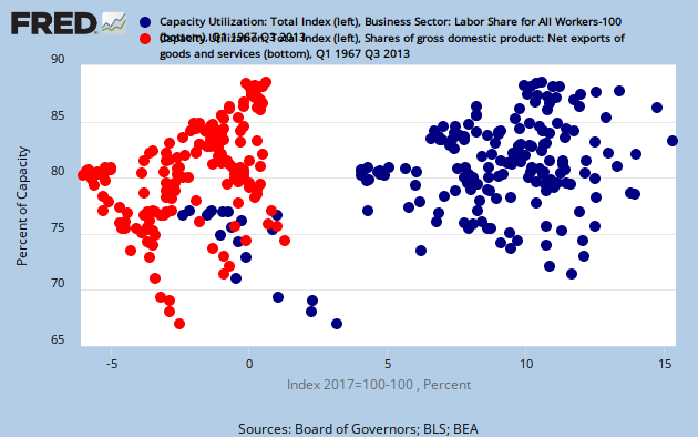
In the video, the graph shows two scatter plots. One is capacity utilization moving with labor share (blue). Capacity utilization hits an upper limit, which is the effective demand limit. The other plot (orange) shows net exports as a % of GDP (same as in first graph) moving with capacity utilization. Now we can see a defined upper limit. Is it the effective demand limit?
The pattern is for capacity utilization to fall as net exports go more negative. One might suppose that increased desire for imports is causing domestic capacity utilization to fall. But there is more to the story. Capacity utilization is actually reacting to the demand limit from labor’s share of income, not so much to an increase in imports. Exports tend to return to balance with imports (yellow line in first graph).
In the video I draw an upper limit on both plots. The one over the plot with labor share (blue) is the normal effective demand limit. The upper limit over the plot with net exports (orange) then simulates the effective demand limit. Do the two plots hit their upper limit at the same time? As it turns out, they do. As labor share slid down over the years, net exports tended to go more negative.
The upper limits followed a somewhat linear downward path. If net exports did not recognize the effective demand limit, you would see the orange line pass through the upper limit. For example, increasing imports would push the orange line to the left through the upper limit. The fact that this does not happen says that the limit upon imports is behaving like the effective demand limit upon domestic production.
Exports can rise, but they will rise in such a way that capacity utilization will not rise above the effective demand limit. You see the orange plot move along the upper limit if exports increase in relation to imports. That insight is important when you are trying to increase capacity utilization with increased exports. If the economy is against the effective demand limit, like it is now, you will only be marginally successful.
To wrap up… In the US, effective demand not only constrains domestic production, but imports too. And capacity utilization rises marginally with increasing exports, when the economy is against the effective demand limit, like it is now.
Note: I am strictly describing data for the US.